Introduction
I will never forget the first time I tried gouache. I had been painting with watercolors for years, always chasing that elusive perfect wash, when a friend handed me a small set of gouache tubes.
"Just try it," she said. "It is like watercolor's more forgiving cousin." She was right.
Within minutes, I was hooked — the way the colors went down opaque and velvety, the way I could layer light over dark, the way mistakes simply painted over instead of haunting me as permanent stains on the paper.
If you have ever wanted to paint a landscape but felt intimidated by the precision of watercolor or the setup of oils, gouache is your medium.
It is affordable, easy to clean up, and incredibly forgiving. You can paint a beautiful landscape in a single afternoon with just a handful of supplies, and the results are satisfying enough to frame and hang on your wall.
In this tutorial, I will walk you through painting a simple landscape scene from start to finish.
We will use just four colors and a few basic techniques. Whether you have never touched a paintbrush or you are returning to art after a long break, this project is designed to help you succeed and, most importantly, to enjoy the process.
What Makes Gouache So Beginner-Friendly?
Gouache (pronounced "gwash") is essentially opaque watercolor. Like watercolor, it is water-soluble and cleans up with soap and water.
But unlike watercolor, gouache dries to a matte, opaque finish. This means you can paint light colors over dark ones — something that is nearly impossible with transparent watercolor.
If you make a mistake, you can simply let it dry and paint over it.
There is no anxiety about getting it right the first time.
Gouache also has a beautiful, velvety surface quality that photographs well and looks gorgeous in person.
It is the medium of choice for many contemporary illustrators and designers, and it has enjoyed a major resurgence in recent years.
But you do not need to be a professional illustrator to enjoy it. In fact, gouache may be the single best medium for a beginner who wants to paint representational art without frustration.
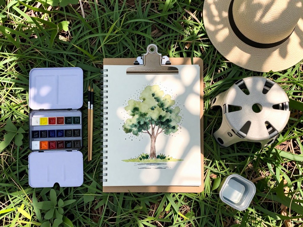
Your Minimalist Gouache Supply List
One of the things I love most about gouache is how little you need to get started. Here is the complete supply list for this project, and every item is budget-friendly.
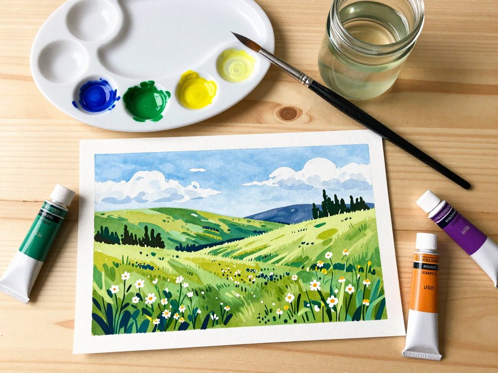
Gouache paint. You only need four colors for this landscape: titanium white, yellow ochre, ultramarine blue, and burnt sienna.
With these four, you can mix virtually every color in a landscape scene — greens from yellow and blue, purples from blue and sienna, warm grays from all three, and any shade of sky blue by adding white.
Look for student-grade gouache brands like Arteza, M. Graham, or Reeves. A set of five or six tubes costs about the same as a nice dinner out.
Paper. Any sturdy paper that can handle a bit of water will work. Hot-press watercolor paper is ideal, but heavy mixed-media paper or even thick cardstock will do.
The key is that the paper should not buckle when you apply wet paint. If you are using a sketchbook, look for one labeled "mixed media" or "watercolor."
Brushes. You need just two brushes to start: a flat brush about half an inch wide for broad areas like sky and ground, and a small round brush for details like trees and branches.
Synthetic brushes are perfectly fine for gouache and very affordable. A two-pack from any art supply store will cost under ten dollars.
A palette. Any shallow dish, plate, or inexpensive plastic palette will work. I use a simple white ceramic dinner plate — the white surface helps me see the true color of my mixtures.
A jar of water and a paper towel. That is it. You probably already have both at home.
Setting Up Your Workspace
Find a spot with good natural light — a kitchen table near a window or a desk in a bright room.
Cover the surface with newspaper or a drop cloth if you are worried about spills.
Arrange your supplies within easy reach: paints on one side, water jar on the other, paper towel nearby for drying your brush between colors.
Before you start painting, take a moment to squeeze a small amount of each of your four colors onto your palette.
A pea-sized dab of each is plenty — you can always add more. Mist your paints with a spray of water if they seem dry; gouache should have the consistency of heavy cream.
Step-by-Step: Painting a Simple Landscape
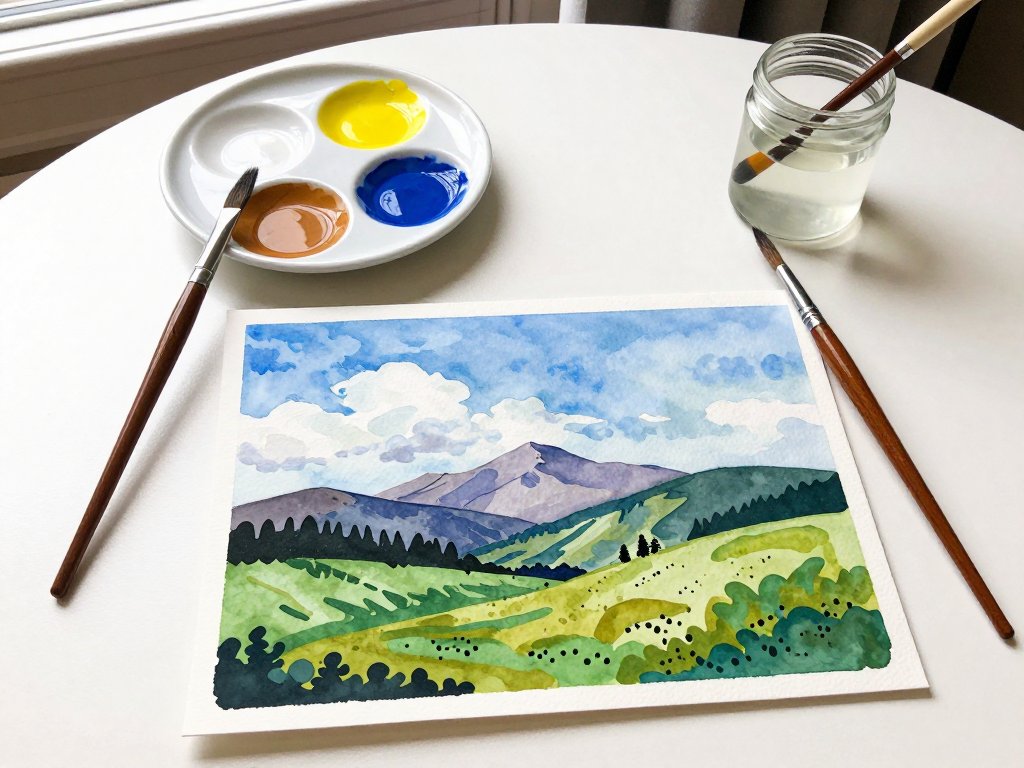
We will paint a simple landscape with three main elements: a sky with soft clouds, a distant mountain range, and a grassy foreground with a few trees. The composition is straightforward, but the techniques you learn here will apply to any landscape you want to paint in the future.
Step 1: Paint the Sky
Mix a small amount of ultramarine blue with plenty of white to create a soft sky blue.
The exact ratio depends on how deep you want your sky — start with mostly white and add blue a little at a time until you like the color.
Using your flat brush, apply the sky color in broad, horizontal strokes across the top third of your paper.
Do not worry about staying perfectly within the lines; you can tidy up the edges later.
Leave a few patches of white paper showing through for clouds.
For the clouds themselves, use pure white gouache mixed with a tiny touch of yellow ochre to create a warm cream.
Dab this onto the wet sky with a stippling motion, then blend the edges gently with a clean, dry brush.
Clouds should be soft and irregular — not perfect circles. Step back and look at your sky.
If it feels too uniform, add a touch more ultramarine to the upper portion for depth.
Step 2: Paint the Distant Mountains
While the sky is still damp, mix a soft purple-gray from ultramarine blue and a touch of burnt sienna.
Add enough white to make it pale. Using your flat brush, paint a series of gentle peaks across the middle of your paper, just below the sky.
The mountains should get lighter and less detailed as they recede into the distance — this is called atmospheric perspective, and it is the secret to creating depth in a landscape.
Do not paint a solid silhouette. Vary the pressure on your brush so some areas are more opaque and others let the sky color show through.
The mountains should feel soft and misty, like they are far away. If the edges are too sharp, soften them with a clean, damp brush while the paint is still wet.
Step 3: Paint the Ground
Mix a warm green from yellow ochre and ultramarine blue. Start with more yellow ochre and add blue gradually; you can always make it greener, but it is hard to warm up a green that is too blue.
Paint the bottom third of your paper in broad, horizontal strokes. Vary the color as you go — add more yellow for sunny patches and more blue for shadowed areas.
The ground should not be one flat color.
If you want to suggest a path or a clearing, leave a swath of warm earth tone (yellow ochre mixed with a touch of burnt sienna) cutting through the green. This gives the viewer a visual path into the landscape.
Step 4: Add Midground Trees
Mix a darker green for your trees by adding more ultramarine blue to your base green.
Using your round brush, paint simple tree shapes along the horizon line where the ground meets the mountains.
Do not paint individual leaves — just suggest the overall shape of the treetops with soft, rounded dabs of paint.
A few vertical strokes of burnt sienna mixed with ultramarine can suggest trunks and branches.
The trees in the distance should be smaller, lighter, and less detailed than the trees in the foreground. This is where atmospheric perspective comes into play again. The closer trees should have more contrast and warmer colors, while the distant trees blend into the mountain haze.
Step 5: Add Foreground Details
Now comes the fun part — bringing the foreground to life. Mix a warm, dark brown from burnt sienna and ultramarine blue for tree trunks.
Paint a few larger tree trunks on one side of the foreground, using your round brush.
These foreground trees act as a frame for the composition, drawing the viewer's eye into the scene.
Add a few simple wildflowers with small dabs of white and yellow ochre mixed with a touch of burnt sienna.
Scatter a few strokes of tall grass along the bottom edge using your round brush and a dark green mixture.
Keep these details sparse — three or four flowers and a handful of grass blades are plenty.
Overdoing the foreground details can make the painting feel cluttered.
Step 6: Final Adjustments
Step back from your painting and look at it with fresh eyes. Is there enough contrast between the sky and the mountains?
Are the shadows in the grass dark enough? Do the trees feel like they belong in the scene?
Gouache allows you to make adjustments even after the paint has dried, so do not hesitate to add a deeper shadow here or a brighter highlight there.
One of the most common adjustments is deepening the shadows on the ground. A mix of ultramarine blue and burnt sienna creates a rich, dark shadow color that instantly adds depth.
Paint a few soft shadow shapes beneath your trees and along the edge of the path.
This grounds everything and makes the landscape feel solid and real.
Tips for Practicing Gouache Landscapes
The landscape you just painted is a starting point. The more you practice, the more confident you will become with mixing colors, controlling brushstrokes, and composing scenes. Here are a few tips to keep in mind as you continue your gouache journey.
Keep a practice journal. Use a small sketchbook to paint quick landscape studies — just fifteen minutes each. Focus on one element at a time: a single tree, a patch of sky, a simple hill. These studies build your skills without the pressure of creating a finished painting.
Paint from life when you can. There is no substitute for sitting in front of a real landscape and trying to capture it.
Even if you only have ten minutes while the kids are playing at the park, a quick sketch from life will teach you more about light and color than hours of copying photographs.
Limit your palette. The four-color palette we used in this tutorial is all you need for most landscapes. Adding more colors too early can actually slow your learning because you skip the essential skill of mixing. Master mixing with a limited palette first, then expand as you feel ready.
Embrace the happy accidents. Gouache has a wonderful way of surprising you. A brushstroke that goes differently than planned might create the exact effect you did not know you were looking for.
Some of my favorite landscape details have come from moments when I let go of control and let the paint do what it wanted to do.
Common Beginner Questions
My gouache looks streaky when it dries. What am I doing wrong? Streaking happens when the paint is too thin or when you go over an area that is already starting to dry.
Use slightly thicker paint and work in one direction, completing each section in a single pass.
If the paint starts to dry before you finish, mist it lightly with water.
How do I clean my brushes between colors? Rinse your brush thoroughly in your water jar, then blot it on a paper towel.
Make sure no residual color comes off before dipping into a new color. Dirty water will muddy your colors, so change your water frequently — every fifteen minutes or whenever it looks cloudy.
Can I use regular printer paper? Printer paper will buckle and warp with even a small amount of water.
It is better to use paper designed for wet media. If you are on a tight budget, try the back of a sheet of scrapbook paper or even heavy cardstock.
Anything that does not disintegrate when wet will work.
My mountains look like solid blobs, not distant peaks. The key to convincing mountains is value contrast.
Distant mountains should be much lighter and less detailed than foreground elements. Try adding more white to your mountain mixture and using a softer touch with your brush.
If they still look too solid, go back with a clean, damp brush and lift some of the paint while it is wet.
Conclusion
Gouache landscape painting is one of those rare creative pursuits that delivers immediate satisfaction while also rewarding years of practice.
With just four colors, two brushes, and a single afternoon, you can create a painting that captures the beauty of the natural world and brings a little bit of that beauty into your home.
I hope you give it a try. Start with the simple landscape we painted together in this tutorial, then experiment with your own scenes.
Paint the view from your kitchen window. Paint the park where you take your children to play.
Paint the rolling hills you drive past on your way to the grocery store. Every landscape is an invitation to look more closely at the world around you — and gouache is the perfect companion for that journey.
Remember, the goal is not perfection. It is the joy of mixing colors, the quiet focus of making marks on paper, and the wonderful surprise of watching a scene emerge from a few simple brushstrokes.
That joy is yours, no matter what your painting looks like when you set down your brush.
Happy painting!