Introduction
I remember standing in my grandmother's garden one crisp October afternoon, watching her paint a landscape of the very spot where we stood.
She had set up her easel beneath the old maple tree, and I was mesmerized by how her brush seemed to dance across the canvas.
But what struck me most was not the grand sweep of the sky or the distant hills — it was the ground.
The fallen leaves in shades of amber and russet, the mossy patches between stones, the way the light filtered through the grass.
"Most painters look up," she said with a smile. "But the real story is often at your feet."
If you have ever felt intimidated by painting the ground in your landscapes, you are in good company.
For years, I would paint lovely skies and convincing trees, only to reach the bottom of the canvas and panic.
The ground felt like an afterthought — a stretch of generic green or brown that I hoped no one would notice.
But here is the truth: the ground is where your viewer's eyes ultimately rest. It is the foundation of your entire composition, and getting it right transforms a flat painting into a scene that feels lived in and real.
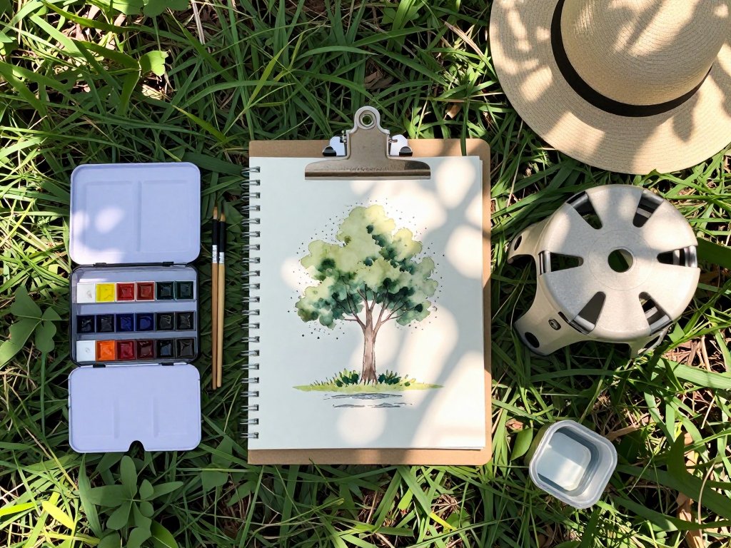
In this article, we will walk through practical, beginner-friendly techniques for painting grass, fallen leaves, dirt paths, pebbles, and all the wonderful textures that make up the ground beneath our feet.
Whether you work in oils, acrylics, or watercolor, these tips will help you approach the earth with the same confidence you bring to the sky.
Why Ground Matters in Landscape Painting
Think about the last landscape painting that truly transported you. Chances are, the ground felt solid and believable.
The ground is not just a backdrop — it is an active part of the scene.
It tells the viewer where they are standing, what time of year it is, and even what the weather has been like.
A muddy path suggests recent rain. Crunchy brown leaves whisper of autumn. Soft green moss speaks to a damp, shaded corner of the woods.
When we neglect the ground, the entire painting feels unbalanced. The viewer senses that something is off, even if they cannot name it. By giving the ground the same attention you give the sky, you create a cohesive world that invites the viewer to step inside.
Start with Observation: What Are You Really Seeing?
One of the most important lessons my grandmother taught me was to really look at the ground before I painted it.
Not just glance — look. If you have the chance, take a sketchbook outside and spend fifteen minutes studying a small patch of ground.
You will notice that what you thought was "brown dirt" is actually a complex tapestry of warm ochres, cool umbers, hints of violet in the shadows, and tiny flecks of green where moss has taken hold.
Grass is never one flat green — it shifts from yellow-green in sunlight to deep blue-green in shadow.
Train yourself to see color where you once saw only "brown" or "green." This single shift in mindset will transform your ground painting more than any technique.
Mixing Your Earth Tones
Every landscape painter needs a reliable earth tone palette. Here is a simple starting point that will serve you well whether you are painting a forest floor or a desert path.
The Essential Earth Palette:
- Yellow Ochre — Warm, sunny earth tones and dried grass
- Raw Umber — Deep soil, tree bark, dark shadows
- Burnt Sienna — Rust-colored dirt, clay soil, autumn leaves
- Raw Sienna — Sandy ground, warm highlights
- Ivory Black — Darkening shadows without muddying the color
- Titanium White — Lightening and creating opacity
The magic, of course, happens when you mix them. For a rich forest floor, try mixing raw umber with a touch of ultramarine blue for the deepest shadows, then lighten with yellow ochre for patches where sunlight breaks through.
For sandy paths, mix raw sienna with a whisper of burnt sienna and plenty of white.
The key is to avoid reaching for a tube of "mud" color — mix your own so you control the warmth and coolness of every stroke.
One trick I learned from my grandmother: keep a small palette knife handy and blend a few versions of your earth mixture before you start.
A warm version (more yellow ochre), a cool version (more umber), and a dark version (add a touch of blue).
Having these ready lets you switch seamlessly as you paint, rather than stopping to mix every few seconds.
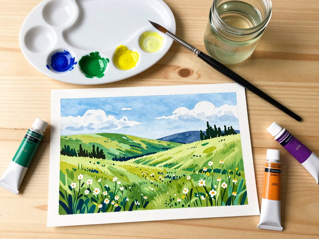
Painting Grass That Looks Like Grass
Grass is one of the most common ground elements, and also one of the most frequently botched.
The mistake most beginners make is painting grass as a solid block of green. Real grass is made of thousands of individual blades, each catching the light differently, and no two are exactly the same shade.
Here is a simple approach that works beautifully in any medium.
Step 1: Lay Down Your Base
Start with a mid-tone green mixed from yellow ochre and a small amount of viridian or sap green. Block in the general shape of the grassy area. Do not worry about detail at this stage — you are simply establishing where the grass lives.
Step 2: Add Light and Shadow
Mix a lighter, warmer green for the sunlit areas (add more yellow ochre and a touch of white) and a darker, cooler green for the shadows (add a bit of ultramarine blue to your base mixture).
Apply these in broad, loose strokes that follow the direction the grass grows. If the wind is blowing from the left, let your brushstrokes angle to the right.
Step 3: Suggest Individual Blades
Here is where it comes alive. Using a small round brush or a liner brush, paint thin, quick strokes in your light and dark greens.
Do not paint every blade — that would take forever and look stiff. Instead, paint clusters of blades here and there, letting the base color show through in between.
The viewer's brain will fill in the gaps. Vary the length and direction of your strokes slightly.
Grass does not grow in perfect rows.
Step 4: Add Foreground Detail
In the foreground, where the grass is closer to the viewer, add a few more defined blades using your lightest and darkest greens.
You can even add a tiny hint of yellow or blue to catch the light.
In the distance, keep your strokes smaller and softer — atmospheric perspective applies to grass too.
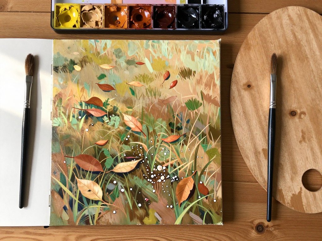
Painting Fallen Leaves
Fallen leaves are one of my absolute favorite things to paint. They add instant character and seasonal mood to any landscape. The trick is to paint them as shapes of color and light, not as detailed botanical specimens.
Capturing the Shapes
Think of fallen leaves as small abstract shapes scattered across the ground. Some are whole, some are curled, some are partially buried in the earth.
Use a small flat brush or a filbert to dab on oval and teardrop shapes in warm autumn colors — burnt sienna, cadmium orange, yellow ochre, and deep crimson.
Do not outline each leaf; let the shapes blur into each other slightly, the way real leaves do when they have been lying on the ground for a while.
Creating Depth with Value
Leaves that are freshly fallen catch the light and appear brighter. Leaves that have been lying on the ground for weeks are darker, damp, and partially decomposed.
Use your lightest warm colors for the fresh leaves in the foreground, and gradually darken toward the background.
A touch of raw umber mixed into your leaf colors gives them that weathered, grounded look.
The Shadow Under Each Leaf
This is the secret that makes leaves look like they are actually resting on the ground rather than floating above it.
Add a tiny crescent of dark shadow beneath each cluster of leaves using a mix of raw umber and a touch of purple.
Keep the shadow soft — you can blend it slightly with a clean, dry brush.
The shadow anchors the leaf to the ground and gives the whole scene a sense of weight and reality.
Painting Dirt and Soil
Dirt is not brown. Repeat that to yourself: dirt is not brown. Well, it is — but it is so much more. Dirt contains every color you can imagine, from warm oranges and reds to cool blues and purples, depending on the light and the composition of the soil.
Texture is Everything
The most convincing dirt paintings are not about color alone — they are about texture.
In acrylics and oils, you can build up texture with your brush or a palette knife.
Apply a thicker layer of paint for the foreground, then scrape through it with the edge of a palette knife to reveal the layers beneath.
This mimics the rough, uneven surface of real earth.
For watercolor, use a dry brush technique: load your brush with a small amount of pigment, blot most of it on a paper towel, then drag it lightly across the paper.
The pigment will catch on the texture of the paper, creating a speckled, granular effect that looks remarkably like soil.
Varying Warm and Cool
Sunlit dirt is warm — think yellow ochre mixed with burnt sienna. Shaded dirt is cool — think raw umber with a whisper of ultramarine.
By alternating warm and cool patches across the ground, you create the illusion of uneven terrain and changing light.
Do not blend these patches smoothly; leave visible brushstrokes that suggest ridges and dips in the soil.
Including Small Details
A convincing dirt path has small details: a pebble here, a patch of moss there, a tiny green shoot pushing through.
Do not overdo it — three or four carefully placed details are more effective than a dozen scattered randomly.
Let the viewer discover these small moments as their eyes wander across the painting.
Painting Pebbles and Stones
Stones and pebbles add wonderful texture and visual interest to the ground. They break up large expanses of grass or dirt and give the viewer's eye resting points. Here is how to paint them convincingly.
Shape and Variation
Stones come in infinite shapes — round, angular, flat, jagged. Vary the shapes in your painting rather than repeating the same oval over and over. A mix of large, medium, and small stones looks far more natural than stones of uniform size.
The Three-Value System
Every convincing stone needs three values: a light side (catching the light), a mid-tone side (the main body of the stone), and a dark shadow side (where the stone meets the ground).
Mix a warm gray from raw umber and white, then adjust the value up or down.
For the lightest side, add more white. For the shadow side, add more umber and a touch of blue.
Paint the mid-tone first as a flat shape, then add the light area on the top or side where the sun hits, and finally the shadow underneath.
Soften the transition between light and shadow slightly — stones are not perfectly geometric, and a hard line will make them look like plastic.
Casting Shadows
The shadow that a stone casts on the ground is just as important as the stone itself.
This shadow tells the viewer where the light is coming from and grounds the stone in the scene.
Paint the shadow as a soft, dark patch extending away from the stone in the direction opposite the light source.
Blend the edge of the shadow so it softens as it moves away from the stone.
Putting It All Together: A Simple Ground Workflow
Now that we have covered each element individually, here is a practical workflow you can use the next time you paint a landscape. I keep this sequence taped to the back of my easel, and it has saved me from many a muddy ground.
Step 1: Block in the ground color. Cover the bottom portion of your canvas with a mid-tone mixture of your earth colors. Do not worry about detail — just establish the general warmth or coolness of the ground.
Step 2: Add the large shapes. Use a medium brush to indicate where the main grassy areas, dirt paths, and rocky patches are. Keep these broad and simple. Think of them as puzzle pieces that fit together to form the ground.
Step 3: Layer in the middle values. Move to a smaller brush and add medium-value details — the shadow areas of the grass, the darker patches of soil, the mid-tones of the larger stones.
Step 4: Paint the highlights. Switch to your lightest values and add the sunlit areas: the bright tips of grass blades, the tops of pebbles, the edges of fallen leaves catching the light.
Step 5: Add the darkest shadows. Deepen the shadows beneath stones, between grass clumps, and under fallen leaves. This step creates depth and makes everything feel grounded.
Step 6: Finish with small details. Add a few carefully placed details in the foreground: a particularly bright leaf, a small patch of moss, a tiny purple flower pushing through the dirt. These details draw the eye and reward close looking.
Common Pitfalls and How to Avoid Them
Over the years, I have made every mistake in the book when it comes to painting the ground. Here are the most common ones and how to sidestep them.
Overworking the ground. It is tempting to keep adding detail, especially when you are enjoying the process.
But an overworked ground looks fussy and loses its freshness. Know when to stop. Step back from your painting every ten minutes and ask yourself: does this feel like a real place, or does it feel like a list of everything I painted?
Using too many colors. While the ground contains many colors, using too many distinct hues can make it look chaotic. Stick to a limited palette of 4-5 earth tones plus white, and mix everything from those. The unity of color will make the ground feel cohesive.
Ignoring atmospheric perspective. The ground in the distance should be lighter, less detailed, and cooler in color than the ground in the foreground. This creates the illusion of depth. If you paint the foreground and background grass the same color and level of detail, the painting will look flat.
Painting every blade of grass. I already mentioned this, but it bears repeating. Suggest, do not inventory. Your viewer's imagination will fill in the rest.
Bringing Your Personal Touch
The techniques in this article are starting points, not rules. The most memorable landscape paintings are the ones where the artist's personality shines through.
Maybe you love the way light catches wet pebbles after a rainstorm and you want to emphasize that.
Maybe you are drawn to the rich, dark soil of a forest floor after years of walking those trails with your children on weekend hikes.
Those personal connections to the landscape are what make your paintings unique.
I keep a small sketchbook dedicated entirely to studies of the ground. Whenever I walk through a park or hike a trail, I stop and sketch a square foot of whatever is beneath my feet — a patch of mossy stones, a scattering of acorns and oak leaves, a muddy puddle reflecting the sky.
These sketches have become my most treasured reference material. They remind me that beauty is not only in the grand vistas; it is in the small, overlooked places that we walk on every day.
Conclusion
The ground beneath your feet holds an entire world of color, texture, and light, waiting for you to discover it.
Next time you set up your easel, I hope you will give the ground the attention it deserves.
Start by really looking at it — not as "brown" or "green" but as a rich tapestry of warm and cool tones, of light and shadow, of tiny details that tell the story of the place.
Start with a simple study: find a small patch of ground in your backyard or a nearby park, and spend an hour painting only that.
Do not paint the sky or the trees. Just the ground. You will be amazed at what you discover, and your landscapes will never look the same again.
As my grandmother used to say, the ground is not something to rush through on your way to the horizon. It is where the story begins.