Introduction
There is a particular quiet that settles over a table when the only colour on it is grey. No deciding which red, no matching a sunset, no hunting for the right green. Just one bottle of ink, a brush and a jar of water.
What is left is a smaller, calmer question: how dark should this part be?
If you have ever finished a picture and felt it looked flat without quite knowing why, ink wash will show you the answer faster than almost anything else. The answer is nearly always value — how light or dark a shape is, before any question of colour.
Working in grey is also a low-pressure way to learn to see. Mistakes announce themselves gently. A wash that went too dark is still a grey wash. Nothing is ruined, and nothing has cost you more than a sheet of paper and twenty minutes.
You do not need a studio or a free afternoon. A cereal bowl of water and a corner of the kitchen table will do. This is a craft that fits into the gaps of a day, and rewards you in the same small increments.
What Ink Wash Actually Is
Ink wash is simply black ink diluted with water. You are not drawing an outline and filling it in. You are laying down a pool of pale grey, letting it dry, and laying another on top. Tone builds the way an evening does — gradually, and from the edges inward.
Here is the part that surprises people. In wash, darkness comes from how much water is in the brush, not from how hard you press. Pressing harder gives you a darker line. It does not give you a darker area. That single distinction is the whole craft in miniature.
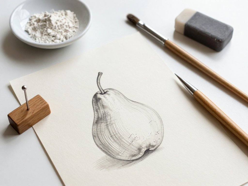
This is where wash parts company with line work. Shading built from hatching and crosshatching accumulates tone stroke by stroke, and you can always see the hand that made it. A wash arrives all at once, as a field of even grey, and the hand disappears.
Line and Tone Are Different Tools
A line describes an edge. A wash describes a surface. If you draw a pear with a line, you have told the reader where the pear ends. If you paint that same pear with a wash, you have told them where the light falls.
Most beginners instinctively reach for line, because a line feels like control. But tone is what makes a drawing feel like it has weight and weather in it. Learning to think in patches of grey rather than outlines is the real work of this practice.
The Materials, Kept Simple
The supply list is short, and that is part of the appeal. You are not building a studio. You are setting up a small, repeatable habit that you can put away in two minutes when someone needs a snack.
- Black drawing ink. Either a shellac-based india ink, which is waterproof once dry, or a water-soluble drawing ink, which stays rewettable and is gentler on brushes.
- Two brushes. One round watercolour or bamboo brush, roughly size 8 to 12, which holds a reservoir of wash. Plus one cheap flat brush for dry-brush texture and lifting.
- Watercolour paper, around 140lb cold press. The texture holds pigment beautifully and the weight survives water without curling.
- Two jars of water. One clean for diluting, one for rinsing. Keep them on opposite sides of the dish so you never confuse them.
- A white ceramic dish or palette. White matters, because you need to judge the grey against something neutral.
- A rag or old tea towel. For blotting the brush and catching drips.
- A scrap sheet of the same paper. For testing every wash before it touches your study.
Please do not use printer paper. It buckles the moment water touches it, the surface breaks down if you lift or scrub, and your beautiful flat wash will dry in ripples. It is a false economy in the truest sense — it costs less and it costs you the study.
On ink: shellac-based ink is close to permanent once dry and stains clothing and brushes, so rinse promptly and wear something you do not love. Water-soluble ink is more forgiving, lifts easily, and is the kinder choice for a first bottle.
Your First Exercise: A Five-Value Scale
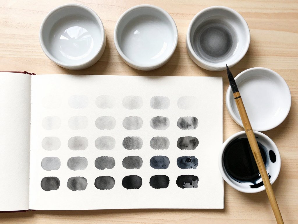
Before you paint anything, paint a ruler for your own eyes. This takes about fifteen minutes and it will improve every study you make afterwards. It is also strangely satisfying, the way sorting a drawer is satisfying.
- Draw five squares in a row on your watercolour paper, each about an inch across, with a small gap between them.
- In the dish, mix a very pale grey: a little clean water first, then one small drop of ink.
- Paint the first square. Then add one more drop of ink to the same puddle and paint the second.
- Continue, adding a single drop each time, until the fifth square is nearly black.
- Test each mix on your scrap sheet first, and let the strip dry completely before you judge it.
When it is dry, look at the five squares and name them in your head: one, two, three, four, five. Not "light" and "dark" — actual numbers. You are building a vocabulary, and vocabulary is what lets you make decisions while you paint instead of guessing.
Here is why this matters. Most beginners paint with two values only: a pale middle grey and one dark. The result looks flat and slightly sad, and they assume they lack talent. They do not. They lack a third and fourth step, and that is a fixable, mechanical thing.
Tape the strip somewhere you will see it — inside a cupboard door, on the fridge, beside your desk. It is a reference you will glance at for years.
Mixing a Wash That Behaves
Almost every patchy wash begins with a mixing mistake, not a painting mistake. The fix is a small ritual, and once it becomes habit you will stop having the problem at all.
Make a puddle in the dish first, never on the paper. Put a little clean water in a well of the dish, then add ink to it a drop at a time. Stir gently with the brush — whisking makes bubbles, and bubbles dry as tiny pale rings.
Then test the strength on your scrap sheet. This is the step people skip, and it is the one that saves the study. A wash always dries noticeably lighter than it looks when wet, often by a full step on your five-part scale.
Finally, mix enough for the whole area before you begin. This is the single most common cause of a blotchy sky or a streaky pear. If you run out halfway and remix, the second mix will never quite match the first, and the seam will show forever.
Mix more than you think you need. A modest puddle in a dish covers a surprisingly large area, and leftover wash costs you nothing but a rinse.
Wet-on-Dry: The One Rule That Matters
If you remember one instruction from this article, remember this: let each layer dry completely before you paint the next one. Not mostly dry. Not dry at the edges. Completely dry.
Wet ink meeting damp paper does not sit politely on top. It lifts the layer underneath and moves it, and the two tones merge into something flatter and muddier than either was alone. This is why impatient painters get grey soup.
You can tell a wash is dry by hovering the back of your hand just above the paper. If it feels cool, there is still water in it. Dry paper also looks matte rather than faintly shiny, and the tone stops shifting as you watch.
A hair dryer on the cool setting is the impatient painter's best friend. Hold it a hand-span away and give it thirty to sixty seconds. Cool air, not hot — heat can cockle the paper and drive pigment to the edges of a wash.
Glazing: Thin Layers, Deep Tone
Glazing means laying one thin, fully dry transparent layer over another. Three pale layers will give you a rich, luminous grey with depth inside it. It looks like light is coming through the tone rather than sitting on top of it.
One thick layer cannot do this. A heavy wash goes chalky and opaque, hides the paper's texture, and dries unevenly because so much pigment is sitting in so much water. Depth is a matter of patience, not quantity.
This is also the kindest rule for a busy life. Drying time is not dead time. It is when you make tea, fold a load of laundry, or answer the same question for the fourth time. The painting waits without resentment.
Protecting the White of the Paper
In wash, your white is the paper itself. There is no tube of white to reach for, and nothing you add later will bring the paper back to what it was. So the lightest value has to be a decision, made early.
Before your first brushstroke, look at your subject and decide where the brightest light sits. A pear's shoulder. The top of a stone. The lit fold of a cloth. Then plan to paint around it, leaving it bare.
Leave a wider margin than feels right. Wash creeps into damp paper and stops short on dry paper, and a highlight that survives is always slightly smaller than the one you imagined.
The reason for all this care is simple asymmetry. You can always add dark — another layer, another pass, another minute. You cannot truly take it away. Lifting removes some pigment, but it leaves a faint ghost of where the dark used to be.
Three Values Are Enough
Before you paint, squint at your subject until your eyelashes nearly meet. Squinting blurs away detail and leaves only the big shapes of light and dark. What remains is the structure of the picture.
Now sort everything you see into three groups: light, middle, dark. Not five. Three. Assign every shape on the paper to one of them, out loud if it helps.
This feels brutal at first, because you can clearly see many more than three values. But the small gradations are a reward, not a starting point. Get the three big shapes right and the study will already read as solid and believable.
If a study looks confusing halfway through, the cause is usually too many values competing, not too few. Take something back to the middle and the picture settles.
A Simple Tonal Study, Step by Step
Choose one object and one light source. A pear, a smooth stone, a folded cloth, or a single cloud all work beautifully. Sit near a window so the light comes from one side, and resist the urge to add a second object.
Draw the shape with a very light hand, or skip the drawing entirely and go straight to tone. If you do sketch, keep the line faint — graphite can smudge under a wet wash and grey the whole study.
Pass One: The Pale Overall Tone
Mix a value one or two. Lay it over the whole shape in one even layer, working quickly and stopping short of your highlight. Tilt the paper slightly so the wash settles evenly rather than pooling.
Then leave it alone. Ten to fifteen minutes on a cool day, less in a warm room. Do not touch the edges to check. A wash that is nearly dry is at its most fragile.
Pass Two: The Middle Shadow Shapes
Mix a value three. Paint only the shapes that fell into your middle group — the shaded side, the crease, the underside. Keep the edges soft by touching them with a barely damp clean brush before they set.
Leave the light side untouched. This is the pass where the object starts to look three-dimensional, and it is worth a small pause to enjoy it. Dry again, about ten minutes.
Pass Three: The Darkest Accents
Mix a value four or five. Use the smallest brush and paint only the tiniest areas: the contact shadow where the object meets the table, the deepest crease, the dimple on the pear.
Resist filling the whole shadow with your darkest value. A small dark accent next to a middle tone reads as far darker than it is, and keeping the dark area small is what makes a study look confident.
The whole study takes forty-five minutes to an hour, and it splits neatly across two nap times. If you only manage one pass today, that is a finished day's work.
Dry Brush and Lifting
Two small techniques will make your studies look far more experienced than they are, and both take about a minute to learn.
Dry brush is exactly what it sounds like. Load the flat brush, then blot it on the rag until it is nearly dry, and drag it lightly across the paper. Pigment catches only the tops of the texture, which is perfect for stone, bark, or the weave of cloth.
Lifting is the opposite gesture. Rinse a clean brush, blot it until it is thirsty rather than dripping, then press and lift. Or simply blot with a paper towel. Both remove damp ink and leave a soft light grey.
Use lifting for a cloud edge, a highlight on a pear, or a soft glow where the light wraps around a form. Work gently. Scrubbing damages the paper's surface, and a damaged surface grabs ink unevenly for the rest of the study.
When It Goes Wrong: Five Familiar Problems
Muddy grey from over-working. Rewetting a half-dry wash and pushing it around stirs pigment into the paper. Stop, let it dry completely, and add one clean thin layer instead of trying to fix the tone in place.
A bloom at the edge. This means the paper was unevenly wet, so the wash rushed toward the drier patch. Either damp the whole area evenly first, or wait until the paper is bone dry and work on that.
The tone floods. Your brush was too wet. Blot it on the rag, test on scrap, and keep the rag under your hand to catch drips before they run into the margin.
Layers merge instead of stacking. There was no dry time. Set a timer, or keep the hair dryer on the table as a physical reminder that the next pass has to wait.
Too dark, too fast. This is the one with no real way back. Start paler than you think you need. Two pale layers will always beat one dark one, and the second layer is a decision you get to make with information.
Let Your Phone Read the Values
Your phone is a free value-checker, and it is more useful than most art gadgets. Switch the camera to its black-and-white or mono mode, or take an ordinary photo and desaturate it afterwards.
Point it at your subject before you paint. With colour removed, the value pattern becomes obvious — often surprisingly so. You may discover that the "dark" side of your pear is really a middle grey, and the shadow underneath is the only true dark.
Then photograph your study beside the subject, both in mono, and compare. This catches the two classic beginner errors instantly: a study that is too light overall, and one where every value has drifted toward the middle.
One caveat. Phone cameras brighten shadows and flatten contrast automatically. Trust the phone for comparing shapes and the general pattern, not for fine judgements at the very ends of the scale.
Keeping and Framing a Small Study
Ink is close to permanent once it is fully dry, which is one of its quiet pleasures. Shellac-based ink is effectively waterproof at that point. Water-soluble ink can still be lifted with water, so keep those studies dry and out of the rain.
Store work flat, between sheets of glassine or plain paper, face up. Do not roll a study with the painted side inward, and do not stack heavy books directly on the surface. Ink is permanent, but paper dents.
A light spray fixative is optional rather than essential. If you use one, work outdoors or by an open window, in two or three light passes rather than one wet coat, and let it dry fully before framing.
For framing, less is more. A simple white or off-white mat with a two- to three-inch border, and a thin black frame, makes a small tonal study look deliberate and calm. The white mat also gives the paper's white somewhere to sit.
A Last Word on Grey
The value scale you paint this week is the one you will still be using in ten years. That is the strange gift of this practice. The skill does not go stale, and it does not need upgrading.
Your first studies will be imperfect. Some will go muddy, some will be too pale, and one will have a bloom across the middle that you cannot explain. Keep them anyway.
A stack of grey studies is a record of learning to see, and that is worth more than a drawer of neat, timid drawings.
So leave the dish on the counter tonight. One bottle of ink, one brush, one jar of water beside the sink. When you have twenty minutes, you already know what to do with them.