Introduction
The first time I ever saw negative painting, I wasn't holding a brush. I was nine years old, lying on my back in my grandmother's garden, staring up at the maple tree while the afternoon passed overhead.
What I remember isn't the leaves themselves. I remember the light between them — the bright, sky-shaped gaps, and the way each leaf seemed to glow because of the brightness tucked behind it.
I didn't have a name for it then. I only knew the feeling of lying there, half-lost in the green, watching small pieces of sky drift between the branches.
Years later, when I finally picked up a watercolor brush, that same quiet idea came back to me. Sometimes the most beautiful way to paint a thing is to paint everything around it.
That is what this guide is about — a gentle, beginner-friendly introduction to watercolor negative painting. You paint the space around your subject, and the subject emerges from the layers, soft and glowing.
No experience needed. No perfect results required. Just paper, a few brushes, some transparent paint, and a little willingness to trust the process.
If you've tried watercolor before and put it down in frustration, I understand. Negative painting feels different from the start. You are not fighting to draw a perfect shape. You are protecting a space and letting the light do the rest.
What Is Negative Painting?
Negative painting is exactly what it sounds like. Instead of painting the subject itself — the leaf, the trunk, the flower — you paint the space around it.
Imagine a simple leaf on your paper. In positive painting, you mix a green and fill the shape in. In negative painting, you leave the leaf paper-white and wash the background around it in soft, transparent color.
Then you do it again. A second wash, a little deeper. A third. Layer by layer, the background darkens while the leaf stays untouched.
And here is the gentle magic: as the background deepens, the leaf begins to glow, like a window of light held open in a shadowed room.
The subject emerges from the background rather than being drawn onto it. That is the whole idea, simpler than it sounds.
Think of a sculptor carving a figure from stone. The figure is already inside the block, waiting. The sculptor's work is removal — taking away everything that is not the figure.
Negative painting works the same way. Your leaf is already waiting in the white paper; your work is to paint away everything around it.
Watercolorists have used this approach for generations, especially in botanical art and landscape painting, where it creates a luminosity that positive painting struggles to match.
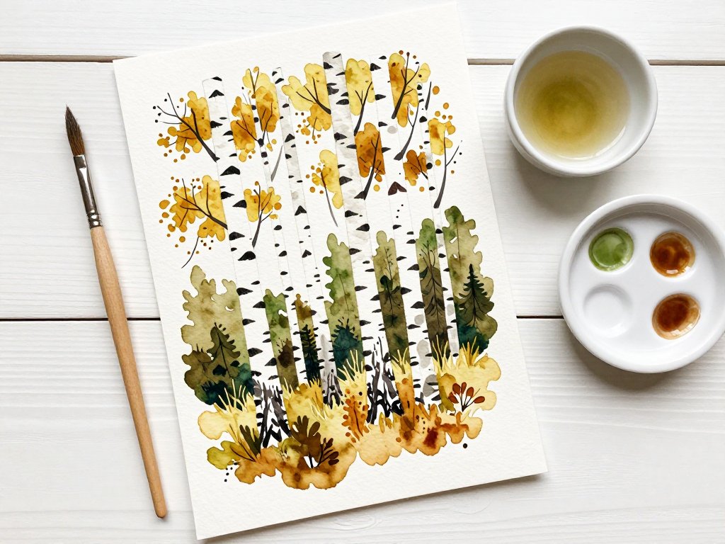
Once you learn to see it, you will notice it everywhere. In the pale trunks of birch trees against a dark forest. In the bright gaps between clouds. In the way a white flower seems to shine from inside a shadowy hedge.
Why does negative painting look so luminous? It comes down to contrast and transparency.
When you lay a transparent wash around a white shape, your eye reads the shape as bright. Each new layer makes it brighter still — not because you touched the shape, but because the world around it grew deeper.
Depth appears the same way. Three or four gentle layers, each darker than the last, create a feeling of space, like walking deeper into a quiet forest.
And here is the lovely part: you already know how to look at this. You have been doing it since childhood — finding faces in clouds, noticing the sky between leaves. You are simply learning to do it with a brush.
Gather Your Materials
Here is the good news: negative painting does not need a big studio or an expensive kit. You can begin with what fits in a small box.
Let me walk you through what you will want, and why each piece earns its place.
- Watercolor paper, cold press, 140lb (300gsm). This is the workhorse of watercolor. Its gentle tooth holds layer after layer of wash without buckling. A small pad is plenty.
- Round brushes in sizes 4, 8, and 12. The size 12 carries the big background washes, the size 8 does most of your shaping, and the size 4 paints the careful edges between shapes. Three brushes, honestly, is all you need.
- A palette of three to five transparent colors. Try ultramarine, quinacridone gold, sap green, alizarin crimson, and burnt sienna. These five mix into an astonishing range of soft, natural tones.
- Two jars of water. One for rinsing your brush, one for clean water. It sounds fussy, but it is the easiest way to keep your washes clear and bright.
- A roll of paper towel. For blotting, for lifting mistakes, and for the occasional happy accident.
Look for paints labeled transparent rather than opaque. Transparent watercolors let light pass through each layer and bounce back from the paper. That bounce is exactly the glow we are chasing.
Keep your palette small on purpose. Three colors used well beat ten used carelessly, and a small palette is easier to keep clean.
You may also want a soft pencil for sketching and a gentle eraser. Both are nice to have, but neither is essential on day one.
That is the whole list. If you have those five things, you have everything you need to begin today.
Protect the Light: The Golden Rule
If you remember only one thing from this guide, let it be this: the white paper is your light source, and your job is to protect it.
Every wash around a shape makes that shape glow a little more. The moment you paint over the shape itself, the light is gone, and no amount of layering brings it back.
So we work light to dark, in three or four gentle layers. Each layer is a little deeper and comes a little closer to the shape — but never over it.
Think of a tide coming in around a rock. The water rises slowly, surrounds the rock, but never covers it. In the end, the rock stands alone in the sea.
Start with your lightest wash. A pale suggestion of color is enough for layer one. You can always go darker. Going back to light is much, much harder.
Let each layer dry completely before the next. Patience here is not a virtue — it is a technique. Dry layers keep their edges and keep your colors from turning to mud.
And resist the urge to skip ahead. If a layer looks too faint, that is perfect. Faint layers are what make the final glow possible.
Save your smallest whites for last. The tiny gaps between leaves, the thin line of a stem catching the sun — these are the hero lights, and they will shine the brightest of all.
Masking Fluid or Painting Carefully Around?
As you work, you will need a way to keep your subject safe from the wash. There are two classic approaches, and both are worth knowing.
Masking fluid is a liquid latex you paint onto the paper to protect the white. It dries into a rubbery skin. You wash freely over the top, let everything dry, then rub it off to reveal crisp white paper underneath.
Masking fluid is wonderful for intricate shapes — fine branches, tiny flowers, anything fiddly. Two tips: use an old brush you do not mind ruining, and let the fluid dry completely before you wash over it.
Painting carefully around is the other approach. You steer your brush around the shapes, leaving a small margin of white between subject and wash.
It sounds harder, but many beginners find it calmer. There is no liquid to manage and no waiting for the mask. The soft halo you leave around each shape becomes part of the painting's gentle character.
My honest advice? Start by painting around. Save the masking fluid for finer details later. Both are legitimate — choose the one that feels like a deep breath rather than a chore.
Whichever you choose, rinse your brush often and dab it on the paper towel between colors. Clean water is quiet discipline, and your paintings will thank you for it.
Your First Project: A Row of Leaves
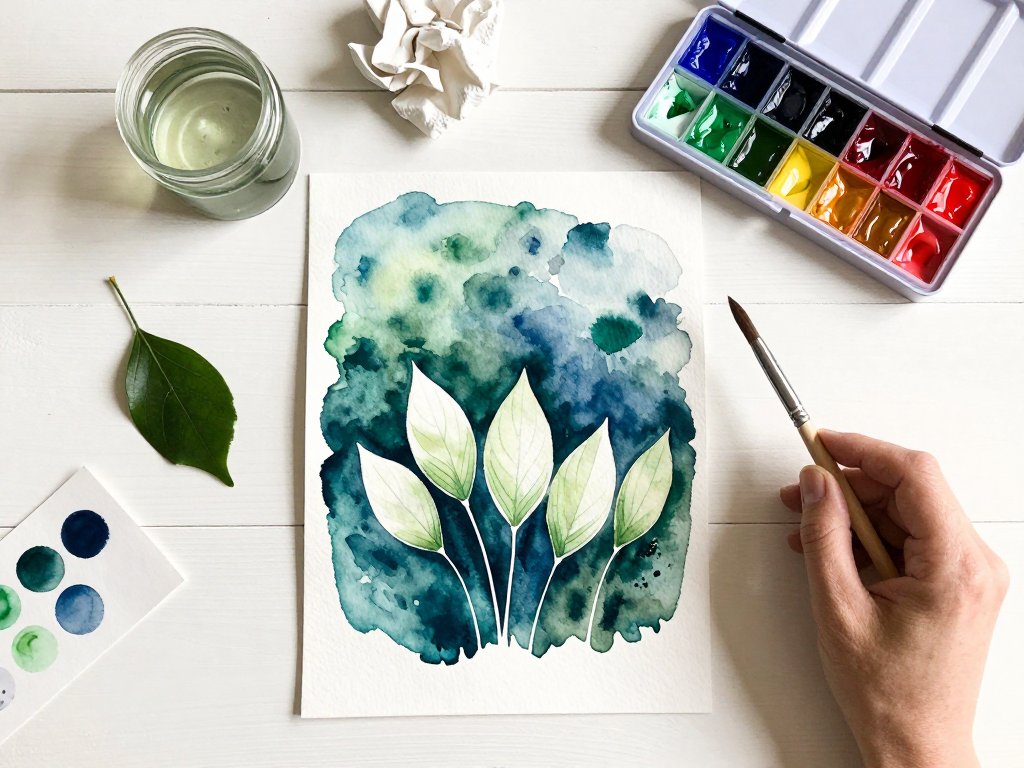
Let's put all of this into practice with a first project that is forgiving, satisfying, and genuinely lovely: a row of leaves.
Find a quiet half hour. Make a cup of tea if that is your ritual. This is supposed to feel like a pause, not a task.
Before you sketch, choose your greens. A mix of sap green and ultramarine gives you a soft, natural leaf color. Quinacridone gold warms the spaces near the stems. Alizarin crimson, used sparingly, brings a rich depth to the darkest pockets.
- Sketch lightly. With a soft pencil, draw three or four simple leaf shapes in a row across your paper. A pointed oval with a stem is perfect. Press gently; the lines should barely show.
- Mix your first wash. In your palette, mix a very light, watery wash of sap green with a touch of ultramarine. It should look almost like tinted water.
- Paint the background. With your size 12 brush, wash the color around and between the leaves, leaving a small margin of white around each shape. Do not worry about neatness — the first layer is just a suggestion.
- Let it dry completely. This is a good moment to stand back and look at your leaves from across the room. They already hold a little light.
- Add a second layer. Mix the same color a touch deeper, and paint only the spaces between and around the leaves, coming a little closer to the shapes.
- Add a third layer. Deeper still, working into the tight spaces between leaves. Add a whisper of quinacridone gold near the stems for warmth.
- Finish with a fourth, darkest layer. In just a few small pockets — where leaves overlap, near the bottom — use a deeper mix with a hint of alizarin crimson for richness.
- Step back and look. Erase any visible pencil, soften one or two edges if you like, then simply look at what you have made. Your leaves should be glowing out of a soft, layered depth.
If your leaves wobble or your layers look uneven, excellent. That is what makes a painting look hand-made and alive.
Your first attempt does not need to be a masterpiece. It needs to be a beginning.
Soft Edges, Hard Edges, and Common Mistakes
As you paint, you will notice edges doing two different things. Learning to read them — and choose them — is a big part of the craft.
Hard edges happen when you paint on dry paper and let each layer dry before the next. They give your shapes crisp, clean definition. Use them when you want the leaf to read clearly.
Soft edges happen when you paint into damp paper, or when you soften a dry edge with a damp brush. They blur gently into the background and create atmosphere, mist, and glow.
Most negative paintings use both. Crisp edges for the subject, soft edges where the background melts into shadow.
Now, the mistakes. Every watercolorist makes these, especially at the start. Here is how to recognize them and what to do.
- Going too dark too fast. A deep second layer is the most common beginner stumble. Fix it by mixing each layer only slightly darker than the last, and testing the color on scrap paper first.
- Muddy colors from over-mixing. If your washes look brown and flat, you are stirring too many colors together. Fix it by limiting yourself to three colors per wash.
- Losing the white shapes. When the wash creeps over the leaf, the light goes out. Fix it by leaving a margin. It is better to have a soft halo than a covered shape.
- Painting the subject by accident. Old habits are strong. Fix it by whispering as you work: around, not on. Around, not on.
- Using opaque paint. Opaque watercolor sits on the surface and blocks the light. Fix it by checking your paint labels for the word transparent before you buy.
- Comparing yourself to finished work online. Every glowing painting you admire began as wobbly layers and doubt. Keep your own paper, and paint for the process.
Notice a pattern? Every fix is gentler than the mistake. This is a forgiving medium, and it rewards the patient hand.
When to Stop, Practice Ideas, and a Gentle Goodbye
Here is the question every beginner asks: how do I know when it is finished?
The answer is quieter than you might expect. Negative painting is about restraint. When the subject glows and the layers feel deep enough to walk into, stop.
Three or four layers are usually plenty. The urge to add one more wash is often just the urge to keep the pleasure going — and the painting is already done.
If you are unsure, put the painting across the room and make a cup of tea. When you come back, you will know. Your eye will tell you the truth, and it is usually kinder than you expect.
When you are ready for more, try these gentle practice ideas.
- Clouds around a mountain. Keep the mountain pale and paint deepening washes of sky around it.
- Light between trees. Paint a few pale trunks, then deepen the forest around and between them.
- Flowers in a field. Leave small white blossoms untouched while the meadow darkens around them.
Each one uses the same idea, and each one will teach you something new about patience.
Before I let you go, I have a question for you. What shape from your childhood would you paint around first — the leaves above your grandmother's garden, the clouds you found faces in, or the light around the tree you used to climb?
Whatever you choose, remember this: the subject emerges from the layers, not in spite of them. Trust the process. Let the white paper do its quiet work.
Your painting will be imperfect. It will have wobbly edges and uneven washes. And it will be yours — glowing with the light you chose to protect.
Happy painting, friend. I will see you at the easel.