Introduction
Do you remember the first time you watched watercolor do something unexpected? A bloom of color spreading across wet paper, a soft edge that looked like a cloud, a puddle of pigment that dried into something far lovelier than you planned.
Watercolor has a wonderful way of surprising us, and no surprise is quite as delightful as texture.
Texture is what makes a flat wash of paint feel alive. It turns a plain blue sky into a night full of stars, a green field into a meadow of wildflowers, a white page into a snowstorm.
And the best news? Some of the most magical textures come from the humblest materials — a pinch of salt, a flick of your brush, a paper towel from the kitchen.
In this guide, we will explore three classic watercolor texture techniques: salt, splatter, and lifting.
You will learn how each one works, when to use it, and how to fix the small mishaps that happen along the way.
By the end, you will have a page full of textures and the confidence to use them in your own paintings.
Why Texture Makes Watercolor Sing
Watercolor is at its most beautiful when it is a little out of your control.
Unlike opaque paints that sit on the surface, watercolor sinks into the paper and moves wherever the water carries it.
That movement is what creates the luminous, airy quality we love — and texture techniques simply give that movement a nudge in a particular direction.
Think of texture as a seasoning. A flat wash is a perfectly good soup, nourishing and calm.
Add a pinch of salt, a scatter of splatter, a few lifted highlights, and suddenly the same soup has interest, depth, and personality.
The techniques do not replace good basic painting skills; they build on them, giving you more tools to express what you see and feel.
There is also something deeply satisfying about texture techniques for beginners. They are forgiving, playful, and quick.
You can practice all three in a single sitting, with a single sheet of paper, and walk away with a page of small wonders.
There is no long, patient process to master before you see results — the magic happens right in front of you.
Gathering Your Supplies
Texture techniques are wonderfully economical. You will need your usual watercolor supplies, plus a few humble extras that are probably already in your kitchen.
Watercolor paper. Use paper labeled for watercolor, at least 140lb (300gsm). Heavier paper handles the wet, the scrubbing, and the salt without buckling or tearing. A pad of cold-press paper is a lovely all-rounder for texture work.
Watercolor paints. Any student-grade or artist-grade set will do. For texture practice, choose colors with plenty of pigment — a deep blue, a rich green, a warm brown — because texture shows up best in stronger colors.
Brushes. A round brush in a medium size (like a size 8 or 10) for washes, and a smaller brush for detail. A stiff old brush you do not mind abusing is useful for lifting and scrubbing.
Salt. Table salt makes fine, delicate texture; coarse sea salt or kosher salt makes larger, more dramatic blooms. Have both on hand and experiment to see the difference.
Paper towel and a clean sponge. These are your lifting tools. A soft paper towel lifts gently; a sponge lifts more aggressively and leaves a more textured mark.
A spray bottle. Optional but handy for re-wetting areas and controlling splatter. A clean plant mister works perfectly.
The Salt Technique: Little Crystals, Big Magic
Salt is the showstopper of watercolor texture, and it is almost embarrassingly simple. You paint a wet wash, sprinkle salt over it, and wait.
As the water dries, it pulls the pigment toward each grain of salt, leaving behind pale, starlike blooms that look like tiny flowers, snowflakes, or distant constellations — depending on your salt and your imagination.
Here is the step-by-step method that works every time. First, mix a generous wash of color and paint it onto your paper in the shape you want — a circle for a moon, a broad band for a sea or sky.
The wash must be wet, but not pooling. If it shimmers and holds its shape without running, it is ready.
Second, sprinkle your salt over the wet wash. Do not cram the grains together; let them fall with a little space between, because each grain creates its own bloom.
Third, walk away. This is the hardest step — resist the urge to poke or blot.
Leave the paper completely flat and undisturbed while it dries.
Patience is the whole secret. The longer the wash stays wet, the more dramatic the salt blooms will be.
On a cold or humid day, drying can take twenty minutes or more, and that is fine.
When the paper is fully dry, gently brush the salt off with your fingers or a soft brush.
The blooms remain behind, pale and beautiful, like frost on a window.
Salt is wonderful for night skies, snowy scenes, ocean water, rocks, and foliage. A deep blue wash with fine table salt becomes a starry sky; a green wash with coarse salt becomes a mossy bank or a field of ferns.
Try a few different salts on one page to learn what each one does — it is the most delicious kind of homework.
The Splatter Technique: Controlled Chaos
Splatter is the technique for painters who like a little chaos. It scatters fine droplets of paint across your paper, adding energy, movement, and texture that no brushstroke can quite replicate.
Stars in a night sky, sand on a beach, freckles on a portrait, spray from a wave — splatter does them all.
There are three easy ways to make splatter, and each gives a slightly different effect.
The first is the flick: load a brush with watery paint, hold it over your paper, and run your finger or thumb across the bristles, pulling them back and letting them snap forward.
Droplets fly onto the page. The second is the tap: hold a loaded brush over the paper and tap the handle against your other hand or a pencil, shaking droplets loose in a steady shower.
The third is the toothbrush: dip an old toothbrush in paint and pull a thumb across the bristles for a fine, even mist of tiny dots.
Splatter looks best when it has direction and purpose. Aim, rather than just flinging. If you want stars scattered around a moon, hold the brush near the page and tap gently.
If you want wild spray across a whole sky, use a bolder flick from a little higher.
You can also protect part of the painting with a scrap of paper or masking fluid — cover what you want to keep clean, splatter freely, then remove the mask to reveal crisp, untouched areas.
The trickiest part of splatter is judging how much water is in your brush. Too dry, and the brush refuses to release; too wet, and you get blobs instead of droplets.
Test on a scrap page first until the droplets look the size you want, then commit.
And remember: splatter is supposed to be a little wild. Some of the loveliest accidents happen when the paint goes somewhere you did not plan.
The Lifting Technique: Erasing with Water
Lifting is the quiet cousin of salt and splatter, but it is just as useful.
Instead of adding texture to a wet wash, lifting removes color from a dry one — and in doing so, creates light.
Clouds in a sky, mist over a mountain, the gleam on a wave, the highlight on a leaf: all of these can be made by lifting pigment back off the paper.
The gentle method starts with clean water. Dip a clean brush in plain water and paint it over the area you want to lighten.
Let the water sit for a few seconds to soften the pigment, then blot the area with a clean, dry paper towel.
The paper towel pulls up the loosened pigment, leaving a soft, pale shape. Repeat if you want the area lighter still, but let the paper dry between passes so you do not damage the surface.
For a more textured lift, use a sponge. Wet the area, then dab with a clean damp sponge — the sponge lifts pigment in an irregular pattern, leaving a lovely mottled texture perfect for foliage, rocks, or rough water.
For tiny highlights, a dry brush scrub works well: scrub gently with a stiff brush, then blot.
This is how you rescue small bright spots like the glint in an eye or the sparkle on water.
Lifting works best on paper that is at least 140lb, because lighter paper can pill or tear when it is scrubbed.
It also works better with paints that are not staining colors. Pthalocyanine blues and some reds are notorious stainers that resist lifting, while earth colors like ochres and siennas lift more easily.
When you plan a painting around lifting, choose your colors with that in mind.
Combining Textures for Rich Paintings
Now for the really fun part: combining techniques. Salt, splatter, and lifting are lovely on their own, but they become something special when they work together in one painting. Each texture plays a different role, and together they give a piece depth and atmosphere that flat washes never could.
Imagine a moonlit ocean. Paint a wet wash of deep blue, sprinkle coarse salt across the water area, and let it dry into a field of pale, shimmering blooms.
Splatter a few bright white droplets above the horizon for stars. Then lift a soft, pale path of moonlight across the water with a clean brush and paper towel.
Three techniques, one painting, a whole mood captured.
Here is a rule of thumb to keep your textures in harmony: use texture with intention, and let each technique carry one job.
Salt makes atmosphere and depth. Splatter makes energy and movement. Lifting makes light and contrast.
If every area of the painting is textured, the eye has nowhere to rest — so save your textures for the moments you want to celebrate, and let other areas stay calm and simple.
Practice on small squares first. Divide a page into six boxes, and fill each with a different combination: salt alone, splatter alone, lifting alone, salt and splatter, salt and lifting, and all three together. You will quickly learn which combinations you love, and which scenes they suit.
Common Mishaps and How to Fix Them
Every watercolor painter, however experienced, has a graveyard of experiments that did not work. Here is how to handle the texture mishaps that come up most often, so they become lessons instead of frustrations.
The salt did nothing. This usually means the wash was too dry when you sprinkled, or your paper dried too fast.
The wash needs to be wet — visibly shiny — and the paper needs to dry slowly.
On a hot, dry day, try misting the wash with water first, or work in a cooler room.
The salt left a gritty residue. You brushed it off too soon, or you pressed too hard.
Wait until the paper is completely dry, then brush the salt away with soft, light strokes or your fingertips.
If a stubborn grain remains, lift it gently with the tip of a craft knife.
The splatter looks like blobs. Your brush was too wet. Test the consistency on scrap paper first — the droplets should land as dots, not splashes. You can also load the brush and then touch the tip to a paper towel to remove the excess water before you flick.
The lift tore the paper. The paper was too light, or you scrubbed while it was very wet.
Use heavier paper, let the water sit briefly but not soak, and blot instead of scrubbing.
A torn spot can often be hidden with a bit of painting over it, or embraced as a happy accident.
The texture overwhelmed the painting. This is the most common beginner worry, and the fix is simple: let some areas breathe. Textures are seasoning, not the whole meal. Step back from your painting and see where the eye needs a rest, then keep those areas smooth and quiet.
Warm-Up Exercise: A Page of Textures
Before you paint anything serious, give yourself a warm-up page. This is a low-pressure way to learn how each technique behaves with your particular paints, paper, and climate — because every setup behaves a little differently.
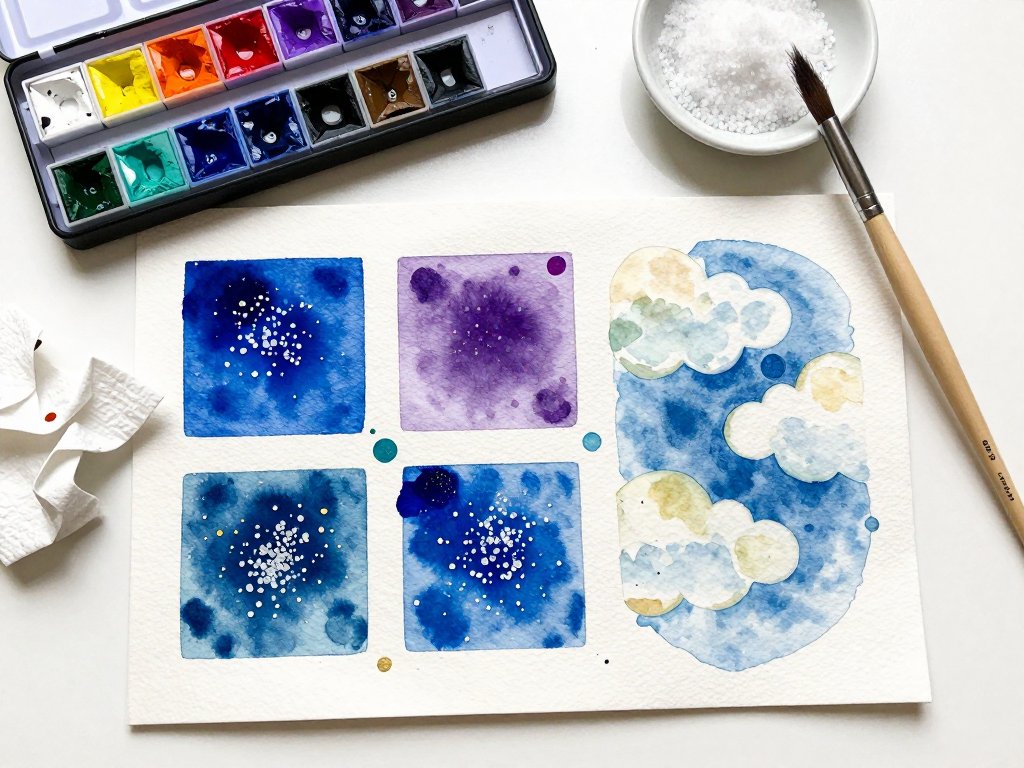
Take a sheet of watercolor paper and divide it into four sections. In the first, paint a wet wash and add fine table salt to one half and coarse salt to the other, so you can compare the two.
In the second, practice all three splatter methods: flick, tap, and toothbrush. In the third, practice lifting: a soft paper-towel lift, a sponge lift, and a dry-brush scrub.
In the fourth, combine textures freely — let the page become your playground.
Label each section with a pencil so you remember what you did. Keep this page.
It is your personal texture dictionary, a reference you will flip back to again and again when you are wondering which technique will give you the effect you want.
And it is proof, on paper, of how much you learned in one sitting.
This warm-up is also a lovely activity to share with children. Kids adore sprinkling salt and flicking splatter, and the results are forgiving enough that everyone feels successful. A rainy afternoon, a roll of paper, and a handful of salt can become a beautiful family memory.
Putting It All Together: A Simple Project
When you are ready to paint something complete, here is a gentle project that uses all three techniques and always feels like a success: a textured night sky over a quiet sea.
Begin by painting a deep blue wash across the top two-thirds of your paper for the sky.
While it is wet, sprinkle coarse salt over the sky area, then set the paper aside and let it dry completely — this is your star field, and it will bloom into pale, scattered lights.
Next, paint a second wash of blue-green across the bottom third for the sea, and let it dry until it is just damp.
Lift a soft horizontal band of moonlight across the sea using a clean brush and paper towel, repeating until the band is gently pale.
Add a few smaller lifted ripples below it.
Finally, load a brush with white or light yellow paint and splatter stars across the sky.
Aim for a scatter that feels natural, with a few larger stars near the top and a fine mist across the middle.
Let everything dry, brush off the salt, and admire your work — a complete painting built from three simple techniques.
You can repeat this project in any color scheme: a green meadow with salt-bloom flowers, a grey winter sky with lifted cloud shapes, a golden desert with splattered sand. Once you know the techniques, the scenes are endless.
Conclusion: Play, Experiment, Enjoy
Salt, splatter, and lifting are three of the most joyful techniques in watercolor because they reward play. They ask you to let go of control, to trust the water and the paper, and to accept that some of the best results are accidents you could never plan.
Set aside a little time this week — even fifteen minutes — to make a texture page of your own.
Use what is in your kitchen, what is in your paint box, and what is already in your hands.
Do not worry about making a masterpiece. Just make marks, add salt, flick some splatter, lift some light, and let the paper surprise you.
Every texture you learn is a new word in your painting vocabulary. The more you play, the more fluently you will speak.
And the paintings you make with these humble techniques — a starry sky, a moonlit sea, a field of wildflowers — will carry a depth and life that flat color never could.
So go on: sprinkle, flick, and lift. Your watercolors are waiting to sing.