Introduction
If you have ever mixed a color and watched it turn into a sad puddle of grey-brown, this article is for you.
Mud is the most common frustration in beginner painting, and it is also the most fixable. A few simple ideas about how paint behaves will change everything.
Color theory sounds like a school subject, but it is really just a friendly set of rules about how pigments mix together. Once you know them, mixing the color you want stops being a gamble.
You do not need a studio or a degree to benefit. You have an hour, and that is enough. A quiet cup of coffee, a small palette, and a few tubes of paint will do beautifully.
Busy lives make painting a luxury, so the time you spend should feel good. Understanding a little color theory is the fastest way to enjoy painting more and fight with your paints less.
Over the next pages we will cover the color wheel, warm and cool colors, value, saturation, and the simple habits that keep mixtures clean. By the end, mud will be a choice, not an accident.
Grab your brushes and let us begin. Nothing here is difficult, and none of it requires talent, only a little patience and a willingness to play.
The Color Wheel: Your First Project
Every color you will ever mix comes from three primaries: a red, a yellow, and a blue. In paint terms, that means cadmium red, lemon yellow, and ultramarine blue.
Mix two primaries together and you get a secondary color. Red and yellow make orange, yellow and blue make green, and blue and red make violet.
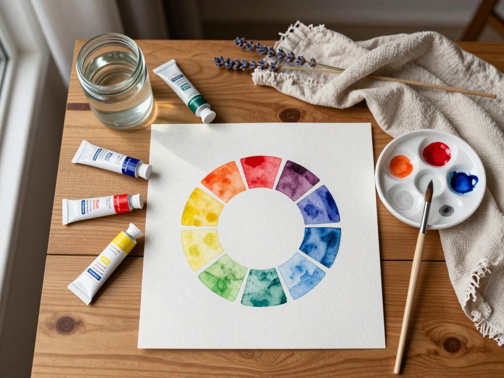
Mix a primary with its neighbor and you get a tertiary, like yellow-orange or blue-violet. Arrange those twelve colors in a circle, and you have the color wheel.
Here is the full circle, in order, so you can label your own: yellow, yellow-orange, orange, red-orange, red, red-violet, violet, blue-violet, blue, blue-green, green, and yellow-green.
Making your own color wheel is one of the best projects a beginner can do. It teaches you how your specific tubes behave, because every brand mixes a little differently.
Draw a circle, divide it into twelve slices, and label them before you paint. Place your primaries first, then mix your secondaries, then fill in the tertiaries.
Notice how the wheel teaches you relationships. Colors that sit side by side blend harmoniously, while colors that face each other will neutralize one another. That single insight will save you endless mud.
Your first color wheel does not need to be perfect. Wobbly edges and uneven slices are completely normal, and honestly, they give it charm. Keep it, and paint another one in a month to see how far you have come.
Warm vs Cool: The Temperature of Color
Colors carry temperature. Reds, oranges, and yellows feel warm, like sunlight and fire. Blues and greens feel cool, like water and shade.
Temperature shapes mood more than any other quality. A warm painting feels cozy and energetic; a cool one feels calm and quiet. Even a simple still life changes completely when you shift its temperature.
Here is the trick most beginners miss: every primary color has a warm version and a cool version.
- Reds: cadmium red is the warm red, leaning toward orange. Alizarin crimson is the cool red, leaning toward violet.
- Yellows: lemon yellow is the cool yellow, leaning toward green. Cadmium yellow is the warm yellow, leaning toward orange.
- Blues: ultramarine blue is the warm blue, leaning toward violet. Cerulean blue is the cool blue, leaning toward green.
Knowing this changes everything. If you want a brilliant orange, mix a warm red with a warm yellow. If your orange comes out dull, one of your paints was simply the wrong temperature.
Try it yourself: mix cadmium red with cadmium yellow, then mix alizarin crimson with lemon yellow. The first orange will glow; the second will be quieter and slightly grey. Both are useful, but only if you choose them on purpose.
In a landscape, distant hills look cooler and hazier than nearby grass, because air adds a veil of blue. Adding a touch of cerulean to a far hill makes it recede naturally, without any fancy technique.
Keep a warm and a cool version of each primary on your palette, and you will always have a way out of a dull mixture.
Value and Saturation: The Hidden Dimensions
Value is how light or dark a color is. It matters more than hue, because our eyes read value first. A painting can survive unusual colors, but it collapses when the values are muddled.
When a beginner's painting looks wrong and they cannot say why, the culprit is usually value, not color. Getting the lights and darks right makes everything else look intentional.
A quick trick: squint at your subject. Squinting removes color and leaves only light and dark shapes, which is exactly what your painting needs to organize first.
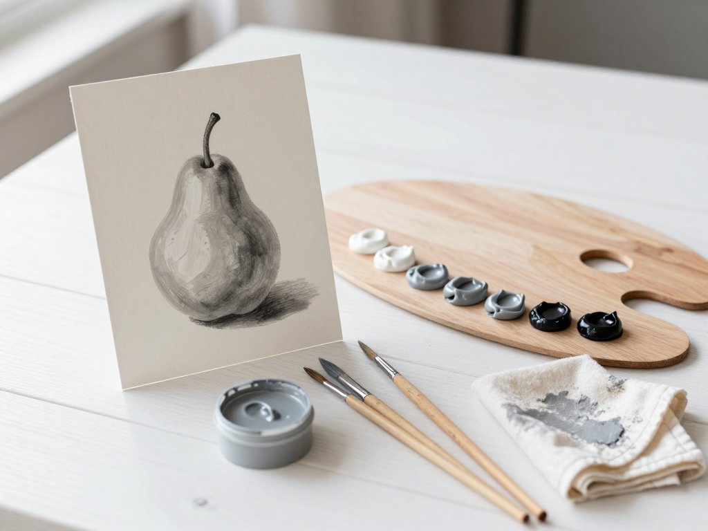
The value scale is the classic exercise. Paint a row of ten small squares stepping from white to black, using titanium white and ultramarine blue.
- Paint ten connected squares in a row.
- Leave the first square pure titanium white.
- Add a tiny touch of ultramarine to each next square, keeping the steps even.
- Step back often, and adjust until the jump between squares looks equal.
Saturation is how bright or muted a color is. A pure pigment straight from the tube is at full saturation; add white or grey, and it softens into a quieter version of itself.
Bright colors grab attention; muted colors create calm and depth. A painting made only of loud colors feels exhausting, so most artists let muted colors do the quiet work and save bright ones for accents.
To mute a color without losing its identity, add a little of its complement, or a touch of grey mixed from all three primaries. You will watch it settle into a beautiful, soft neutral.
When you grey a color on purpose, you are controlling saturation. When it happens by accident, you get mud. The difference is entirely intention.
Why Colors Turn Muddy
Mud is a lifeless grey-brown, and it appears for a few very specific reasons. Each one is easy to fix once you can recognize it in the moment.
Overmixing is the number one cause. The longer you stir paint, the more the pigments grind together, until every color surrenders to the same tired grey.
Mixing complementary colors by accident is another common culprit. Red and green, blue and orange, yellow and violet, combine any opposite pair, and they cancel each other into grey.
Too many colors on the palette invite trouble. Every extra puddle is a chance for a wrong neighbor to sneak into your mixture and dull it without you noticing.
Dirty brushes are sneaky mud-makers. A brush rinsed in cloudy water carries ghost colors into every new mix, quietly draining the life from each one.
Mixing too long on the paper or canvas is the last big culprit. Pigment soaks into the surface, and scrubbing it back and forth only guarantees a lifeless patch.
There is also the matter of white. Adding titanium white to brighten a color is natural, but too much white makes color chalky and flat, a cousin of mud that is just as discouraging.
Notice the pattern: mud is almost never one dramatic mistake. It is a hundred small ones, and every single one of them is avoidable.
How to Mix Clean Colors
Clean color starts with clean habits. Each one takes ten seconds, and together they will save you hours of frustration.
- Rinse your brush thoroughly between mixes, then dry it on a rag before dipping into fresh paint.
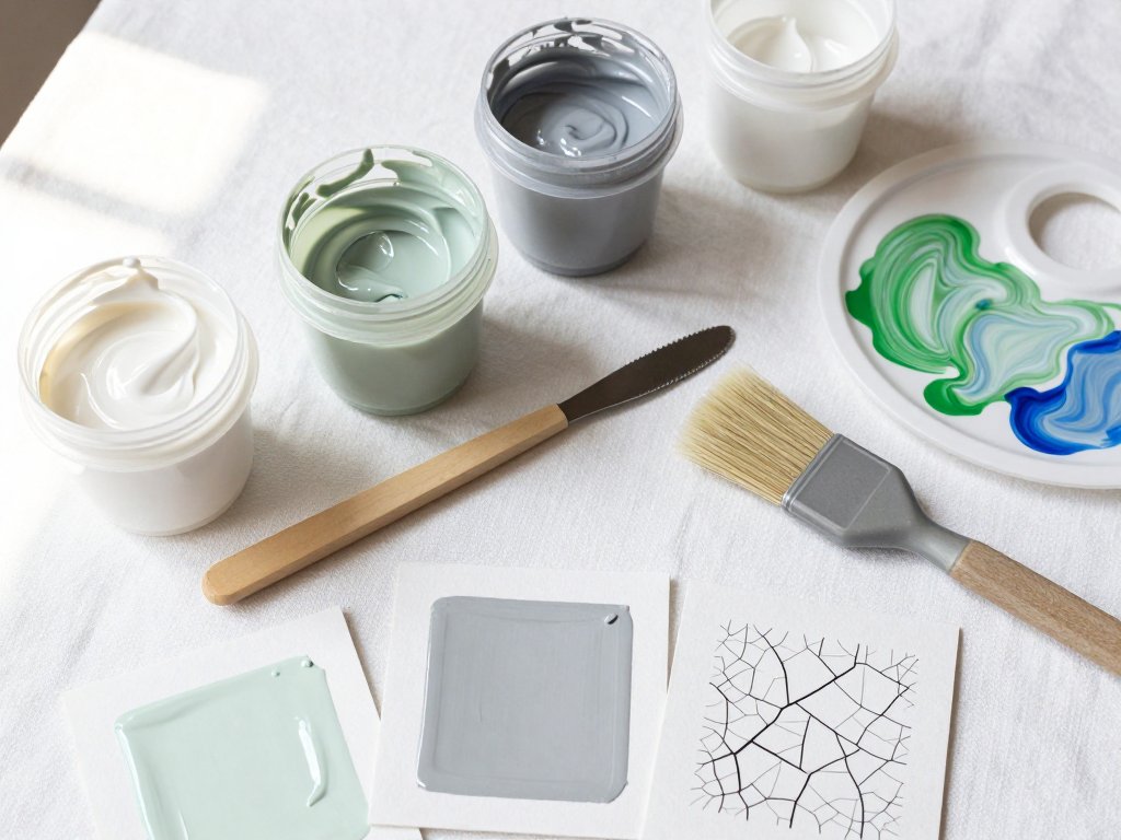
- Mix with a palette knife instead of your brush whenever you can. It keeps the pigment lively and your brush clean.
- Limit your palette. Three to five colors force you to mix deliberately instead of grabbing whatever is nearby.
- Mix lighter colors first, then darken gradually with tiny additions. It is far easier to add than to subtract.
- Let layers dry before painting over them. Dragging wet paint into wet paint is how mud is born.
A palette knife deserves special praise. It blends paint quickly without grinding the life out of it, and one swipe across a rag leaves it perfectly clean.
When you darken a mixture, think in pinches, not dollops. A single small touch of ultramarine can shift a whole puddle of sky blue into a deeper, richer tone.
Give your palette an architecture: keep your puddles separate, mix in the middle, and never let a mixed color wander back into a pure one. A tidy palette is a tidy mind.
Mix more paint than you think you need. Nothing drains a painting session faster than running out of a perfect sky and trying to recreate it from memory.
And when a mixture looks right, stop touching it. The moment it reaches your canvas, let it be. Trust your first instinct, and your colors will stay fresh.
Complementary Colors: Grey With Purpose
Complementary colors sit opposite each other on the wheel: red and green, blue and orange, yellow and violet. Mixed together, they grey each other out.
This sounds like a warning, but it is actually a superpower. Complements let you mute a color by exactly the amount you want, instead of hoping for the best.
Shadows are where complements shine. The shadow on a red apple is not just darker red; it is red with a touch of its opposite, green, which makes a believable and lively grey.
A lemon's shadow wants a whisper of violet, because violet is yellow's opposite. A blue mug's shadow comes alive with a hint of orange. These greys feel like real light, not like dirt.
Even skin tones benefit. Flesh is not simply pink; it contains greens and greys in the shadows, which is why portraits painted only in pinks look flat and waxy.
Landscape painters use the same idea. Shadows on grass lean toward violet and red-violet, and a touch of that complement keeps a sunny field from looking like a child's coloring page.
The goal is not to avoid grey but to choose it. Grey mixed with intention reads as shadow and atmosphere; grey mixed by accident reads as mud. The paint is the same, and the difference is you.
A Simple Beginner Palette
You do not need twenty tubes of paint. A small, thoughtful palette teaches you more than a giant one ever will, because every color on it earns its place.
Start with a warm and cool version of each primary, plus white. That means cadmium red and alizarin crimson, lemon yellow and cadmium yellow, ultramarine blue and cerulean blue, and titanium white.
With those seven tubes you can mix almost every color you see: all three secondaries, a full range of tertiaries, and countless beautiful greys. It is astonishing how far seven tubes go.
If you prefer an even smaller challenge, try the cyan, magenta, and yellow triad. These three modern primaries mix brilliantly clean color, and they are wonderful for learning saturation firsthand.
Earth colors like burnt sienna and yellow ochre are tempting, and they are lovely, but you can mix convincing versions of them from your primaries. Learn to mix them once, and you will understand your palette far better.
Whatever you choose, treat white with respect. Titanium white is powerful, and a heavy hand with it is a quiet road to chalky, lifeless color.
Keep your palette small for a month. The constraint feels strange at first, then liberating, and your mixtures will grow cleaner every single week.
Practice, Troubleshooting, and Your Next Step
Theory is only useful when it reaches your brush. Here are four small exercises that build real skill in a single sitting, and each one fits inside your hour.
- Paint a twelve-color wheel, mixing every secondary and tertiary yourself.
- Paint a value scale of ten steps using one blue and white.
- Paint a tiny study using only ultramarine blue, cadmium red, and lemon yellow.
- Make a complementary chart: mix each pair of opposites in small steps and watch them grey into beautiful neutrals.
None of these exercises are meant to become masterpieces. They are practice, like scales on a piano, and their only job is to teach your hands what your eyes already know.
Now, what if a passage still turns muddy? Take a breath. It is paint, not a tattoo, and almost everything is fixable.
You have three rescue options. Glaze a thin, transparent color over the area to unify it. Scrape the wet paint off with a palette knife and simply paint again. Or let it dry completely and repaint on top the next day.
Often the kindest fix is the last one. Fresh eyes and dry paint solve most problems, and some mud becomes a lovely undertone once it settles into the surface.
Give yourself permission to make muddy paintings. Every artist you admire has a drawer full of them. What matters is that you keep painting, keep noticing, and keep trying again.
Here is your next project: paint the same simple subject, an apple, a mug, a leaf, twice, once in warm colors and once in cool. Compare the two, and you will see how much you already understand.
Then, next month, try painting that same subject again using only complements for your shadows. You will feel the difference in your brush before you even see it on the paper.
You have an hour, and that is enough. Lay out your paints, make a color wheel, and let yourself enjoy the process. Your colors are about to get a whole lot cleaner.