Introduction
The summer Clara turned six, we cleared the kitchen table and painted our back garden with her little box of watercolors.
She painted the shed, the apple tree, and the washing line, all of it floating together on one flat sheet of paper.
It was a sweet, honest picture, and completely flat, like a map of the garden seen from high above.
So I asked her one small question. "What if the apple tree sat in front of the shed?"
She stared at me for a moment. Then she painted the tree right over the shed, hiding half of its gray wall.
Her face lit up. "Mummy, look. The tree is closer now."
That was the day my daughter discovered painting depth, and it has stayed one of my favorite memories.
A painting is only a flat surface: paper or canvas with color laid upon it.
Depth is the quiet illusion that makes that surface feel like a window into a place you could almost step into.
The good news is that depth is not a mysterious gift. It is a set of simple composition tricks that your eyes already believe.
You read depth all day without noticing, when you judge how far away the parked car is, or reach for the milk at the back of the fridge.
Over the next pages we will wander through seven gentle techniques, each one wrapped in a memory, to give your paintings space and air.
These lessons work with any paint you own: watercolor, acrylic, gouache, or oil. Keep your brushes close, and let us begin.
Technique 1: Overlapping
The first depth lesson came to us on a seaside morning, the year Clara turned eight.
We sat on the harbor wall eating ice creams, watching the fishing boats bob at their ropes.
Far across the water, the headland rose in a soft haze of blue-gray.
"Which is nearer, the boat or the land?" I asked her. "The boat," she said at once. "It covers the land."
That is the whole secret of overlapping: when one shape sits in front of another and hides part of it, we read the covering shape as nearer.
The bookshelf hides the wall behind it. The mug hides the tablecloth. Your brain never has to think twice.
In a painting, you can borrow that certainty anywhere two shapes meet:
- A tree standing in front of a hill, its trunk crossing the hill's soft edge.
- A boat cutting across the horizon line.
- A row of tulips where each flower overlaps the next.
- A child on a swing overlapping the fence behind them.
As you plan your composition, look for places where one thing could step in front of another instead of floating beside it.
In practice, most painters lay down the far shape first, then paint the nearer shape over it once the first is dry.
With watercolors that means waiting a few minutes between layers. With acrylic, gouache, or oil, you can often paint over while the underlayer is still wet.
Overlapping alone can make a flat scene feel layered in seconds.
Try it next time you paint: choose one shape and let it cross in front of another.
Technique 2: Size and Scale
My grandparents' farm had a long lane of white fence posts running up to the house.
As a child I loved to stand at the gate and look down that lane, because the posts seemed to march away from me.
The nearest post was tall and sturdy. The next was a little shorter. The ones near the house were tiny, no bigger than my thumb.
I knew the posts were all the same size in real life. My eyes simply reported that far things look small.
That is our second gentle trick: things farther away appear smaller.
When you repeat the same object in a painting, smaller and smaller, your eye reads each copy as farther back.
This works beautifully with fence posts, flowers in a meadow, birds crossing a sky, or beach umbrellas along the sand.
Here is a quiet practice I still enjoy. Choose one simple shape, such as a daisy or a fence post.
Paint the first one large in the lower corner of your paper.
Paint another a little smaller and a little higher. Then another, smaller and higher still.
Without any other effort, you have created a path that leads the eye into the distance.
Notice the word "higher" in that instruction. We will look at why it matters next.
Technique 3: Vertical Placement
Children paint a strip of blue at the top, a strip of green at the bottom, and float everything in between.
It is a perfectly honest way of seeing the world, and we have all done it.
Our third technique simply refines that childlike view: on a flat surface, higher means farther away.
The farmhouse had an upstairs window where I used to kneel and watch the whole world below.
Close beneath the window, the flowerbed filled the bottom of my view, bright and large.
Beyond it the lawn stretched away. Farther still came the lane, then the fields, then a line of blue hills at the very top.
Everything I could see sat higher in my view the farther away it was.
A canvas works the same way. Objects placed higher on the paper feel farther back.
Painters call this vertical placement, and it is the backbone of many landscapes.
The ground line creeps upward as things recede: the lawn at your feet sits low, while the distant hedge sits high, near the horizon.
A simple way to use this is to plan your painting in three bands, like shelves for the eye:
- Foreground: the lowest band, where the largest, nearest shapes live.
- Middle ground: a band higher up, where shapes begin to shrink.
- Background: the highest band, home of the horizon and the far hills.
Keep each object's feet on the right shelf, and the space between shelves will do the work for you.
Technique 4: Atmospheric Perspective
Every autumn I drive the country road to my mother's house, and every autumn the same thing happens.
The hills ahead, only a few miles away, look pale blue and soft, as if someone had washed them with milk.
My mother calls it "the hills putting on their winter coats." Painters call it atmospheric perspective.
Air is not empty. It holds tiny particles of moisture and dust, and light bounces gently through them.
The farther away something is, the more air sits between you and it, and the more that air softens it.
So distant things look hazy. They become lighter, cooler, and bluer, with gentler edges and less contrast.
Near things stay sharp, dark, and true to their color.
Here is a tiny demonstration you can do with any paint you own. Imagine three hills in a row:
- Paint the farthest hill a pale, milky blue with soft edges, hardly darker than the sky.
- Paint the middle hill a gentle mid-tone: a muted green or blue-green, still soft around its edges.
- Paint the foreground hill strong and warm: a richer green or earthy brown, with clear, confident edges.
Stop right there. Three hills, three degrees of softness, and your paper already holds miles of air.
To make a color recede, thin it or mix in a little blue. To pull a color forward, keep it warmer and more itself.
With watercolor, add more water. With acrylic, gouache, or oil, blend in a touch of white or a paler blue.
Next time you look out of a window on a misty morning, notice the layers of haze.
Technique 5: Linear Perspective, the Gentle Basics
My grandmother lived at the end of a long, straight road lined with poplar trees.
As a child I pressed my nose to the car window on the way there, watching that road the whole journey.
The edges of the road ran side by side at our bumper, but far ahead they seemed to lean toward each other and nearly touch.
The poplars did the same: tall beside the car, dwindling to toothpicks at the horizon.
That leaning-together is called linear perspective, and you need no geometry to enjoy it.
Parallel lines, like the two edges of a road, a river, or a fence, appear to meet at a point on the horizon.
Painters call that meeting place the vanishing point, a lovely name for a quiet idea.
Try the simplest version: a road with trees.
- Lightly draw your horizon line across the paper, about a third of the way down.
- Choose a vanishing point somewhere on that line, perhaps in the center.
- Draw two faint lines from the bottom corners of your paper up to that point. That is your road.
- Add trees along the road: tall ones near the bottom, and smaller ones closer to the vanishing point.
You have just painted one-point perspective, with no ruler and no fuss.
Nothing needs to be perfectly straight. Freehand lines give a road its living, breathing quality.
The moment the edges of the road begin to lean together, your eye happily supplies the miles.
Rivers, railway tracks, hedgerows, and even a line of stepping stones will all perform the same quiet magic.
Technique 6: Value and Contrast
My art teacher, Mrs. Hartley, had a habit that puzzled me for years.
Whenever we finished a painting, she would half-close her eyes and study it through her lashes.
"Squint at it, girls," she would say. "Let the color go to sleep, and watch what wakes up."
She was teaching us about value: how light or dark a shape is, apart from its color.
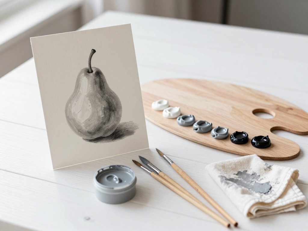
When you squint, color fades away and only lights and darks remain, like a photograph printed in grays.
And in those quiet grays, our sixth secret appears: contrast.
Strong value contrast pulls shapes forward. A dark tree against a pale field steps right up to you.
Soft, muted, low-contrast areas slide quietly backward.
Think of a misty morning: everything grayish, almost no contrast, so the whole world feels far away.
The squint test is the simplest tool in painting. Hold your work at arm's length and half-close your eyes.
Where do the strongest lights and darks sit? If the boldest contrast lives in your background, the depth will feel wrong.
Most pleasing paintings keep their strongest contrasts near the front, or on the one thing you want the eye to greet first.
Soften the far hills until they almost melt into the sky, and let the foreground hold the drama.
Value does the heavy lifting of painting depth, and color simply gets the credit.
Technique 7: Color Temperature and Detail
The maple at the end of our street turns first every autumn, and Clara and I used to walk out to meet it.
Standing beneath it, the leaves blazed orange and red, so warm they seemed to glow toward us.
But the hedgerow behind the tree, and the long shadows at our feet, held blues and violets that seemed to step away.
That memory holds our final two secrets: color temperature and detail.
Warm colors advance. Cool colors recede. It is a simple rule, and your eyes obey it without a thought.
A warm red barn will sit forward against a cool blue hill. A splash of golden light pulls the eye straight across the canvas.
Meanwhile, crisp detail and texture belong in the foreground. Backgrounds want to stay simpler and softer.
Look at any photograph of a landscape: you can count the blades of grass at your feet, but the far mountain is only a smooth shape.
Paint that way too. Put your finest brushwork up close, and let the distance rest.
If you paint every leaf on every tree, the whole picture goes flat, because nothing tells the eye what is near.
Here is a warm little exercise. Paint a simple garden: a bed of marigolds in front, a hedge behind it.
Give the marigolds rich oranges and yellows with small, bright strokes. Paint the hedge in cooler greens and blues with smooth, quiet shapes.
The same scene will suddenly have a front and a back.
Detail is a promise of nearness, and softness is a promise of distance. Use both, and your painting depth will take care of itself.
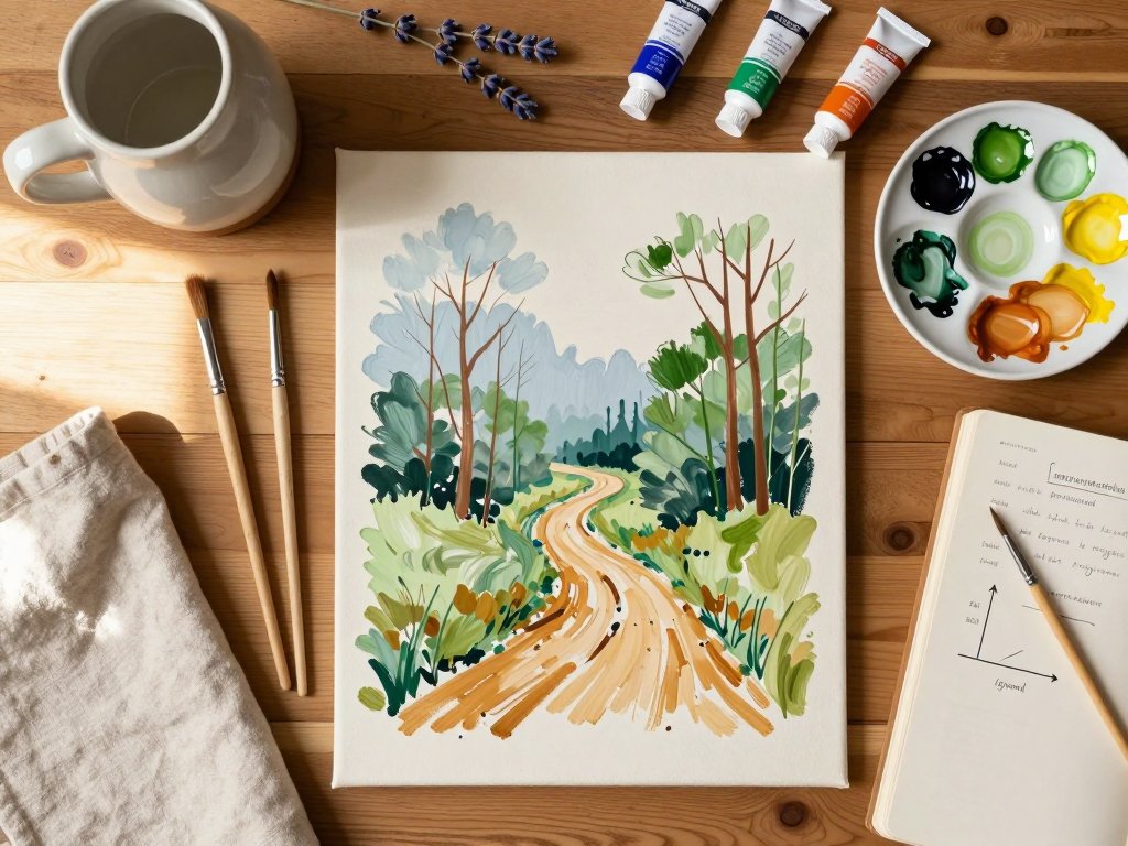
Putting It All Together: A Little Path Through the Woods
Now let us fold several of these techniques into one small practice painting: a path through the woods.
You will need only a small piece of paper or canvas, your paints, a brush, and about fifteen unhurried minutes.
Begin with a light pencil line for the horizon, about a third of the way down the page.
- Sketch three bands: a strip of sky and far trees at the top, darker woods in the middle, and a path curving up from the bottom edge. You have used vertical placement to build your shelves.
- Paint the farthest band first: soft, pale, slightly blue trees with gentle edges, hazing into the sky. That is atmospheric perspective doing its quiet work.
- Next comes the middle band: trees a little darker and greener, with softer detail than the foreground will carry.
- Now the path itself. Let its edges lean toward each other as it rises, narrowing toward a vanishing point near the horizon. You have borrowed a little linear perspective.
- Paint a sturdy tree trunk along one side of the path, overlapping the path edge and the middle woods behind it. Overlapping tucks that trunk firmly into the near world.
- Add smaller trees higher up and larger ones lower down, letting scale deepen the space between them.
- Finish in the foreground: warm browns and greens, strong darks beneath the trees, and a few crisp leaves or a fallen branch. Let the contrast and detail live here.
- Finally, squint at your little painting. Soften anything in the distance that shouts too loudly, and strengthen the foreground if it has gone shy.
You have now used vertical placement, atmospheric perspective, overlapping, scale, and a touch of linear perspective in one small scene.
When Clara painted that first tree over the shed, she had only one technique, and it thrilled her.
Imagine what five will do for you.
Gentle Practice Prompts for This Week
Try one of these when the kettle is on.
- Look out of your nearest window and notice the three bands: near, middle, and far. Paint the view on a small sheet, keeping each band simple. You do not need detail here; you need the shelves.
- Paint a row of the same thing, fence posts, tulips, or birds, starting large at the bottom of the paper and growing smaller and higher as they go. Let them shrink naturally and watch the distance appear all by itself.
- Take a favorite holiday photograph, squint at it, and paint only the shapes of light and dark. Let the far parts soften and the near parts stay strong. You may be surprised how much depth arrives without any fiddly detail.
A Last Word
Not long ago, Clara, now grown, sent me a photograph of a little painting she had made of the harbor where we once ate our ice creams.
The fishing boat sat in front of the headland, just as it had on that morning years before.
I thought about how one small question at the kitchen table had started it all.
You do not need to master all seven techniques this week, or this month, or this year.
Choose the one that made you smile, and try it on a tiny painting, smaller than your hand.
Depth grows one gentle practice at a time, the way any good thing does.
Here is the question I leave with you: if you could step into one of your own paintings, what place would you most like to find there?
Hold that place in your mind as you paint, and let these little tricks carry you toward it.
Your eyes already know the way. Your brushes are only learning to follow.
May your pictures always have room to wander.