Introduction
I remember the first time I tried to paint water. I was sitting on a picnic blanket at a local park, my toddler napping in the stroller beside me, a set of children's watercolors balanced on my knee.
The pond before me was impossibly beautiful — lily pads floating like green saucers, the late afternoon sun turning the surface into a mirror of gold and violet.
I dipped my brush, touched it to blue paint, and produced a muddy, flat, utterly disappointing puddle.
I laughed, packed up, and went home to Google "how to paint water like Monet." That rabbit hole led me through library books, ruined practice paintings, and eventually — years later — to the quiet joy of creating water scenes that actually feel like water.
Not perfect. Not photorealistic. But alive. Rippling. Glowing.
If you are a stay-at-home mom who has ever stolen twenty minutes with a brush while the baby napped, you already know what took me years to learn: painting is not about having time.
It is about making time for small, soul-filling moments. And there is no subject more forgiving or more magical than water.
Today I want to share four tips that transformed my water paintings. The kind I wish my grandmother had written down for me.
And the kind that work whether you have fifteen minutes or an afternoon, whether your studio is a proper art desk or a corner of the kitchen counter with a sippy cup nudging your palette.
Who Was Monet, and Why the Lily Pond?
Claude Monet was not the first painter to notice water is beautiful. But he understood that water is never truly still — and the whole point of painting it is to chase that shimmering quality, not to pin it down like a butterfly in a display case.
In 1883, Monet moved to Giverny, fifty miles northwest of Paris. He bought a pink house with green shutters and transformed the land behind it into a water garden that became his greatest muse.
He dug a pond, diverted a river, planted water lilies — nymphéas — in shades of white, pink, yellow, and red.
He built a Japanese bridge arched over the water and lined the banks with irises and weeping willows.
He painted that pond for thirty years — more than 250 works, many now among the most revered paintings in the world.
What made them revolutionary was how he painted water itself. Not as a flat, transparent substance to be filled in with blue.
But as a living surface reflecting everything above while revealing what lay beneath. His water is at once sky and pond, solid and liquid, luminous and deep.
It is water as we actually experience it, not as we think it ought to look.
As a busy mom, there is comfort in Monet's approach. He did not paint every lily pad with botanical precision.
He painted what he felt — the shimmer, the warmth, the peace. He gave himself permission to simplify, to blur.
He understood that a painting is not a photograph. It is a feeling, translated into pigment.
That is the permission I want to give you today.
Tip One: Start with the Water, Not the Lilies
Here is the mistake almost every beginner makes — and I made it for years.
We look at a pond and think, "I will paint the green lily pads and pink flowers, then fill in the blue water around them." But water is not a background to add after the main subjects.
Water is the whole stage. Paint the water first, and everything else will naturally belong to it.
Monet's water is never a flat afterthought. It is a luminous, layered field of color with lilies floating on top like musical notes on a staff.
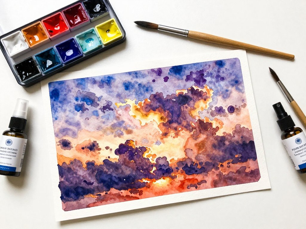
Here is how to start. Wet your entire paper with clean water using a large, soft brush. This is called a wet-on-wet wash — the single most important watercolor technique. Working on wet paper lets pigments bloom and blend organically, creating the soft edges that make water look real.
While the paper is still glistening, lay in broad strokes of color. Do not worry about staying inside lines — there are none yet.
Use a mix of French ultramarine — a deep, warm blue with a hint of violet — and cobalt turquoise, which adds bright clarity.
Pull the brush horizontally across the paper. These horizontal strokes matter because still water naturally reads as a series of horizontal planes.
Before this wash dries, drop in touches of other colors. If the sky is warm, add a whisper of lemon yellow or pale alizarin crimson near the top of the pond to suggest reflected sunset light.
Let the colors do what they want. Watercolor has a mind of its own, and that is precisely why it is so good at painting water.
Let this first layer dry completely. Rushing into the next layer while the first is damp is how we end up with mud.
Go make tea. Fold laundry. Read a picture book to your little one. The painting will wait.
When it is dry, you will have a soft, dreamy foundation — the underlying light of your pond.
That foundation will do half the work for you.
Tip Two: Observe Reflections and Light Using Broken Color
One afternoon, my three-year-old daughter pointed at a pond and said, "Mama, why is the sky in the water?" I realized that children see reflections more purely than adults do.
We have learned to separate "real sky" from "reflected sky." Children just see two skies and accept both as equally true.
That is the secret to painting reflections. In a water painting, the reflection is not an echo of the real world.
It is half of the painting.
Monet used a technique called broken color to capture the dance of light on water.
Instead of mixing a single flat color for a reflection, he placed small strokes of pure colors side by side — a dab of cobalt turquoise next to a stroke of lemon yellow, a touch of alizarin crimson beside a slash of French ultramarine.
From a distance, the viewer's eye blends these separate strokes into a luminous, vibrating whole.
Up close, the painting is a mosaic of tiny, joyful marks.
Here is an exercise. Paint a row of trees along the top edge of your paper.
Keep them simple — silhouettes of trunks and foliage. Then paint their reflection below using smaller, looser strokes.
Break the colors apart. If you used solid green for the treetops above, use separate strokes of lemon yellow and cobalt turquoise for the reflection.
The yellow suggests sunlight on leaves; the turquoise reads as water filtering through the reflection.
Broken color is especially forgiving for busy moms because it rewards speed and instinct over precision. You do not need a steady hand or hours of uninterrupted time. Fifteen minutes of broken-color painting can produce more magic than an hour of painstaking detail work.
Notice how reflections change with distance. Near the shore, water reflects clearly — you see distinct shapes of trees and clouds.
Toward the middle of the pond, reflections become softer, more about color than shape. At the far horizon, the reflection becomes nearly indistinguishable from the real thing.
Paint this gradation from sharp to soft, and your water will feel deep and spacious.
Tip Three: Simplify Shapes — Paint the Impression, Not the Detail
I am going to tell you something that might feel like permission you did not know you needed.
You do not have to paint every single lily pad. In fact, please do not.
Your painting will be better with fewer pads, painted more loosely, with more attention to overall shape and placement than to individual veins and curves.
Monet's water lilies are not botanically accurate. They are impressions — soft, rounded shapes suggested with a few confident strokes.
He understood that when we look at a pond, we do not count lily pads.
We feel their presence as a constellation of green shapes. The impression of a lily pad is more powerful than a meticulously rendered one.
Try squinting at your reference photo or at a real pond. Squinting reduces visual information — you lose details and keep only major shapes and values.
You will see simple ovals for lily pads, small clusters of brighter color for flowers, and soft vertical streaks for reflections.
That is all you need.
Paint your lily pads as simple, flattened ovals — slightly irregular, organic shapes. Mix a soft sage green from French ultramarine and lemon yellow.
Add a tiny touch of alizarin crimson to warm the green if the light is golden.
Do not outline the pads; just touch the brush to the paper and let the shape emerge.
Leave a small gap between each lily pad — water peeking through is what makes the pond feel like a pond instead of a green carpet.
For flowers, resist painting every petal. Suggest the flower with a few strokes of alizarin crimson softened with water, or leave pure white paper untouched while painting the water around it.
A water lily seen from a distance is not a botanical illustration. It is a soft, luminous blur — a tiny sun floating on the water.
Paint it like that, and your viewer will see a lily without needing to count its petals.
This is the motherhood approach to art. We are experts at simplifying. A clean-enough house, a well-enough meal, a happy-enough child is often better than a perfect version of any of those things. The same grace applies to painting. Simplify. Prioritize. Let the rest go soft.
Tip Four: Embrace Color Over Form — Use Complementary Colors for Water Reflections
This is the tip that made everything click for me. Look at any Monet water scene, and you will notice the water is not just blue.
It contains pinks, oranges, purples, yellows, greens, even touches of red. Monet painted water with every color because water reflects everything — and every reflected thing brings its own color to the surface.
The key to making water feel luminous is to use complementary colors — colors opposite each other on the color wheel — in your reflections.
Blue and orange. Violet and yellow. Red and green. When you place complementary colors near each other, they vibrate.
They intensify each other. They make the painting feel electric with light.
Suppose you are painting a pond on a late summer afternoon. You have laid in your wet-on-wet wash of French ultramarine and cobalt turquoise.
Now, as you paint the reflections of the sky, add strokes of lemon yellow and alizarin crimson — complementary warmth against your cool blues.
The yellow and orange will make the blue around them feel deeper, richer, more liquid.
For green lily pads, drop in small touches of their complement — a pinkish wash — near the edges where they meet the water.
The pink makes the green look greener and suggests the warm light wrapping around the leaves.
It is not realistic in a photographic sense. But it is true in the emotional sense.
It is how the pond feels.
Monet was a master of violet in his water scenes. He mixed French ultramarine with alizarin crimson to create lavenders for shadows on the water, the undersides of lily pads, and the deepest parts of the pond.
Violet is the color of mystery in water. It suggests depth and the hidden world beneath the surface.
Do not be afraid to use colors that seem wrong at first glance. A pond on a sunny day looks blue, but if you paint it only in blue, it will look flat.
Push yourself to see the orange where the sun hits ripples, the pink where the sky bleeds into the water, the violet where deep shadows gather.
Your painting will not look chaotic. It will look like the real, shimmering, infinitely complex thing that water is.
Practical Watercolor Techniques for Busy Moms
Here are a few more techniques that have saved my sanity as both a painter and a mom. These are not fancy. They are the workhorses of watercolor.
Wet-on-wet washes. Whenever you want soft, blurry edges — the edge of a reflection, the halo around a lily pad — wet the paper first and drop paint into the damp area. It spreads on its own. Minimal effort, beautiful results.
Wet-on-dry strokes. Use dry paper for crisp details — the sharp edge of a lily pad, the bright highlight of a reflection. Color stays exactly where you put it. The combination of soft wet-on-wet backgrounds and crisp wet-on-dry details gives watercolor its signature look: dreamy but defined.
Brush control for loose strokes. Hold your brush farther from the ferrule — the metal band holding the bristles.
This prevents a tight grip and encourages fluid marks. Use your whole arm, not just your wrist, for sweeping horizontal strokes.
If you can, stand while you paint. It makes it harder to lean in and obsess over details.
Let the paper do the work. Good watercolor paper is not a luxury — it is a tool that does half the work.
Cheap paper buckles and absorbs paint unevenly. Decent paper — 100% cotton, cold-pressed, at least 140 lb / 300 gsm — holds water beautifully and dries with a luminous quality.
Brands like Arches, Fabriano Artistico, or Stonehenge are worth every penny. If you can splurge on one supply, make it the paper.
Use two water cups. One cup of clean water for wetting your brush and mixing clean washes. A second cup for rinsing pigment between colors. Dirty water is the enemy of luminous watercolor. Two cups make a world of difference.
Paints and Materials I Love
You do not need a vast palette. A limited palette forces thoughtful mixing and builds your understanding of how pigments behave. For Monet-style water scenes, start with these four colors:
- French ultramarine. A warm, slightly violet blue. The backbone of your water.
- Cobalt turquoise. A bright, green-leaning blue. Use it for clear, sunny parts of the water.
- Alizarin crimson. A cool, transparent red. Essential for violets (with ultramarine), warming greens, and sunset pinks.
- Lemon yellow. A cool, green-leaning yellow. Brilliant for mixing fresh greens and painting sunlight on the water.
These four colors give an astonishing range. Ultramarine and alizarin crimson produce violets for deep shadows.
Cobalt turquoise and lemon yellow make bright greens for lily pads. Lemon yellow and alizarin crimson mix into warm oranges for sunset reflections.
And all four together, applied in broken strokes, create the shimmering surface of a living pond.
Invest in a good round brush — size 8 or 10 — and a flat wash brush about one inch wide.
Synthetic brushes are perfectly fine when starting out. A palette with wells is helpful, but a white ceramic plate works just as well.
I used a dinner plate for my first year of watercolor. My grandmother's palette was a chipped saucer she kept in a kitchen drawer.
Finding Your Own Lily Pond
Monet had Giverny. You have the neighborhood pond, the backyard kiddie pool at golden hour, the birdbath where leaves float. Water is everywhere, and every body of water can be a subject for a beautiful painting.
Take your children to a local pond. Bring a sketchbook, or just bring your eyes.
Sit and watch the water for ten minutes. Notice how light changes as clouds pass.
Watch ripples spread from a falling leaf. Point out reflections to your kids and listen to what they see — children notice colors that adults have learned to ignore.
If you cannot get to a pond, look at photographs. But I encourage you, at least once, to paint from life.
There is something irreplaceable about sitting in front of real water, feeling the breeze, hearing the birds, and trying to capture not just what the water looks like, but what it feels like to be near it.
That is what Monet was really doing. He was not just painting a pond. He was painting his love for it.
His wonder at its beauty. His gratitude for the quiet hours he spent beside it.
When you paint water, you are making a record of a moment you took to be still, to pay attention, to let your heart be moved by something ordinary that became extraordinary because you looked at it with love.
And that is the most Monet-worthy thing of all.
A Gentle Closing
Let me leave you with a story. On a hard day — the kind where the baby would not nap, the toddler spilled juice on the rug, and I had not spoken to another adult in seven hours — I sat down at the kitchen table after everyone was finally asleep and painted a pond that did not exist.
I invented it from memory of a botanical garden visit years before. I painted blue water first, letting it bloom across the wet paper like a sigh.
I added strokes of turquoise and a whisper of alizarin crimson near the top, because I remembered the sunset had been pink.
I painted seven lily pads, not because there had been seven, but because seven felt right.
I suggested three small pink flowers with a few strokes of the brush.
When I finished, I held the painting at arm's length. The water shimmered. The lilies floated.
It was not a Monet. But it was mine. It was a record of twenty minutes in which I was not a mom, not a cook, not a cleaner, not a chauffeur.
I was just a person with a brush and water and a desire to make something beautiful.
That is what painting can give you. Not mastery. Not perfection. Just twenty minutes of being fully yourself, fully present, fully alive to the color and light of the world. And that is worth every messy brush and every interrupted session.
So fill your water cup. Wet your paper. Lay in that first wash of French ultramarine and watch it spread like a sky made of water. You have everything you need. The pond is waiting.
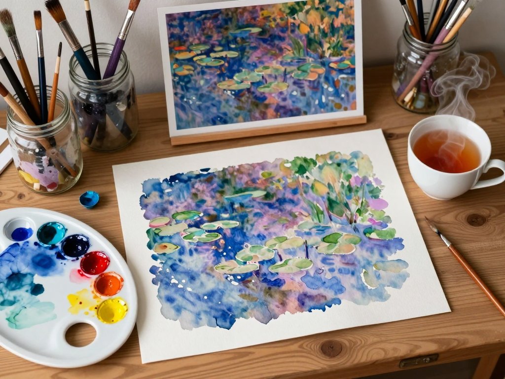
Image: A Scene for Your Studio Wall
To inspire your next painting session, here is a detailed prompt for generating an AI image to hang near your workspace or use as a reference.
Imagine a warm, softly lit watercolor studio corner: a wooden table scattered with paint-splattered mason jars holding brushes, a white ceramic palette with dabs of French ultramarine, cobalt turquoise, alizarin crimson, and lemon yellow.
Beside it, a thick block of Arches cold-pressed paper bears the beginning of a pond scene — soft blue-violet washes bleeding into wet paper, with three loose lily pads suggested in sage green.
A half-drunk cup of tea steams beside a reference photo of Monet's Giverny pond tucked into a vintage brass frame.
Late afternoon sunlight spills through a window with sheer white curtains, casting warm golden rectangles across the table.
Faintly visible in the background, a child's crayon drawing is taped to the refrigerator, a sweet reminder that creativity runs in the family.
The overall feeling is quiet, hopeful, and deeply peaceful — the kind of corner that invites you to sit down, take a breath, and paint.