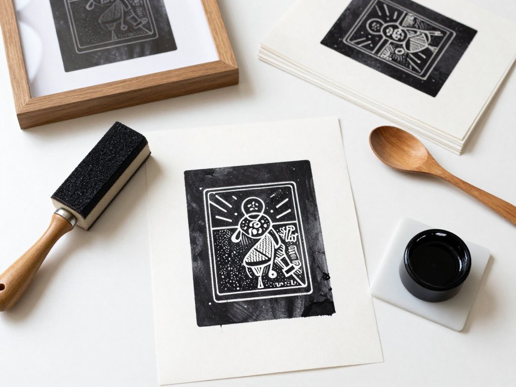
Introduction
I wasted thirty-four dollars on my first linocut kit. That is the honest number, and I still have the receipt folded in a studio drawer.
The kit had one plastic handle and five blades that arrived dull. The block was a soft grey sheet of traditional lino that had clearly spent months in a warm warehouse.
I pushed. The blade skipped. Then it slipped sideways and gouged straight through the line that was supposed to stay raised. That line was the entire design.
So I did what beginners do. I inked the block anyway, rolled on about four times too much ink, and pulled a print that was an unreadable black blob with a ghost of a flower somewhere inside it.
Thirty-four dollars for one ugly test print. Not my finest afternoon at the kitchen table.
Here is the thing, though. The kit was not really the problem, and neither was my lack of talent. I had the wrong block, the wrong blade order, and far too much ink.
Linocut is genuinely cheap once you know the four or five things that actually matter. One block keeps printing for years.
This guide is the version of that afternoon I wish somebody had handed me.
What a Real Starter Kit Costs
Let me frame this the way I frame everything: money in, prints out.
About twenty to thirty dollars buys a completely workable beginner setup. That covers a few soft-cut blocks, a handle with interchangeable blades, a small brayer, and a tube of block printing ink.
You can absolutely spend sixty. You do not need to. The quality jump between a thirty-dollar setup and a sixty-dollar one is much smaller than the jump between a thirty-dollar setup and a thirty-dollar setup with correct technique.
Here is the honest breakdown of what belongs in the basket, and what does not.
Blocks: Soft-Cut Rubber vs Traditional Grey Lino
Soft-cut or rubber carving blocks are what I tell beginners to buy first. They carve like a firm eraser, they do not fight your hand, and they forgive hesitation.
The trade-off is detail. Soft blocks compress under pressure, so very fine lines and tight corners have a habit of closing up or rounding off.
Traditional grey lino is firmer and holds sharp detail beautifully. It also slips more easily when your blade is dull, which is exactly how I ruined my first design.
Start soft. Move to grey lino once your hand knows the angle.
Size: Start Small, Roughly 4x6 Inches
Four by six inches, or A6, is the sweet spot. No bigger for block one.
A small block carves in one sitting. A big one becomes a two-week project and gives you far more chances to slip.
A few dollars buys a single sheet, and you can cut it into two or three small blocks. That is three designs for the price of one.
Tools: Interchangeable Blades and Winged Safety Cutters
A handle with interchangeable blades gives you every shape you need from one grip. Loose tools with fixed blades are cheaper and much more limiting.
If you already own a scalpel-style safety cutter with the little wings on the blade, that is a fine outline tool for fine shapes. The wings sit above the cutting edge and keep the blade from diving through the block.
Blades dull. Dull blades are the number one cause of slips, and a replacement pack costs less than a coffee.
Ink: Water-Based vs Water-Soluble Oil
Water-based block printing ink is the easy first buy. It cleans up with soap and water and dries fast.
Its weakness is working time. It skins over on the inking plate within a few minutes, so you re-roll more often and get more variation between prints.
Water-soluble oil-based ink gives you a much longer open time and a richer, tackier film. It still cleans up with soap and water. It dries overnight instead of in a couple of hours.
If you plan to pull a numbered edition in one sitting, the oil-based tube is worth the extra few dollars.
The Rest of the Bench
- A brayer (roller). A small soft rubber brayer, around two inches wide, is plenty for a first block.
- A baren, or the back of a wooden spoon. The spoon is free and it works. A baren costs fifteen to thirty dollars and saves your wrist on longer editions.
- An inking plate. A sheet of glass from a cheap picture frame, a ceramic tile, or a flat plastic tray. Free to a few dollars.
- Paper. Plain 80 gsm copy paper for test prints, then a small pack of proper printmaking paper for the real ones.
- A bench hook or a taped board. Stops the block sliding while you carve, which stops a whole category of accidents.
If you want the smaller cousin of this craft for stationery and cards, our guide to rubber stamp carving uses almost the same bench to make something completely different.
The Only Three Blades You Need
Starter sets ship with five or six blades. You will use three. The rest will sit in the tin looking professional.
- Small V-gouge. Cuts a narrow V-shaped valley. This is your outline tool and your fine-detail tool. One pass around a shape gives you a crisp edge that proves itself on the print.
- Small U-gouge. Cuts a thin rounded channel. Ideal for thin cleared lines, hatching, and clearing narrow gaps between shapes that sit close together.
- Large U-gouge. Clears big areas fast. This is the blade that removes all the background you do not want printing.
The rule that fixed my carving: start with the smallest blade and work up. Every single time, no exceptions.
Why? A small blade removes a small amount of material. Make a mistake with a 2 mm gouge and you have a 2 mm problem. Make the same mistake with a 6 mm gouge and you have a crater.
Big blades are for clearing space you have already decided to lose. They are not exploration tools.
Design Rules That Save Blocks
Most ruined blocks were ruined on paper, days earlier, by a design that was never carveable in the first place.
Keep the first design bold. Strong shapes, strong contrast, thick lines. A leaf silhouette, one bold flower, a simple mountain, a chunky mushroom.
Details get lost in the ink. Solid black areas and clean white areas are what make a relief print look confident instead of muddy.
Your print is a mirror image of the block. Every time, without exception. If your design includes letters or numbers, reverse them before you carve, or they will print backwards.
Trace the drawing, flip the tracing paper over, and burnish it down. That reverses it automatically, no mental gymnastics required.
Think in positive and negative space. Before the blade touches the block, decide which areas stay raised and which get carved away.
Say it out loud if you have to. "The petals print. The background goes." That one sentence prevents most beginner disasters.
Draw small, on cheap paper, first. Sketch five thumbnails the size of a postage stamp. Pick the one that still reads when it is tiny.
Then draw it at final size on copy paper, fix it there, and only then commit it to the block. Paper is free. Blocks are not.
Transferring the Design to the Block
Three methods, all fine. Pick the one that matches your drawing.
- Draw directly on the block in pencil. Fastest option for simple shapes. Keep the line light and steady.
- Tracing paper burnish. Draw on tracing paper, flip it face down on the block, then rub the back with your fingernail or the back of a spoon.
- Carbon paper. Slide a sheet between your drawing and the block, then trace over your lines with a pencil. Good for detailed drawings you do not want to redraw.
One warning: pencil lines on a soft block disappear as you carve. You gradually erase them with your own hand.
So re-mark as you go, or trace the outline once more with a fine marker before you start. Following a vanishing line is how a straight stem turns into a wobbly one.
Carving Technique and Safety
This is the section to read twice.
Always carve away from your body. The hand holding the block stays behind the blade, never in front of it. If the blade slips, it slips into empty space instead of into your thumb.
Hold the tool at a low angle. A steep, upright blade digs in and jams. A shallow angle skims across the surface and gives you control.
Take shallow passes. Go over the same line three times rather than digging it out once.
The carving tool removes small slivers, not chunks. If you are fighting the block, you are asking the blade to do too much in one stroke.
Carve in short strokes, not long ones. A two-inch stroke has two inches of opportunity to wander off your line. A half-inch stroke stays where you put it.
Rotate the block, not the tool. Turn the block so your comfortable cutting angle stays the same, then carve again.
And the real cause of most slips is not the tool. It is speed. Rushing is what pushes a blade off the line.
Carve slowly enough that you could stop mid-stroke. If you cannot stop, you are going too fast.
Carving a Two-Tone Image, Step by Step
Here is the exact order that produces a clean first print. Two tones: ink and paper.
- Outline the entire design with the small V-gouge. One blade-width line around the whole shape, all the way around, with no gaps.
- Check the outline. Anywhere two shapes touch, you need a cleared line between them, or they will print as one blob.
- Switch to the small U-gouge. Clear the narrow gaps and the tight areas between close lines.
- Switch to the large U-gouge. Clear the rest of the area you want left white, working outward from the design.
- Keep working outward until only the raised design remains. The background should sit visibly lower than the design.
- Brush away the crumbs with a soft brush. Loose crumbs in the ink print as speckles you did not design.
That order matters because the outline protects the shape. Once the outline is cut, the big blade has a border to stop against.
If I had carved in that order on my first block, I would still have that design. And my thirty-four dollars.
Chatter, and Why It Matters
Chatter is the rough texture the carving tool leaves behind. Little ridges, torn fibers, uneven gouge marks.
Some printmakers keep it on purpose. A little chatter in the background reads as handmade, and the texture becomes part of the charm.
But chatter catches ink. A rough surface picks up unwanted ink in every groove and torn edge, so a background you meant to leave clean prints grey.
If you want a clean surface, clear it smooth with a chisel-shaped tool or a wide flat gouge. Skim the surface instead of deepening your cuts.
Decide which one you want before you start. Clean backgrounds suit graphic, modern designs. Chatter suits organic shapes and natural subjects.
Inking the Block
This is where my first print died. Let me be precise about it.
Squeeze a pea-sized amount of ink onto your inking plate. That is genuinely all. A pea, not a stripe.
Roll it out in short strokes in both directions, lifting the brayer off the plate regularly. The sound is your signal, and you are listening for a soft, sticky, zzzz sound.
When the roller is covered in a thin, even, velvet layer that looks almost dry, you are ready to ink the block.
Too little ink gives pale, patchy prints. Too much fills your carved lines and turns the whole print into a blob.
Now roll the brayer onto the block in one direction, with light pressure. One or two passes is plenty.
Do not scrub the brayer back and forth on the block. That is how ink gets pushed down into the cut areas and your clean white lines disappear.
Printing Without a Press
No press needed. That is the whole appeal of relief printing.
- Lay the inked block face up on a flat, stable surface.
- Lay the paper down on the block. Once it touches the ink, it does not move, not a millimeter.
- Press with a baren, or the back of a wooden spoon, using firm circular pressure.
- Start from the middle and work outward to the edges.
- Peel one corner up to check the transfer before you lift the whole sheet.
That corner peek saves paper. If the corner is pale, you can press more before committing.
When the print looks right, lift the sheet from one corner in one smooth motion. Do not drag it sideways.
Then ink the block again and pull a second impression with the same ink load. Comparing print two against print one teaches you more than any tutorial does.
Troubleshooting Your First Prints
Almost every failed print is one of six problems. Here is the diagnosis for each one.
- Patchy or pale print. Usually uneven pressure, or the paper lifted, or too little ink. Press more evenly from the middle out, and add ink to the plate, not to the block.
- Ink filling your fine carved lines. You have too much ink, or the lines were carved too shallow. Wipe the block, re-roll thinner, and go back in with the V-gouge if the lines are shallow.
- A blurry double image. The paper shifted during printing. Hold one corner with your free hand and do not let go until you lift the sheet.
- Part of the design missing entirely. Either the block is not flat, or your pressure missed that corner. Check the block against a straight edge, and press all the way out to the edges.
- The block rocking while you carve. The block is warped or the surface under it is. Tape the block to a flat board, or put a cutting mat underneath it.
- Weary hands rounding the corners of the block. After an hour of carving, your grip softens and your lines drift. Tape the block down so you are not gripping it at all.
That last one is a real technique fix, not a discipline problem. Tired hands produce rounded corners, and rounded corners are a design change you did not choose.
Editions, Numbering, and Drying
Hand-pulled relief prints vary a little from one to the next. That is normal, and it is not a failure.
Ink load, paper, pressure, and room temperature all move slightly. Print four will not be identical to print one, and no buyer expects it to be.
Number your edition under the image in pencil. Write it as 1/10, 2/10, and so on. The first number is that print. The second is the edition size.
Sign it in pencil under the image too. Pencil is the tradition, and it will not bleed into the paper the way ink can.
Then let the paper dry fully before you stack anything. Water-based ink dries in a couple of hours. Oil-based ink wants overnight.
Stacked wet prints press into each other and transfer ink from one sheet to the next. Lay them flat, one at a time, until they are properly dry.
Store the finished block wrapped, dry, and flat. Soft-cut and lino blocks hold their shape for years, so a block carved today can be re-inked five years from now and give you the same image.
The Money Math for Etsy and Craft Fairs
Here is the number that matters: your cost per print collapses after the block is carved.
The block cost a few dollars. Paper and ink cost pennies per print. The only thing you keep spending is time.
So a small numbered edition of ten prints from one block has an absurdly low material cost per print. A single framed hand-printed artwork sells for a lot more than that per unit.
If you sell at craft fairs or on Etsy, this is the argument for carving instead of printing digitally. Your hand-pulled prints carry visible ink texture, slight edge variation, and numbered editions.
Buyers can see the process in the paper. That is why a hand-printed version justifies a higher price than any digital print of the same image.
My suggestion for a first seller run: carve one block, pull ten numbered prints, price the hand-printed ones clearly higher, and keep two for your own wall.
That is a real product line built from a cheap block and one weekend afternoon.
What the Wasted Kit Actually Taught Me
Thirty-four dollars is cheap tuition, in hindsight.
That kit taught me three things. Buy blades you can replace. Buy a block matched to your skill level, not to the package photo. And carve in the right order, small blade first and big blade last.
But only one thing actually fixed my prints, and it had nothing to do with the tools.
A thin, even layer of ink. Plus patience with shallow carving passes.
Every blob I have ever printed came from too much ink. Every gouged line came from trying to remove too much material in one stroke.
Fix those two habits and linocut becomes what it should be: a cheap, forgiving, deeply satisfying craft you can do at the kitchen table while the pasta water heats up.
So buy the twenty-to-thirty-dollar setup. Keep the receipt if it makes you feel better. Then carve slowly, ink thin, and pull a second print that beats the first.