Introduction
Have you ever saved a photo of a beautifully lettered quote, a wedding invitation, or a menu board and thought, "I wish I could do that"? I have been there. For years I assumed hand lettering was a talent you were born with, like perfect pitch or naturally curly hair.
Here is what I learned when I finally tried it: it is not a talent.
It is a skill. And like most skills, it breaks down into a handful of simple movements that anyone can practice.
The beautiful lettering you admire online is the result of those movements, repeated thousands of times, one stroke at a time.
The best part for busy schedules? You can practice for ten minutes a day, with tools that cost less than a pizza, and see visible improvement within a week.
You do not need a calligraphy class, a fancy desk setup, or an artistic background.
You need a pen, some paper, and the willingness to make wobbly letters for a little while.
I promise the wobbly phase is worth it.
In this guide, I will walk you through the difference between calligraphy and hand lettering, the exact tools to buy (and what to skip), the basic strokes that build every letter, and the practice habits that turn beginners into confident letterers. Let us get those letters flowing.
Calligraphy vs. Hand Lettering: Know the Difference
People use the two terms interchangeably, but they are actually different skills, and understanding the difference helps you choose where to start.
Calligraphy is the art of beautiful handwriting. You write letters in a continuous flow, using a pen or brush that creates thick and thin lines as you move.
The letterforms come from your hand, written in real time, like elegant cursive. Once you learn the strokes, you can write full words and sentences smoothly.
Hand lettering is the art of drawing letters. Each letter is drawn individually, often with a pencil first, then inked.
You can stretch, decorate, and arrange letters however you like, which is why hand lettering is so popular for quotes, logos, and posters.
It is slower than calligraphy, but it gives you total control over the design.
For most beginners, I recommend starting with modern calligraphy using a brush pen. Here is why: it teaches you the core skill, the thick-and-thin stroke, that makes letters look professional.
And once you can make confident strokes with a brush pen, hand lettering becomes much easier because you already understand how letterforms are built.
You can absolutely learn both at the same time. Many letterers do. But pick one as your main focus for the first month, and you will progress faster than bouncing between the two.
The Tools You Actually Need
Here is the honest tool guide, including what to buy and what you can skip. I have tested a lot of pens so you do not have to.
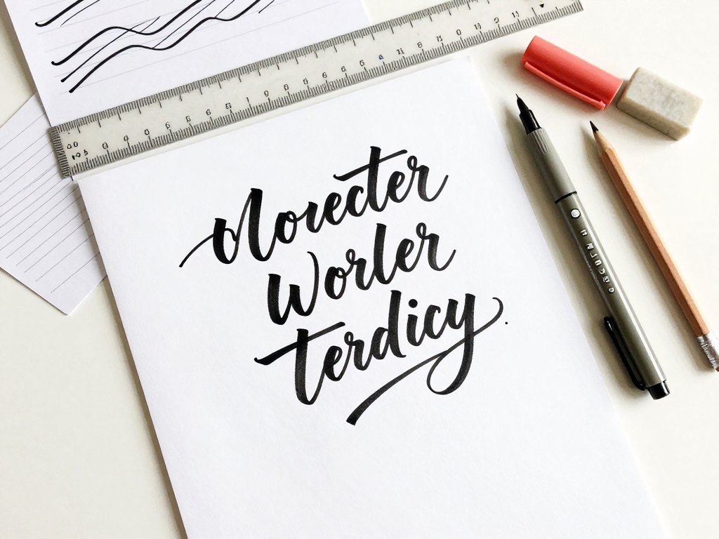
Brush pens. Your first brush pen should be a medium-tip marker with a flexible tip, like the Tombow Dual Brush Pen or a similar brand.
These pens create thick lines when you press down and thin lines when you use just the tip.
They are forgiving, easy to find, and perfect for practice. Start with one dark color, like black or gray, and add colors later if you love it.
Paper. Smooth paper is the secret. Brush pens have soft tips that catch on textured paper and shred within minutes.
Printer paper works fine for practice, but a smooth, coated practice pad made for brush pens will protect your pens and make your strokes cleaner.
This is the one supply worth spending a little extra on.
A pencil and eraser. For hand lettering projects, you will sketch letters lightly in pencil first. Any regular pencil works. You will also want a good eraser that does not smudge.
A ruler. A simple ruler helps you keep your guide lines straight and even. You will use it more than you expect.
Optional but nice: a pointed pen and ink set for traditional calligraphy, a small palette of watercolor or gouache, and a fine-liner pen for adding details. You do not need any of these to start, so keep your first shopping trip small.
The total cost for a beginner setup is about fifteen to twenty dollars. Compare that to the price of a single framed quote from a home goods store, and you will see why this hobby pays for itself quickly.
The Golden Rule: Thick Down, Thin Up
Every beautiful letter you have ever admired follows one simple rule: downstrokes are thick, upstrokes are thin. That is it. That is the whole trick.
Here is how it works with a brush pen. When you pull the pen downward, press with a little more pressure so the flexible tip spreads and makes a thick line.
When you push the pen upward or sideways, ease off the pressure so you are writing with just the tip of the pen, making a thin line.
The contrast between those two strokes is what makes modern calligraphy look so elegant.
Your hand should stay relaxed, and your wrist and forearm should do the moving, not your fingers. This takes practice, because most of us write with our fingers by default. Rest your forearm on the table and let your whole arm glide across the page.
Here is a good warm-up: draw a page of gentle waves, like rolling hills, pressing down on the way down and easing up on the way up. Do this for five minutes a day and you are already building the muscle memory you need.
Do not worry about perfection in the beginning. Every professional letterer has a drawer full of practice pages with wobbly waves and lopsided loops. The thick-down, thin-up rhythm will click sooner than you think.
Master the Basic Strokes First
Here is the most important lesson in this entire guide: do not start by writing the alphabet. Start by practicing the eight basic strokes that make up every letter. It sounds slower, but it is actually the fastest path to beautiful lettering.
There are eight basic strokes in modern calligraphy. The underturn, a thin upstroke that curves into a thick downstroke.
The overturn, a thick downstroke that curves into a thin upstroke. The compound curve, a combination of both.
The oval, the foundation of letters like a, d, and g. The ascending loop, the tall loop in letters like b, d, and l.
The descending loop, the hanging loop in letters like g, j, and y. The full pressure stroke, a straight thick line.
And the entrance stroke, a small thin curve that starts most letters.
Practice each stroke in a row, like this: entrance stroke, full pressure, entrance stroke, full pressure. Repeat the same stroke across the whole page before moving to the next one. This focused repetition is what builds the muscle memory, and it is genuinely relaxing once you get into the rhythm.
When you can make each stroke consistently, start combining them into letters. The letter n is an underturn.
The letter u is an underturn with a tail. The letter m is two underturns.
You will start to see every letter as a combination of strokes you already know, and that is when it clicks.
Keep your practice pages. Label them with the date. In two weeks, you will be able to flip back and see real progress, which is the best motivation there is.
Build the Lowercase Alphabet
Once the basic strokes feel comfortable, it is time to build the lowercase alphabet. Take it in groups, because letters that share strokes are easier to learn together.
Start with the straight-line letters: i, l, t, j. These use entrance strokes, full pressure strokes, and a simple dot or crossbar.
Next come the curve letters: c, e, o, a, d, g, q. These are built from ovals and compound curves.
Then the loop letters: b, f, h, k, l, and the descender loops on g, j, p, q, y.
Finally, the diagonal letters: v, w, x, z, plus m and n, which are all underturns.
For each letter, write it slowly and deliberately, focusing on the pressure changes. Then write it ten times in a row. Then move to the next letter. Do not worry about speed yet. Slow, careful practice is what builds good habits. Speed comes later, on its own.
Here is a tip that helps a lot of beginners: trace. Print out a calligraphy alphabet worksheet and trace the letters with your brush pen.
Tracing teaches your hand the correct movement patterns, and it is a completely legitimate practice method.
After a week of tracing, try writing the letters freehand next to the traced ones and compare.
Remember that your lowercase letters should all sit on the same baseline, with the loops rising and falling to the same heights. Using guide lines, which we will cover next, makes this much easier.
Use Guide Lines for Even Letters
Even professional letterers use guide lines. They are not a crutch. They are the framework that keeps lettering tidy and consistent.
Here is the simple setup. Draw three horizontal lines: a baseline, a waistline, and an ascender line.
The baseline is where the bottom of your letters sits. The waistline is the height of most lowercase letters, called the x-height.
The ascender line is where the tops of your tall letters, like b, d, and h, reach.
Descenders, like the tails on g and y, drop an equal distance below the baseline.
For a beginner, make the x-height about half an inch, with ascenders and descenders the same distance above and below. You can draw these lines lightly in pencil on every practice page. Or buy a practice pad with printed guide lines, which many letterers prefer for convenience.
Once you are comfortable, you can vary the proportions to change the look of your lettering.
A taller x-height with short loops looks modern and playful. A small x-height with dramatic loops looks elegant and traditional.
Playing with these proportions is one of the most fun parts of developing your own style.
For hand lettering projects, guide lines matter even more, because you are arranging multiple words into a composition. Light pencil lines keep everything straight and give you a roadmap to follow.
Add Uppercase Letters and Flourishes
Uppercase letters are where you can really make your lettering shine. They are larger, more decorative, and full of personality.
Practice your uppercase alphabet the same way you practiced lowercase, in stroke groups. Many uppercase letters, like A, H, and M, are built from the same basic strokes as lowercase, just bigger and bolder. Others, like S and G, are drawn more freely, so they benefit from extra practice.
Flourishes are the decorative swashes and loops that extend from letters. A single graceful flourish at the end of a word, or under a signature, can turn good lettering into something special.
Start with simple flourishes: a small loop, a curve, a swoosh. Practice them alone until they feel natural, then attach them to letters.
Here is the golden rule of flourishes: less is more. One or two flourishes per word is elegant. Flourishing every letter is chaos. When in doubt, leave a flourish out. Your lettering will look cleaner and more professional.
Uppercase letters are also where your personal style emerges. Try making your loops rounder, your crossbars longer, or your baseline slightly bouncy. These small choices are what make your lettering recognizably yours.
From Letters to Words and Quotes
When you are comfortable with individual letters, it is time to put them together. This is where the magic happens, because words and quotes are what people actually want to letter.
Start with short, single words: your name, a season, a feeling. Write the word slowly, keeping your letters connected and even. Pay attention to the spaces between letters, which should be visually equal, and the rhythm of your thick and thin strokes, which should flow across the whole word.
Next, try a short phrase, like "hello" or "thank you." Arrange it on one line first, then experiment with two lines, breaking the phrase where it reads naturally. Lettering is not about filling space. It is about creating a balanced, readable composition.
Here is a beginner project that produces a beautiful result: letter a favorite quote on a small piece of watercolor paper, add a simple border or a few painted leaves, and frame it.
You will have a handmade gift that looks like it came from a boutique, and it will mean more because you made it.
For hand lettering pieces, always sketch in pencil first. Lightly draw the letters, adjust the spacing and layout until it feels right, then ink over your pencil lines and erase the sketch. This planning step is what separates confident lettering from hesitant lettering.
Practice Habits That Actually Work
You do not need hours of practice to improve. You need consistency. Ten focused minutes a day beats a two-hour session once a month, every single time.
Here is a simple daily routine that takes ten to fifteen minutes. Warm up with waves and basic strokes for two minutes.
Practice one stroke group or a few letters for five minutes. Then letter one short word or phrase for the remaining time.
That is it. Fifteen minutes, every day, and you will see steady progress.
Keep your supplies somewhere visible, like a basket on the kitchen counter or a pouch in your bag.
When the tools are easy to grab, practice happens naturally during naptime, while dinner simmers, or in the car line.
When they are tucked away in a drawer, practice does not happen at all.
Take photos of your work every week. You will not notice improvement day to day, but a week-by-week photo log makes progress obvious, and that is incredibly motivating.
Do not compare your week two to someone's year five. Compare your work to your own work from last week. That is the only comparison that helps you grow.
Troubleshooting: Common Beginner Struggles
Every beginner hits the same few walls, and knowing them in advance makes them much easier to climb over.
My strokes look shaky. Shaky strokes usually mean you are moving your fingers instead of your arm, or you are going too fast. Slow down, move from the shoulder, and breathe. Shaky lines also improve with warm-ups, so do not skip them.
My thin lines are not thin. You are probably pressing too hard on your upstrokes. Ease off until you are barely touching the paper. It feels weird at first, like you are not really writing, but that light touch is exactly what creates the contrast you want.
My pen is shredding the paper. Your paper is too textured. Switch to a smooth practice pad or printer paper, and your pen will glide instead of snagging.
My letters slant different ways. Consistency takes time. Use guide lines, and pay attention to the angle of your strokes. Many letterers hold their pen at a consistent angle, which keeps the slant uniform.
I made a mistake and ruined the piece. Hand lettering mistakes are fixable. For ink, letter over the mistake with a white gel pen, or carefully cut out the word and re-letter it on a fresh piece.
For pencil, just erase. And remember that small imperfections are what make handmade pieces charming.
Nobody is inspecting your lettering as closely as you are.
Projects to Try as You Improve
Here are five projects, in order of difficulty, that will grow your skills and give you something beautiful to show for it.
Gift tags. Letter each guest's name on a small tag and tie it to a favor or present. Simple, useful, and a perfect first real-world project.
Greeting cards. Letter a message on a blank card and add a simple painted border. Handmade cards are rare and treasured, and they take less than an hour.
A quote print. Letter a favorite quote on watercolor paper and frame it. This is the project that makes people say, "Wait, you made that?"
Menu or sign. Letter a menu for your next dinner party or a welcome sign for a gathering. It adds a handmade touch that guests always notice.
A journal or planner. Add lettered headers to your planner or journal. This is a great way to practice daily without extra time, because you are lettering things you were going to write anyway.
Each project uses the same skills: basic strokes, pressure control, and guide lines. The more you use them in real projects, the faster they become automatic.
Final Thoughts
The first time I lettered a full quote, it took me forty-five minutes and it was crooked.
The right side of the page had more ink than the left, the "s" was noticeably taller than its neighbors, and I nearly threw the whole thing away.
I am so glad I did not.
I framed it anyway. Every time I look at it, I remember exactly where I started, and how far the practice has carried me since.
Now lettering is my calm hobby, the thing I do with a cup of tea when the house is quiet.
It has made gift-giving personal again, and it has taught me that beautiful things are built from small, repeated, patient actions.
That is what I hope you take from this guide. You do not need talent.
You need a pen, some paper, ten minutes a day, and the willingness to make wobbly letters for a little while.
The wobbly phase passes faster than you expect, and what comes after it is worth every practice page.
Grab a brush pen and write your name slowly, with thick strokes on the way down and thin strokes on the way up. That is your first real lettering. It will not be perfect, and it does not need to be. It just needs to be the beginning.