Introduction
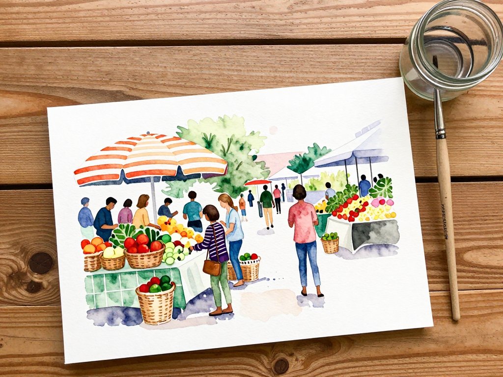
I still remember the first time I tried to paint a farmers market scene. I had spent a lovely Saturday morning wandering through stalls of sun-ripened tomatoes, bundles of lavender, and hand-lettered signs.
Back in my studio, I stared at a blank canvas, my reference photo crammed with about fifty things I wanted to include — the vendor's striped umbrella, a child reaching for an apple, the way the morning light caught the glass jars of honey.
I froze. How was I supposed to fit all of that onto a single canvas without it looking like a jumbled mess?
If you have ever felt that same overwhelm looking at a complex scene — a crowded street, a bustling café, a garden in full bloom — you are in good company.
Painting a crowded scene is one of the most intimidating challenges for beginner and intermediate artists alike.
And yet, it is also one of the most rewarding. A well-composed busy scene draws the viewer in, inviting them to discover something new with every glance.
Here is the good news: you do not need to include everything you see. In fact, the secret to painting a crowded scene lies in knowing what to leave out, where to lead the eye, and how to create a sense of order within the chaos.
I have spent years learning these lessons — often through trial and error — and I am excited to share them with you.
Why Crowded Scenes Intimidate Us
Before we dive into techniques, let us acknowledge the real challenge. A crowded scene presents the artist with an overwhelming number of choices.
Which elements matter most? Where should the viewer look first? How do you handle all those figures, objects, and details without turning the painting into a confusing blur?
Our instinct, especially when we are learning, is to try to paint everything we see.
We worry that if we leave something out, the scene will feel incomplete. But here is the truth that professional artists learn early: a painting is not a photograph.
You are not documenting reality — you are interpreting it. Every element you include should serve a purpose: telling a story, guiding the eye, or creating a mood.
The most crowded and chaotic scenes in the world — a Tokyo crosswalk during rush hour, a Mardi Gras parade, a Christmas market in full swing — can become stunning paintings when handled with intention. The chaos becomes part of the beauty. But getting there requires a few deliberate choices.
Finding Your Focal Point
Every successful painting needs a focal point — the one area where the viewer's eye lands first and returns to. In a crowded scene, choosing a focal point is even more critical because there are so many competing elements.
When I paint a crowded scene, I ask myself one question: what moment do I want the viewer to feel part of?
Sometimes it is a specific interaction, like a vendor handing a flower to a child.
Other times it is a quality of light, like the golden hour glow spilling across a plaza.
That moment becomes my focal point.
Here are some ways to establish a strong focal point:
- Use contrast. The area with the strongest contrast between light and dark naturally draws the eye. If your focal point is a figure in sunlight surrounded by shadowy elements, the viewer will look there first.
- Use color temperature. Warm colors advance; cool colors recede. A small area of warm color — a red umbrella, a golden scarf — can become the focal point even if it is physically small in the composition.
- Use sharpness. The sharpest detail in your painting naturally attracts attention. Keep your focal area crisply defined and let the surrounding elements soften.
- Use leading lines. Arrange elements so they point toward your focal point — the line of a market table, the curve of a street, the angle of a row of chairs.
I once painted a busy train station scene where the focal point was a small child waving goodbye.
Everything else — the crowds, the pillars, the train itself — was secondary. By keeping the child the sharpest, brightest element in the painting, I made sure viewers saw her first, even though she occupied only a tiny portion of the canvas.
The Rule of Thirds and Why It Works
If you have done any reading about composition, you have likely encountered the rule of thirds. It is simple: divide your canvas into a three-by-three grid (like a tic-tac-toe board) and place your most important elements along those lines or at their intersections.
In a crowded scene, the rule of thirds becomes your best friend. It helps you distribute the visual weight of multiple elements across the canvas rather than clustering everything in the center.
Place your focal point at one of the four intersection points. Let secondary elements fall along the grid lines.
The remaining space naturally becomes breathing room.
But here is the nuance that beginners often miss: the rule of thirds is a guideline, not a law.
Once you understand why it works, you can break it intentionally. A symmetrical composition, for example, can be powerful for a crowded scene that is meant to feel formal or ceremonial — think of a procession or a choir.
The key is knowing why you are making the choice.
Creating Depth in a Crowded Scene
A crowded scene that lacks depth feels flat and overwhelming — like a pile of objects rather than a living space. Depth gives the viewer room to breathe and creates a sense of being inside the scene rather than looking at a jumble.
There are three reliable ways to create depth in a busy painting:
Foreground, Middleground, Background
Divide your scene into three distinct planes. The foreground contains elements closest to the viewer — large, sometimes cropped by the edge of the canvas. The middleground holds your focal point and main action. The background provides context — sky, architecture, distant crowds.
In practice, this means you might have a large figure or object in the foreground on the left, the main market scene in the middle, and a soft suggestion of buildings or trees in the background. The three planes work together to create a sense of depth and space.
Atmospheric Perspective
Objects farther away appear lighter, cooler in color, and less detailed. This is called atmospheric perspective, and it is one of the most powerful tools for handling crowded scenes. Keep your background elements soft, muted, and low-contrast. Reserve your brightest colors and sharpest edges for the foreground and middleground.
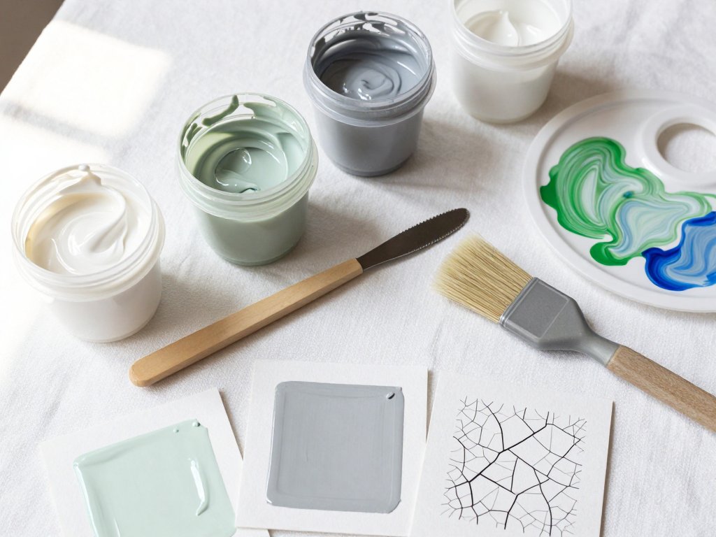
When I paint a crowded street scene, I often mix a tiny amount of white and a touch of blue into my background colors to create that hazy, distant quality. It instantly pushes those elements back, creating space for the more colorful foreground action.
Overlap
Objects that overlap each other create a natural sense of depth. A figure standing partially behind a market stall is clearly behind it. A cart partially obscuring another cart creates layers. When you arrange your elements with intentional overlap, you build depth without any special techniques.
The beginner mistake is to space everything out evenly so that no element overlaps another. This flattens the scene and makes it feel like a crowded lineup rather than a lively space. Do not be afraid to overlap — it is one of the most natural ways to create depth.
Simplifying the Chaos
Here is a lesson I had to learn the hard way: you do not need to paint every single person in a crowd.
In fact, you should not. A crowded scene reads as crowded with far fewer figures than you think.
The suggestion of a crowd — a few well-placed figures with soft, suggested faces — feels more realistic than a dozen meticulously painted individuals.
I call this the "less is more" approach to crowds. Instead of painting twenty people at a market, paint five.
Place them strategically: one in the foreground on the left, one near your focal point, two in the middleground, and one suggestion of a figure in the background.
Your viewer's brain will fill in the rest.
The same principle applies to objects. A market stall filled with a few carefully suggested fruits and vegetables reads as abundant. A shelf with every bottle individually painted reads as cluttered. Trust your viewer to imagine the details.
Using Value to Organize the Scene
Value — how light or dark something is — may be the single most important tool for composing a crowded scene. Before you start painting, squint at your reference and identify three to four distinct value groups: light, medium-light, medium-dark, and dark.
Map these values across your canvas in a deliberate pattern. Typically, your focal point will be in the lightest value area, surrounded by medium values, with dark values framing the edges. This creates a natural spotlight effect that guides the viewer's eye exactly where you want it to go.
I once painted a crowded night market scene where the entire composition was built around this value structure.
The focal point — a lantern vendor — was the brightest area, surrounded by medium-dark crowds and framed by deep shadows at the edges.
Viewers told me their eyes went straight to the lanterns, even though there were dozens of other elements competing for attention.
Color Strategies for Busy Compositions
Color can either unify a crowded scene or make it feel chaotic. The key is restraint. Here are three color strategies that work beautifully for busy compositions:
Limited Palette
Choose three to five colors and mix everything from them. A limited palette forces harmony because every color in your painting shares a family relationship.
For a farmers market scene, you might choose a warm red, a cool blue, a yellow, and white.
All your greens become a mix of blue and yellow. All your browns are red and yellow with a touch of blue.
Everything ties together.
Color Temperature Grouping
Group warm colors together in your focal area and cool colors in the periphery. Alternatively, do the reverse for a cool, moody focal point in a warm scene. The contrast between temperature zones creates visual interest and guides the eye naturally.
Grayscale Test
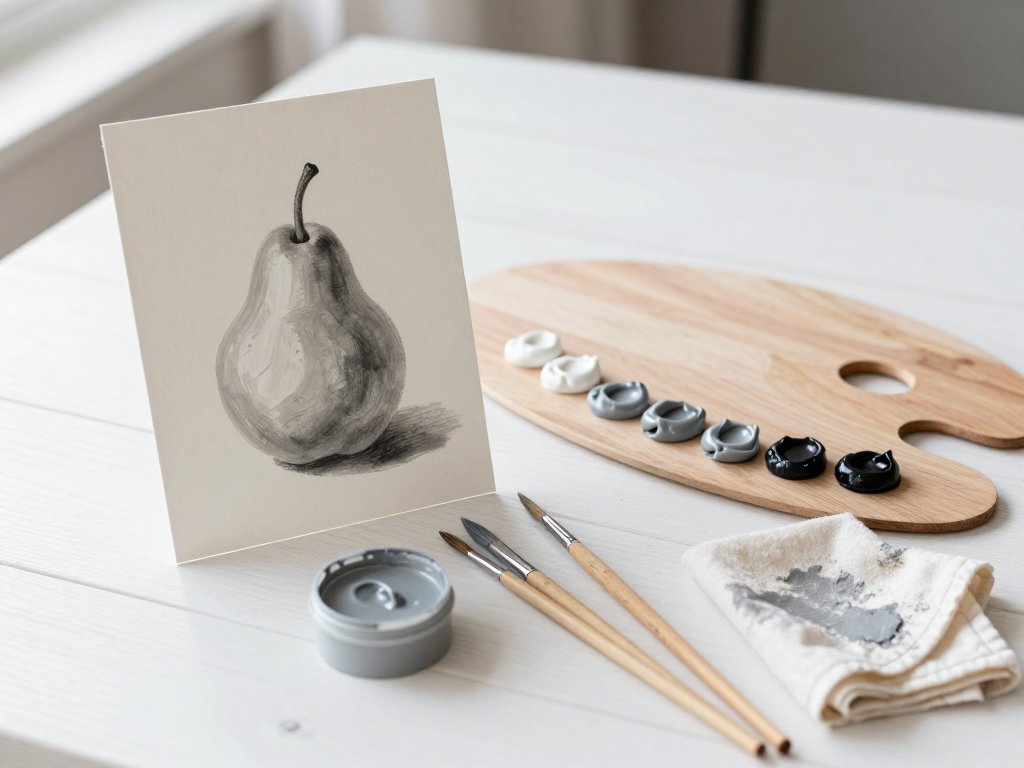
Before committing to a full-color composition, paint a small grayscale version of your scene. If it reads well in black and white — if the values are clear and the focal point stands out — your color version will be that much stronger.
This test has saved me from countless muddy, confusing compositions.
Edges: The Secret Weapon
Edge quality is one of those advanced techniques that transforms a painting from good to stunning. In a crowded scene, varying your edges creates a sense of depth and movement. Hard edges bring elements forward; soft edges push them back.
Here is how to apply it: keep your focal point edges crisp and defined. As you move away from the focal point, gradually soften your edges.
Figures in the background can be painted with a soft, blurry edge that suggests their presence without demanding attention.
This mimics how our eyes actually see — we focus on one thing at a time, and everything else is slightly out of focus.
I learned this technique from painting in public parks, where I was forced to work quickly before the light changed.
I discovered that if I painted the children on the swings with hard edges and let the surrounding trees and benches dissolve into soft, blurry shapes, the painting felt alive and focused.
The hard edges anchored the scene; the soft edges created atmosphere.
Practical Exercise: Paint a Five-Figure Crowd
Here is an exercise I give to students who want to practice crowded scenes without feeling overwhelmed. Find a reference photo of a busy outdoor market, a train platform, or a festival. Now paint only five figures:
- Figure 1 (foreground) — Large, cropped by the canvas edge on one side. This figure establishes the viewer's position within the scene.
- Figure 2 (focal point) — The main subject. Place this figure at one of the rule-of-thirds intersections. Make this figure the sharpest and most detailed.
- Figure 3 (supporting) — A figure interacting with or near the focal point. This could be someone handing something to the main subject or standing nearby.
- Figure 4 (middleground) — A less detailed figure, smaller, placed in the middleground to create depth.
- Figure 5 (background suggestion) — Just a suggestion of a figure — a soft shape with no detail. This hints at the larger crowd beyond.
Paint these five figures with attention to value, color temperature, and edge quality. Leave the rest of the canvas as soft, suggested elements — buildings, trees, stalls, or sky. You will be amazed at how convincingly crowded the scene feels with just five intentional figures.
From One Artist to Another
I have been painting crowded scenes for over a decade, and I still feel that flutter of uncertainty when I start a complex composition.
But I have learned to trust the process. I begin with a rough value sketch.
I identify my focal point. I decide which elements to include and which to leave out.
And I remind myself that a painting is not about reproducing everything I see — it is about sharing how a moment felt.
The farmers market painting I mentioned at the beginning? It is still one of my favorites, even though I painted only a fraction of what was actually there.
I chose the striped umbrella, the child reaching for an apple, and the honey jars catching the light.
Everything else faded into soft, warm suggestions. And when people look at it, they do not say, "You left out the pickle stall." They say, "I feel like I am there."
That is the magic of painting a crowded scene. You are not a documentarian — you are a storyteller.
You get to decide what matters, what the viewer sees first, and what lingers at the edges.
And with a little practice and a few intentional choices, you can turn even the busiest, most chaotic scene into a painting that feels spacious, inviting, and full of life.
So grab your brush, find a crowded reference that excites you, and give it a try. Start with five figures. Use the rule of thirds. Let your edges soften. And remember: you are in control of the chaos.