Introduction
The first face I ever painted came out grey. Not a moody, shadowed grey, but a flat, chalky grey, like dishwater left in the sink overnight.
I was nineteen, home from my first year of college, and I had decided to paint a portrait of my mother from a photograph.
I remember the tubes lined up on the kitchen table, borrowed from my grandmother's wooden paint box. She had kept them for thirty years, and the caps were stiff with dried paint.
One tube was labeled simply "flesh." I thought that was the entire secret. Flesh paint for flesh, the way green paint is for leaves.
I squeezed out a worm of it, added a little black for the shadows, and went to work with great confidence.
Two hours later I had a face that looked like a paper mask. Grey, lifeless, and somehow smaller and flatter than the woman I was trying to paint.
My grandmother studied it for a long time. Then she said, "Skin isn't a color, sweetheart. It's a temperature."
She was right, though it took me a decade of muddy canvases to hear it. The tube had done nothing wrong. My thinking had.
I had been searching for one perfect color, a single answer to a question that never had one. Skin, it turns out, is a relationship between colors.
I did not understand her for years. I filed it away with the other mysterious things adults say, and kept painting badly.
This article is the explanation I wish someone had handed me that summer, along with a clean glass of water and a softer brush.
Why Skin Is Never One Color
When a beginner looks at a face, they usually see beige. That single word is the root of most disappointing portraits.
Beige is an average, and no living face is an average. A face is a landscape of light and shadow, and every part of it sits at a different temperature.
Put simply, skin is a temperature problem before it is a color problem. Warm light against cool shadow, or cool light against warm shadow, is the whole game.
Look at the side of a nose in daylight. The plane catching the light is often quite orange, almost coral.
The shadow just beside it is often a soft blue-violet. Neither patch is "flesh" on its own, yet together they read as a nose.
There is also the reflected color all around a face. A green wall throws green into a cheek. A red sweater lifts warmth into the jaw.
Outdoors, a wide blue sky cools the top of the head and the brow. Indoors, a lamp makes one side golden and the other side dull.
These reflections are quiet, but the eye notices them instantly. When you leave them out, the skin looks dead and pasted on.
Skin also glows from underneath. Ears, fingers, the tip of the nose, and the corners of the eyes all show more red because the blood is close to the surface.
That living red is the secret warmth you are chasing. It is why a faithful portrait sometimes looks more alive than a photograph.
Pay attention to whether a face is olive, golden, ruddy, or ashen. Those words describe temperature as much as they describe color.
An olive complexion carries a quiet green undertone, which you can flatter with a hint of ochre and a whisper of blue.
A ruddy complexion holds more red in the cheeks, nose, and ears. Keep those areas warmer than the forehead and jaw.
This is also why portraits and figure drawing both train you to see temperature instead of labels.
You stop asking "what color is this arm?" and start asking "is this arm warmer or cooler than the patch next to it?"
The Three Colors You Actually Need to Start
You do not need a rack of flesh tones with names like "sun-kissed almond." You need a red, a yellow, and a blue, plus white.
My own starting trio is burnt sienna, yellow ochre, and ultramarine blue, with titanium white for lifting.
That set is cheap, forgiving, and can suggest almost every complexion on earth. It also teaches you more than any pre-mixed tube ever will.
Burnt sienna is a warm, earthy red with a touch of brown. Yellow ochre is a soft, muted yellow that never shouts.
Ultramarine is a deep, slightly violet blue. A little of it neutralizes orange without dragging the mix toward mud.
Together those three make a believable mid-tone. The order matters more than the exact amounts.
- Squeeze out a pea-sized blob of burnt sienna and a pea of yellow ochre, side by side on your palette.
- Pull them together with your knife until you have a soft, dusty orange.
- Add a sliver of ultramarine, roughly a quarter of the orange amount, off to one edge.
- Mix gently and watch the orange settle into a warm neutral. Too much blue and it turns green-grey.
- Add a touch of titanium white to lift the mix toward the lighter mid-tone of a face.
- Test the color on a scrap of canvas before it ever touches the portrait.
That is your base flesh: a warm, dusty peach. It should not look like a tube label. It should look like skin in soft light.
Now compare it honestly against your photograph or the person in front of you. Mixing is a conversation, not a formula.
If your subject reads too pink, add a whisper of ochre. If they read too yellow, add a whisper of sienna.
For a ruddier, more florid complexion, introduce a scrap of cadmium red light. It adds a healthy flush without turning orange.
For deeper skin tones, add raw umber or a touch of alizarin crimson to the base rather than simply darkening it with black.
Keep notes as you go. A tiny notebook of ratios will teach you faster than any tutorial, mine included.
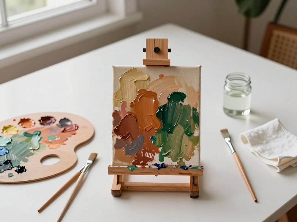
An easy way to learn your pigments is to paint a simple strip of swatches on scrap canvas. Start with your base, then warm it step by step to the right.
On a second strip, cool the same base step by step. Within an afternoon you will know exactly how much blue it takes.
That small exercise builds more confidence than reading ten chapters. Your hand remembers what your eyes learn.
Mixing Warm and Cool Skin Tones
Once you have a base mix, you can shift it in any direction without ever starting over.
Warm skin leans orange, red-yellow, or golden. Think of a cheek glowing after a walk on a cold morning.
Cool skin leans blue or pink. Think of the pale, porcelain dignity of a portrait painted under overcast light.
To warm a mix, add a touch of burnt sienna or a scrap of cadmium red. A little goes a very long way.
To cool a mix, add a touch of ultramarine or a cooler red such as alizarin crimson.
Both moves change the same puddle. You are tuning one instrument, not buying a new one every time the light shifts.
A lovely practice is to keep three puddles on the palette: a warm version, a neutral version, and a cool version of the same family.
Then paint with all three at once. Warm where the light strikes, cool in the shadow, neutral across the turning planes.
You will notice that pure white cools a color as it lightens it. That is why highlights mixed only with white look chalky and cold.
So warm your whites. Add a breath of yellow ochre or a speck of sienna to the highlight so it stays alive.
Now comes the rule that matters most of all. Never add black to shade skin.
Black kills temperature. It drags skin toward grey mud, exactly like the sad little portrait I painted at nineteen.
Instead, darken with a complement or a cool blue-violet. A little ultramarine into your orange base makes a rich, living shadow.
A mix of burnt umber and a blue will also work. These shadows feel like they sit inside the skin rather than painted on top of it.
You can push a shadow cooler or warmer without making it darker, simply by shifting its temperature. Dark and cool is not the same as dark and dead.
Value controls how light or dark a patch is. Temperature controls whether it feels alive. Keep the two ideas separate.
A common trap is to cool a shadow by adding more blue until it turns purple-grey. Stop while it still feels like skin.
When in doubt, compare two patches side by side. Warm and cool only mean anything in relation to a neighbor.
Paint One Simple Face
Let's paint a single head, facing forward, from a photograph. Keep it small — a few inches across is plenty for a first try.
The goal is not a masterpiece. The goal is to feel how three puddles of paint can build a living face.
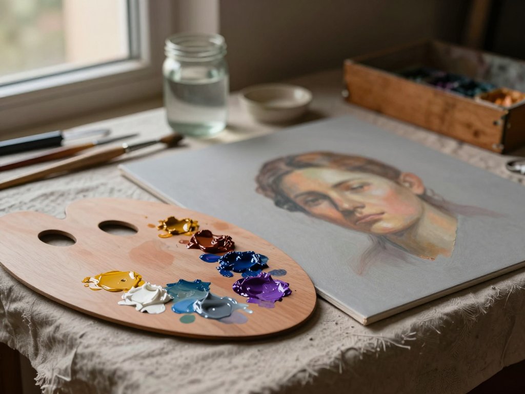
Work on a toned canvas or a mid-grey board. A bright white surface tempts beginners to paint everything too light and too chalky.
Set your photograph beside the easel at the same height as your canvas. Squinting at it will help you see the big shapes.
- Block in the shape of the head with your neutral mid-tone. Keep it simple — a rounded oval, nothing fussy.
- Add the neck and shoulders in the same flat tone. Do not worry about features yet.
- Mix a cooler, darker version of your base for the shadow side. Use ultramarine or blue-violet, never black.
- Place the shadows as one connected shape: under the brow, beside the nose, under the jaw, and down one side of the face.
- Mix a warmer, lighter version for the highlights — your base plus white plus a touch of sienna or ochre.
- Place highlights on the forehead, the top of the cheekbone, and the bridge of the nose. Keep them small and fussy-free.
- Step back and soften the edges only where the light turns. A hard edge reads as a plane change; a soft edge reads as a curve.
- Save your sharpest edges for the shadow shapes that describe the form, such as the edge of the jaw against the neck.
That is the whole method: mid-tone, then shadow, then light, then edges. Four moves, repeated forever.
If you remember only one thing from this section, remember the order. Flat shape first, light last.
Resist the urge to paint eyes and lips early. They are small details that sit on top of a form, not the form itself.
When the big shapes feel solid, only then add the features. They will fall into place almost by themselves.
Practice this sequence five times on five different faces. Repetition teaches more than perfection ever will.
If a first attempt looks flat, it usually means the shadows were too close in value to the light. Push the contrast a little.
If it looks harsh, the edges were too hard. Soften one or two turns and the whole face will settle.
Common Beginner Mistakes
Almost every disappointing portrait I have seen makes one of a few familiar mistakes. Here they are, so you can catch them early.
- Using a single tube of "flesh" color straight from the tube. It is an average, and averages look lifeless on a real face.
- Shading with black. It greys the warmth out of skin and makes shadows feel dirty instead of deep.
- Over-blending until everything goes grey. Endless brushing muddies the temperature until warm and cool simply cancel out.
- Ignoring the background color. A green wall or a red cushion reflects into the skin, and leaving it out makes the face look cut out and pasted on.
- Painting the whole face one temperature. Real skin shifts from warm to cool across the form, even within a single cheek.
- Making shadows too dark, too fast. Skin shadows are usually much closer to the mid-tone than beginners expect.
- Painting the white of the eye pure white. It picks up the skin, the light, and the shadow around it, so keep it soft and tinted.
- Chasing a photograph instead of a feeling. The camera flattens temperature, and copying it faithfully can look colder than life.
Each of these mistakes has the same cure: look harder, mix slower, and trust temperature over labels.
If a mix goes wrong, do not scrape it away in frustration. Add a touch of one color and see where it takes you.
Small corrections in the same puddle are how you learn what each pigment actually does. Nothing is wasted.
My grey first portrait taught me more than a hundred tidy ones ever could. Be kind to your early failures.
A Slow, Forgiving Practice
Portrait painting is a slow art, and that is a comfort rather than a flaw.
You can leave a face half-finished for a week, come back with fresh eyes, and see instantly which temperature is wrong.
A wet painting forgives you. Colors blend, edges soften, and a heavy-handed morning can become a tender afternoon.
Nobody is watching the clock except you. There is no deadline on learning to see.
Start with one face and one small palette. Burnt sienna, yellow ochre, ultramarine, and white will carry you further than you think.
Mix a mid-tone, warm it, cool it, and let the shadows stay colorful instead of grey.
Then paint the same face again next month. The difference will surprise you, because your eye will have grown even when your hand feels unsure.
Skin is not a color you buy. It is a quiet conversation you have, slowly, with warm and cool, light and shadow.
Pull up a chair, squeeze out a little paint, and begin. The faces you love are worth the patience.