Introduction
My grandmother kept a small watercolor of the sea on her hallway wall. It was nothing fancy, just a strip of blue-gray water beneath a pale sky, but I could stare at it for ages.
She painted it in her sixties, the summer she first lived near the coast, and she always said the ocean taught her more about painting than any class ever did.
I did not understand that until I tried a seascape myself. There is something about water that forgives a beginner. The sea moves, it shifts, it never looks the same twice, so your painting does not need to be perfect. It just needs to feel like water.
That is the gift of watercolor seascapes. You do not need to draw a perfect boat or a realistic figure.
You need sky, water, and a few simple shapes, and the paint does the rest of the work for you.
In this guide, I will walk you through the basics with the same gentle approach my grandmother would have used: simple washes, simple waves, and plenty of room to play.
Why Watercolor Loves the Sea
If you are new to watercolor, seascapes are one of the kindest subjects to start with. Here is why this pairing works so well.
Water paints water. The medium itself behaves like the subject. Wet-on-wet washes create soft, blurry edges that look exactly like a hazy horizon or a distant swell. You are not fighting the paint; you are working with its natural personality.
Mistakes look like weather. A bloom or a runny patch that would ruin a portrait simply looks like fog or spray in a seascape. I have turned many accidents into clouds, and honestly, some of them were my favorite parts of the painting.
The composition is forgiving. A horizon line, a band of water, and a little foreground interest are all you need. Even a very simple layout reads clearly as a beach or an ocean view, so you can focus on enjoying the paint rather than worrying about accuracy.
You can paint from memory or imagination. No model, no photo, no setup required. Close your eyes, think of the sea, and begin. That freedom is rare in art, and it makes seascapes a wonderful evening hobby.
If you have been hesitating because the ocean feels too big or too hard to capture, let this reassure you: you only need to capture a feeling, not the whole ocean.
What You Will Need
Here is the good news: you probably already own most of this. Watercolor seascapes need very little.
- Watercolor paper. Any 140 lb (300 gsm) cold-press paper works well. A pad of at least nine by twelve inches gives you room to play.
- A basic palette. You do not need dozens of colors. Ultramarine blue, cerulean blue, a warm yellow, and a touch of burnt sienna will mix into every sea and sky you could want.
- Two brushes. A large round brush for washes, around a size twelve, and a smaller one, around a size four, for details.
- Two jars of water. One for rinsing and one for clean water. It sounds fussy, but it keeps your colors from muddying.
- Paper towels. For lifting paint, blotting, and cleaning up happy accidents.
- Masking fluid or artist's tape. Optional, but lovely for keeping a white horizon or foam line clean.
That is genuinely all you need. A seascape is one of the least equipment-hungry painting subjects there is, which makes it perfect for a busy evening at the kitchen table.
The Two Washes That Do All the Work
Before we paint any waves, let us practice the two techniques that carry almost every seascape. Both are simple enough to learn in one sitting.
Wet-on-wet. Wet your paper with clean water, then drop color into the damp surface. The paint spreads and bleeds into soft-edged shapes. This is how you paint skies, distant water, and that hazy line where sea meets sky. The wetter the paper, the softer and blurrier the result.
Wet-on-dry. Paint directly onto dry paper. The color stays where you put it and dries with crisp edges. This is how you paint a sharp horizon, the curl of a wave, or a boat silhouette against the sky.
Almost every seascape is a conversation between these two approaches: soft wet-on-wet for the background, crisp wet-on-dry for the foreground details. Once you feel the difference between them, you can paint any sea scene you can imagine.
Take ten minutes to play with both on a scrap sheet before you start. Mix blues with a little yellow for a green-gray sea tone, or add a touch of burnt sienna for a warmer, sandier water color. Notice how the same color looks different on wet and dry paper.
Start with the Sky: Simple Skies First
The sky sets the mood for the whole painting, so begin there, and keep it simple. A complicated sky is not necessary. In fact, simple skies often look the most like real mornings by the sea.
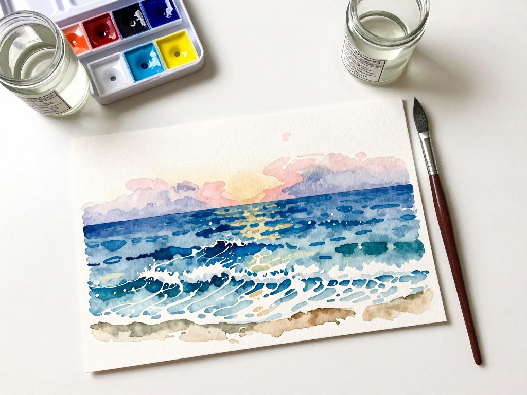
A calm sky. Wet the top third of your paper with clean water. Touch in a pale wash of cerulean blue, leaving the area near the horizon nearly white. Let the color drift downward on its own. That gentle fade is exactly what a hazy coastal sky looks like.
A sunset sky. While the paper is still damp, drop in a band of warm yellow near the horizon, then a band of soft orange above it, and let a little rose or pink meet the blue at the top.
Do not stir them together; let the water blend them naturally. Sunsets are the most forgiving skies because they are supposed to be soft.
Clouds. If you want clouds, blot a damp paper towel gently into the still-wet sky to lift out a few soft shapes. The paper's white shows through as cloud. Less is more here. Two or three clouds make a sky feel real; a dozen make it feel busy.
Remember to leave your horizon line area pale. The brightest part of a coastal sky is almost always just above the water, and keeping that light is what makes the sea look luminous.
Painting Waves: The Basic Wave Shape
Now for the part everyone worries about: the waves. Let me show you a simple shape that reads as a wave every time, even when it is a little wobbly.
Step 1: Lay in the water. Paint a band of mid-tone blue across the lower two-thirds of your paper with a wet-on-wet wash. Leave a few small white gaps where foam will go later.
Step 2: Paint the wave bodies. With your smaller brush, paint short curved strokes of darker blue where you want each wave. Think of them as little hills of water with a rounded top and a flatter base. They do not need to match each other; real waves never do.
Step 3: Add the curl. On a few waves, paint a small hook of darker color at the top edge. This little curl is what makes a flat shape suddenly read as a breaking wave. Even three or four curls across the whole painting make it feel alive.
Step 4: Soften the bases. While the paint is still damp, run your clean brush along the bottom of each wave with plain water. This blurs the base into the sea and makes the wave look like it belongs in the water rather than sitting on top of it.
That is the whole trick. Rounded tops, a few curls, softened bases. Once you paint one wave you are happy with, you will find yourself adding more everywhere.
Foam and Highlights: Let the White Paper Work
Here is the secret that makes beginner seascapes look professional: you do not paint the foam. You protect the paper and let the white show through.
Plan your whites. Before you lay your first wash, decide where the white foam will be: the crest of a wave, the line where water meets sand, the glint on a calm sea. Leave those areas dry and paint around them.
Lift with a paper towel. If you lose a white area, blot it while the paint is still damp with a clean, dry paper towel. Press gently and lift. The paint transfers to the towel and the white returns, softer and more natural than paint could ever be.
Scrub back with a clean brush. For stubborn paint, wet a clean brush, gently scrub the area, and blot with a towel. This works on damp paper and on dried paint, though it is gentler on the paper when the paint is still fresh.
Add sparkle last. Once everything is dry, you can add tiny dots of white gouache or thick white watercolor for sea spray. Use them sparingly, like salt on a meal. A scattering of dots across the wave crests is all it takes.
The white paper is your brightest light. Trust it, protect it, and your water will sparkle without you painting a single highlight.
Beach Scenes: Sand, Sea, and a Simple Horizon
Once you can paint water, add a little land and you have a full beach scene. The same washes do all the work, with just a few extra touches.
Sand. Paint a soft wash of warm color, a mix of yellow ochre and a touch of burnt sienna, across the bottom of the paper.
Keep the edge where it meets the water slightly uneven, as if the tide has nibbled at it.
A thin white line of foam along that edge makes the sand and sea separate beautifully.
A simple horizon. Your horizon can be a single crisp line of darker blue where the sea meets the sky, painted wet-on-dry after your sky has dried. A perfectly straight line is not required; a slight softness there looks like haze and distance.
Foreground interest. A few simple shapes give the eye somewhere to rest: a seashell, a piece of driftwood, a distant sailboat, or the silhouette of a child building a sandcastle. Keep them loose and small. Two or three shapes are plenty.
Wet sand reflection. If your beach has a stretch of wet sand near the water, mirror the sky colors there in a pale wash. Wet sand always reflects the sky, and painting that reflection is what makes a beach scene feel grounded and true.
Beach scenes are the perfect second project after plain seascapes. They use every skill you have learned so far, and they make wonderful cards for family and friends.
Three Easy Seascape Projects to Try This Week
If you would like a little structure, here are three projects that build on each other. Start with the first and see how far you get.
Project 1: Sunset over calm water. A wet-on-wet sunset sky, a pale horizon, and a band of water that mirrors a few sunset colors. This takes about twenty minutes and is almost impossible to get wrong.
Project 2: Three gentle waves. A pale sky, a band of mid-tone sea, and three simple waves with curls and foam, arranged across the middle of the painting. This is where you practice the wave shape until it feels natural.
Project 3: Beach with a lighthouse. Your favorite sky, a strip of sea, a soft line of sand, and a small lighthouse silhouette on the horizon.
Keep the lighthouse dark against a light sky, and add one tiny light dot in its window.
This one makes a gorgeous gift for someone who loves the coast.
Each project teaches the same few skills in a new combination. By the end of the week, you will have three small seascapes and a much braver hand.
Common Beginner Fears and How to Handle Them
Every watercolor beginner I know carries the same quiet fears. Let me gently set them down for you.
"I cannot draw." You do not need to. Seascapes are made of washes and shapes, not drawings. If you can paint a band of color, you can paint the sea.
"I will ruin the paper." Paper is made to be painted on, and mistakes are how you learn. Buy an inexpensive pad for practice and give yourself permission to fill it with imperfect waves. That pad is your playground, not your portfolio.
"My colors look muddy." Muddy color usually means too many colors mixed in one place, or a dirty brush. Use your clean water jar, rinse often, and limit each wash to two or three colors. Your blues will stay fresh and clear.
"It does not look like the photo." It is not supposed to. It is supposed to look like the sea felt to you. A painting that captures a mood is worth more than a copy of a photograph, and the people you share it with will feel that difference.
Every painter who ever loved the sea started exactly where you are now. The waves in their first paintings were wobbly too. They kept going, and so will you.
Framing and Sharing Your Seascape
Do not let your seascapes sit in a drawer. These paintings are made to be seen, and seeing them on a wall changes how you feel about your own work.
Frame the ones you love. A simple frame with a white mat makes even a small, loose watercolor look like gallery art. Thrift stores and discount home stores are full of affordable frames; a mat does most of the work.
Send them as gifts. A hand-painted seascape makes a deeply personal card for a birthday, an anniversary, or a thank-you. People keep handmade art in ways they do not keep store-bought cards.
Keep a practice wall. Pin up your seascapes side by side, oldest to newest. Watching your own progress is one of the most motivating things in art. Six weeks from now, you will look back at your first wave and smile.
Paint from your own memories. The best seascapes are personal. Paint the beach you visited as a child, the view from a favorite holiday, or the sea your grandmother loved. Those paintings carry stories, and stories are what make art matter.
Final Thoughts
My grandmother's little seascape still hangs in my hallway, and now I understand exactly what she meant about the ocean teaching her to paint. The sea does not demand perfection. It asks only that you show up with a brush and an open heart.
Start with a simple sky and a simple wash. Let the paint be soft and the waves be wobbly. Give yourself the same kindness the ocean offers: room to move, room to change, room to begin again.
When your first seascape is dry, hold it up and remember this moment. This is where every sea painter starts, right here at the kitchen table with a jar of water and a quiet afternoon.
Paint something blue this week, and send a little of the ocean out into the world. I think my grandmother would have loved that.