Introduction
I still remember the summer I discovered colored pencil layering. It was late July, the kind of afternoon so hot the air felt thick and syrupy.
My grandmother sat on the porch swing, a pad of drawing paper balanced on her knee, working on a sketch of the zinnias blooming along the fence.
I was maybe twelve, bored and restless, and I asked if I could try. She handed me a single pencil — a soft, buttery yellow — and said, "Start light.
You can always add more."
That simple sentence became my compass for every drawing I have made since. Colored pencil layering is one of those techniques that sounds technical but feels intuitive once you try it.
There is something deeply satisfying about watching pale washes of color build into rich, luminous petals, each layer adding depth and light.
And the best part? You do not need expensive supplies or a studio. Just a few pencils, some paper, and a quiet afternoon.
In this tutorial, I will walk you through the fundamentals of colored pencil layering with a project that feels like summer on the page: a cheerful zinnia blossom.
Whether you are brand new to drawing or returning after years away, this project is designed to meet you where you are.
We will work through the techniques slowly, with plenty of room for imperfection. Because as my grandmother liked to say, "Every flower blooms differently, and that is what makes them beautiful."
Why Colored Pencil Layering Works So Well for Summer Florals
Summer flowers are the perfect subject for learning layering because they are naturally vibrant and forgiving.
Sunflowers, zinnias, coneflowers, and marigolds grow in bold, saturated colors that respond beautifully to the translucent quality of colored pencil on paper.
Unlike watercolor, where you commit to a mark immediately, colored pencils let you build confidence gradually.
You can start with the faintest whisper of a petal and strengthen it over several passes, deciding as you go how intense you want each color to be.
The science behind the magic is straightforward. Colored pencil pigment is semi-transparent. When you apply it in light layers, the white of the paper shines through, giving your colors a luminous, glowing quality.
Each new layer interacts with the ones beneath it, blending optically rather than physically. This is why layering produces richer, more vibrant results than pressing hard with a single color — you are creating depth, not just coverage.
For summer florals, this technique is especially rewarding because flowers have natural variation in tone.
The shadowed curve of a petal, the golden warmth where sunlight hits, the deep maroon at the center — all of these can be achieved with stacking layers of complementary colors.
It feels almost like gardening on paper, planting seeds of color and watching them grow.
What You Will Need
One of the things I love about colored pencil work is how accessible the supply list is. You probably have most of these items already, and the ones you do not are easy to find at any craft store or online. Here is what I recommend for this project:
Colored pencils. A basic set of 12 to 24 pencils is plenty for this tutorial.
Brands like Prismacolor Premier, Faber-Castell Polychromos, or even Crayola for beginners all work well. The key is having a range of warm tones: yellows, oranges, pinks, reds, and several greens for the stem and leaves.
You will also want a white pencil for blending and a very light cream or pale yellow for underpainting.
Paper. Choose a smooth, heavy paper designed for colored pencil. Bristol board, vellum finish drawing paper, or a multimedia sketchbook with at least 90 lb weight are excellent choices.
The smooth surface allows for even layering and prevents the paper texture from overwhelming fine details.
That said, if all you have is printer paper, do not let that stop you — I drew on notebook paper for years, and it taught me to be gentle with my strokes.
Blending tools. A colorless blender pencil is wonderful for smoothing layers and creating seamless blends. You can also use a tortillon (paper blending stump), a cotton swab, or even your finger for subtle smudging. Each tool gives a slightly different effect, and experimenting is half the fun.
Reference photo. Find a clear photograph of a summer flower you love — a zinnia, a sunflower, a rose, or even a dandelion.
Print it in color or keep it open on your phone. Having a reference helps you see where the light falls and which colors appear in the shadows.
Optional extras. An eraser pencil for lifting small highlights, a sharpener with a good blade, and a soft brush for dusting away eraser crumbs. These are nice to have but absolutely not required.
The Three Foundation Techniques of Layering
Before we begin the project, let me introduce you to three techniques that form the backbone of colored pencil layering. Think of these as your basic stitches — once you practice them a few times, they will become second nature, and you will use them in every drawing you create.
Light Pressure Layering
This is the most important technique in the entire tutorial, so let me say it again with emphasis: start light.
Hold your pencil near the back, away from the tip, and let your strokes fall with the gentlest touch you can manage.
The goal is a soft whisper of color on the paper, not a solid mark.
You want to see the tooth of the paper through the first layer. If you press hard on the first pass, you will flatten the paper's surface and make it impossible to add more layers on top.
Grandmother's rule: you can always add more, but you cannot take away.
Practice on a scrap piece of paper. Shade a small square with the lightest pressure you can manage, then another square with medium pressure, then one with firm pressure.
Notice how the light layer looks almost translucent, while the firm layer is waxy and solid.
For layering, you will use light and medium pressure almost exclusively. Save firm pressure for tiny accent details at the very end.
Burnishing
Burnishing is the art of pressing hard with a light or colorless pencil to blend your layers together into a smooth, polished finish.
It is typically done near the end of a drawing, after you have built up several layers of color.
When you burnish, the wax binder in the pencil melts slightly from the pressure, creating a glossy, paint-like surface.
This technique is what gives professional colored pencil drawings their luminous, rich quality.
Use a white pencil or a colorless blender for burnishing. Apply firm, even pressure in small circular motions, working over the area you want to smooth.
You will see the colors blend and soften before your eyes. Burnishing works best on areas where you want a smooth, saturated look — the sunny face of a petal, for instance.
Reserve it for your final or second-to-last layer, because once you burnish, the paper's tooth is filled and you cannot add more color on top.
Hatching and Cross-Hatching
Hatching is a series of parallel lines that create tone and texture. Cross-hatching adds a second set of lines in the opposite direction.
This technique is wonderful for suggesting the delicate veining in flower petals or the fibrous texture of leaves.
It also creates beautiful optical blends when you hatch one color over another — from a distance, the eye mixes the two colors together.
For flower petals, try hatching in the direction the petal grows, curving your lines slightly to follow the contour.
For leaves, hatch outward from the center vein. Cross-hatching with a complementary color over a base layer creates depth without needing a third color.
A pale blue cross-hatch over a warm pink, for instance, produces a soft lavender shadow.
Project: A Summer Zinnia in Five Layers
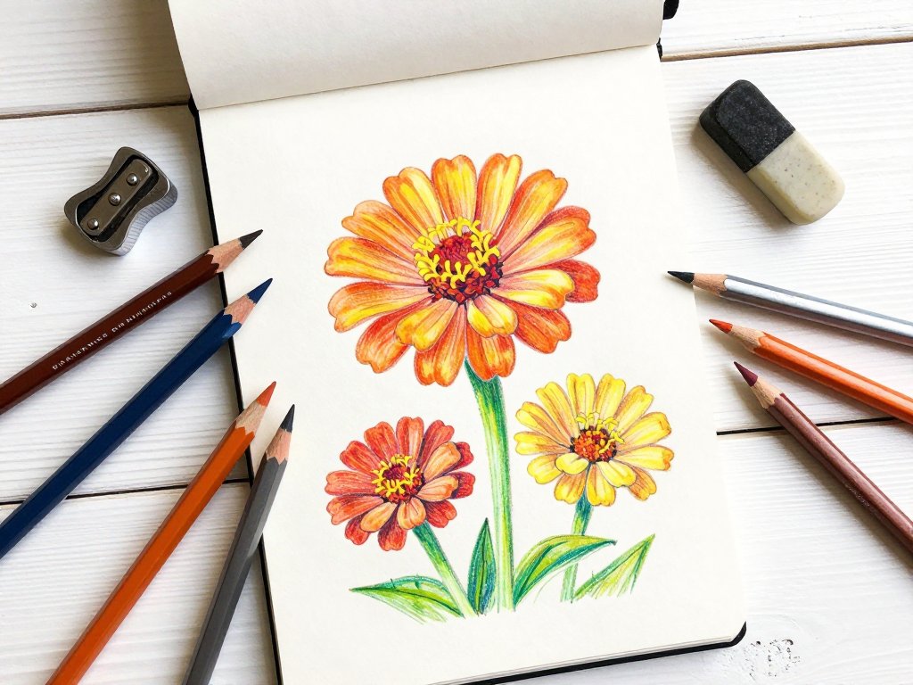
Let us put these techniques to work with a step-by-step project. I chose the zinnia because it is such a cheerful, forgiving flower.
Its petals overlap in lovely layers, which gives you plenty of opportunities to practice the techniques we just covered.
Take your time with each layer — this is not a race. The magic happens gradually, and rushing is the fastest way to lose the delicate quality that makes colored pencil work so beautiful.
Layer One: The Underpainting
Begin with your lightest pencil — a pale yellow, cream, or very light peach. Using the lightest pressure you can manage, sketch the basic shape of your zinnia: a circle or oval for the flower head, with a small dark circle in the center and a curved stem descending.
Do not worry about individual petals yet. Think of this first layer as a map, a gentle suggestion of where things will go.
Once your basic shapes are in place, begin adding a light wash of color to the petal areas.
Use small, circular motions or very light hatching to deposit a thin film of pale yellow over the entire flower head.
This underpainting will serve as the luminous base for all the layers to come. It is the sunlight shining through the petals.
For the leaves and stem, use a very light green or olive. Keep everything soft and sketchy. If you can see the pencil strokes, that is fine — they will be covered by subsequent layers. The goal is simply to establish the overall composition and begin building color.
Layer Two: Defining the Petals
Now switch to your mid-tone colors. For a warm zinnia, this might be a medium yellow, a soft orange, or a warm pink.
Begin defining the individual petals by drawing their shapes more precisely. Use light to medium pressure, and let your strokes follow the direction of each petal.
A zinnia's petals radiate outward from the center, so imagine your pencil moving from the center of the flower outward toward the edge.
At this stage, leave small gaps between petals and don't worry if the edges are uneven.
Flowers are organic, and slightly irregular edges make your drawing feel natural. Pay attention to your reference photo: which petals overlap others?
Which parts of a petal are in shadow? Add slightly more pressure in the shadow areas and lighter strokes in the highlights.
Start suggesting the dark center of the flower with a burnt umber, dark brown, or deep maroon. Keep this area loose for now — you will build it up in later layers.
Layer Three: Adding Depth and Shadow
This is where your flower begins to come alive. Take your darker colors — deep orange, crimson, burgundy — and add them to the shadow areas of each petal.
Look at your reference photo again. Where is each petal darkest? Usually it is near the center of the flower, where petals overlap, or at the base of each petal where it emerges from the center disk.
Use small, tight circular motions or short hatched lines to deposit color in these shadow areas.
Blend the dark color into the mid-tone with a light touch, creating a smooth gradient from dark to light.
This is the layering technique at its finest: you are stacking semi-transparent films of color that combine to create depth.
The pale yellow underpainting should still be visible at the tips and lighter areas of each petal.
For the leaves, add a darker green or even a touch of deep blue-green to the underside and the areas where leaves overlap. The contrast between light and dark on the leaves gives your drawing a three-dimensional feel.
Layer Four: Refining and Highlighting
Take a step back and look at your drawing. What areas feel flat or unfinished?
This is the layer where you add final color adjustments. Perhaps a petal needs a touch more orange at its base, or the center needs another layer of deep burgundy to feel rich and velvety.
Add these final color layers with light to medium pressure, always following the natural contours of the flower.
Now it is time for highlights. Use a white pencil or a very light cream to add bright spots where the light hits each petal most directly.
These highlights give the flower a dewy, fresh appearance. Apply the white with medium pressure in small circles, blending it gently into the surrounding color.
If you are using a colorless blender, this is also a good point to smooth any areas where the pencil strokes feel too visible.
For the center of the zinnia, add tiny dots of dark brown, black, and a touch of warm yellow to suggest the textured seed head. A fine-tipped pencil works best for this — sharpen carefully and make small, varied dots rather than uniform circles.
Layer Five: Burnishing and Final Details
This is the finishing layer. Select the areas you want to appear smooth and glossy — typically the most vibrant parts of the petals.
Using a white pencil or colorless blender, apply firm, even pressure in small circles. This burnishing action melts the wax layers together, creating a polished, paint-like finish.
The effect is stunning: colors that were already layered become luminous and saturated.
Do not burnish the entire drawing. Leave some areas with visible pencil texture — the leaves, for instance, often look more natural with their stroke texture intact.
And certainly do not burnish the dark center disk, which benefits from a rougher, seed-like texture.
Selective burnishing creates visual interest and keeps your drawing from looking flat.
Add a final round of tiny details: a few delicate veins on the larger leaves, a subtle shadow beneath the flower where it meets the stem, and perhaps a soft cast shadow on the ground below.
These finishing touches bring the drawing to life and give it a sense of place.
Common Beginner Mistakes and How to Embrace Them
I want to pause here and share something that took me years to learn: mistakes are not failures — they are information.
Every time a layer looks too dark, too muddy, or just plain wrong, you have learned something about how your pencils behave.
That knowledge is far more valuable than a perfect drawing.
That said, here are a few common stumbling blocks and how to work around them:
Muddy colors. This happens when you mix too many complementary colors on top of each other.
To avoid it, limit your palette to two or three warm colors per petal area, and use cool colors (blues, purples) only in the shadows.
If your colors do get muddy, a light layer of white can sometimes lift and soften them.
Wax bloom. That hazy, cloudy layer that appears on heavily layered areas is called wax bloom.
It happens when the wax binder rises to the surface. It is harmless and can be wiped away with a soft cloth.
Better yet, spray your finished drawing with a workable fixative to prevent it.
Pressing too hard. This is by far the most common beginner mistake, and I still catch myself doing it when I get excited.
If your pencil strokes look harsh or the paper feels slick and waxy, you are pressing too hard.
Switch to a lighter touch and build more layers instead.
Losing the whites. Once you cover the paper completely, you cannot get the pure white back. Leave small areas of untouched paper for the brightest highlights. It takes discipline, but the result is worth it.
Beyond the Zinnia: Exploring Summer Florals
Once you have finished your zinnia and feel comfortable with the five-layer approach, try applying the same techniques to other summer flowers.
Sunflowers respond beautifully to layering with warm yellows, golds, and deep browns. Coneflowers (echinacea) let you practice the transition from vibrant pink-purple petals to the warm orange-brown center cone.
Poppies are wonderful for practicing blending from deep crimson to bright orange.
Each flower teaches you something new about color and texture. The daisy, with its simple white petals and yellow center, is a masterclass in subtle shading and highlight placement.
The rose challenges you to capture overlapping, spiraling petals in a way that feels dimensional.
And the humble dandelion — with its fluffy seed head and sturdy stem — is a beautiful exercise in texture contrast.
Keep a small sketchbook dedicated to flower studies. Even ten minutes a day will transform your layering skills faster than you expect.
Date each sketch and note which pencils you used. Looking back at your progress is incredibly encouraging, especially on days when a drawing does not turn out the way you hoped.
Bringing Your Artwork to Life with Presentation
Once your drawing is complete and you have given it a final look-over, there are a few finishing touches that can make your artwork feel polished and professional.
A clean white mat or a simple frame elevates colored pencil work beautifully, allowing the white of the paper to contrast with the vibrant layers.
Even taping the drawing onto a slightly larger piece of colored cardstock creates a finished look.
Photograph your work in natural daylight, near a window but out of direct sunlight. A gentle overhead angle captures the subtle sheen of burnished areas.
And please, sign your name in the bottom right corner, as small and neat as you like.
There is something deeply satisfying about seeing your name next to a drawing you built, layer by layer, from blank paper to vibrant flower.
Conclusion
The afternoon I spent on that porch with my grandmother, I probably drew something lopsided and messy.
I remember being frustrated that my flower did not look like hers. But she did not correct me.
She just handed me another pencil — a soft pink this time — and said, "Try adding this on top.
See what happens."
That is the heart of colored pencil work: the willingness to try one more layer and see what happens.
Every artist who has ever created a luminous, lifelike drawing started exactly where you are, with a page full of tentative first strokes.
The layering is not just a technique — it is a reminder that beauty builds slowly, and that every layer matters, even the ones nobody else sees.
So gather your pencils, find a summer flower that makes you smile, and start light. You can always add more.