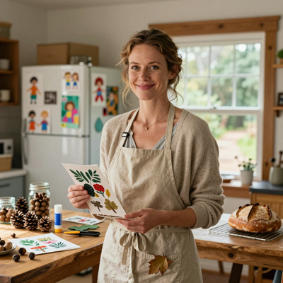
Introduction
I still remember the afternoon I nearly gave up on watercolor. My washes were muddy, my edges were ragged, and the white paper glared back at me like an accusation.
I set down my brush, frustrated, and wandered into my grandmother's craft room — a dusty sanctuary of half-finished projects and well-loved art supplies.
That is where I found it: a pad of toned paper, the kind artists use for charcoal sketches, tucked behind a stack of unfinished cross-stitch patterns.
On a whim, I grabbed a tube of gouache I had bought months earlier and never opened, and I started to paint.
The result was nothing short of a revelation. The mid-toned paper did half the work for me — the highlights I painted popped, the shadows I left as bare paper felt intentional, and the gouache, with its creamy opacity, covered my mistakes like a forgiving friend.
If you have ever felt intimidated by watercolor's unforgiving nature or frustrated by the stark white of traditional paper, let me introduce you to the quiet joy of painting with gouache on toned paper.
Gouache is, in many ways, the perfect medium for busy moms. It dries quickly, cleans up with soap and water, and does not require the precise timing that watercolor demands.
Paired with toned paper — typically a warm gray, cream, or tan — it becomes an exercise in letting the surface do some of the heavy lifting.
In this guide, I will walk you through everything you need to know to create your first vibrant illustration, from choosing supplies to mastering the techniques that make toned paper such a powerful ally.
Why Toned Paper Makes Such a Difference
When I was a child, my grandmother taught me to draw with charcoal on brown kraft paper.
She would say, "The paper is your middle value, dear. Light and dark are just visitors." That lesson stayed with me, and it is exactly the principle behind painting with gouache on toned paper.
Unlike white paper, which forces you to build up from white to dark, toned paper gives you a mid-tone foundation from the start.
You add the lights with opaque gouache, leave the paper as your mid-tones, and deepen the darks where needed.
Suddenly, a full range of values is achievable in half the time.
There is a reason portrait artists have used toned paper for centuries. The warm gray or tan surface mimics the natural undertones of skin, making flesh tones feel more alive.
For illustration, the effect is equally magical. A bright gouache highlight on a gray ground reads as luminous rather than harsh.
The paper itself becomes a participant in the artwork, not just a backdrop for it.
Another unexpected benefit? Toned paper forgives blank spots. On white paper, an unpainted area screams "unfinished." On toned paper, unpainted areas read as shadows, mid-tones, or atmospheric depth.
This alone has saved me countless hours of frustration, especially when I am painting in short bursts between school pickup and dinner prep.
Choosing Your Supplies
The Paper
For this technique, you will want a paper with some tooth — enough to hold the gouache but not so rough that it chews up your brush.
I recommend starting with a mid-tone gray or tan paper in the 80 to 100 pound weight range.
Strathmore's Series 400 Toned Sketch paper is an excellent choice; it comes in a cream shade called "oatmeal" and a neutral gray, both of which work beautifully with gouache.
If you prefer a warmer tone, Canson's Mi-Teintes pastel paper in "pearl gray" or "ivory" is a dream to paint on.
A pad of nine by twelve inch sheets will run you about twelve dollars and last for dozens of studies.
A note on color: warm-toned paper (cream, tan, warm gray) pairs wonderfully with earthy gouache palettes — ochres, burnt siennas, olive greens.
Cool-toned paper (cool gray, blue-gray) suits jewel tones and pastels. For your first project, I suggest a neutral warm gray; it works with almost any color scheme and gives you the most flexibility as you experiment.
The Gouache
You do not need a full set of forty colors to get started. A basic palette of five to eight tubes will carry you through most illustrations.
I recommend starting with titanium white, ivory black, a warm yellow (cadmium yellow or hansa yellow), a cool red (alizarin crimson or pyrrole red), a warm blue (ultramarine), and a cool blue (cerulean or phthalo blue).
Add a burnt sienna and a yellow ochre, and you have a palette that can mix almost any hue you can imagine.
As for brands, student-grade gouache is perfectly adequate for learning. Arteza and Himi Miya offer affordable sets that perform surprisingly well.
If you want to invest a bit more, Winsor & Newton's Designers Gouache and Holbein's gouache are professional-grade and worth every penny — they rewet more smoothly and produce slightly more opaque coverage.
But please do not let brand anxiety stop you. The ten-dollar set from the craft store will serve you beautifully while you learn.
The Brushes
Gouache is typically painted with synthetic brushes, as natural bristles can be too absorbent. A set of three round brushes in sizes two, six, and ten will cover most of your needs, along with a one-inch flat brush for washes and backgrounds.
Synthetic sable is an excellent choice — it holds a good point, springs back after each stroke, and costs a fraction of natural sable.
Brand is less important here than condition: keep your brushes clean, never let gouache dry in the ferrule, and they will serve you for years.
Extras
A small spray bottle is surprisingly useful. Gouache dries quickly on the palette; a spritz of water keeps it workable.
A palette with wells and a flat mixing area — I use a simple ceramic dinner plate — gives you room to mix colors and see what you are doing.
Have a jar of clean water for rinsing and a soft rag or paper towel for blotting your brush between colors.
Setting Up Your Workspace
One of the reasons I love gouache is that it asks so little of my workspace.
A corner of the kitchen table, good lighting from a window or a simple desk lamp, and a cup of tea at my elbow — that is all I need.
Lay down some scrap paper to protect the surface, arrange your colors on the palette from light to dark (a habit that will save you from muddy mixtures), and fill your water jar.
If you have young children, this is also a wonderful activity to do alongside them.
Give them their own paper and a few colors, and you can paint together in companionable silence.
I find that playing soft music or a familiar audiobook helps me settle into the rhythm of painting.
The goal here is not perfection — it is the quiet pleasure of watching color meet paper and seeing what emerges.
Set a timer for thirty minutes if that helps you relax into the process without worrying about how much time is passing.
Basic Techniques for Gouache on Toned Paper
Layering Light Over Dark
The most important principle to understand is that gouache is opaque. Unlike watercolor, where you preserve the white of the paper, gouache allows you to paint light colors over dark ones.
On toned paper, this means you can paint your highlights directly — no need to plan around them.
Start with your mid-tones and shadows, letting the paper do the work, then layer your light colors on top.
A titanium white highlight applied over a dried layer of dark blue will pop with an intensity that is hard to achieve in any other medium.
The key is patience. Let each layer dry completely before adding the next. Gouache dries quickly — usually five to ten minutes — but if you rush, the layers will mix and turn muddy.
I like to work on two or three small studies simultaneously. While one dries, I add a few brushstrokes to another.
This keeps me from hovering impatiently over a wet surface.
Creating Texture with Dry Brush
One of my favorite techniques is dry brush. Load your brush with a small amount of paint, then wipe most of it off on a paper towel so the bristles are barely damp.
Drag the brush lightly across the paper's surface. The paint catches on the tooth of the paper, creating a broken, textured mark that resembles graphite or chalk.
This is wonderful for rendering tree bark, fur, grass, or the sparkle of light on water.
On toned paper, the effect is even more striking because the paper's color shows through the gaps in the paint, adding depth and warmth.
Experiment with the pressure you apply. A light touch produces fine, delicate lines; heavier pressure fills in the gaps for a more solid mark. The same brush, used with varying pressure, can produce an entire range of textures in a single illustration.
Washes and Gradients
Gouache can be thinned with water to create translucent washes, similar to watercolor but slightly more opaque.
Dilute your paint with a generous amount of water — about one part paint to three parts water — and apply it in broad, even strokes.
The wash will dry to a soft, matte finish that is beautiful for backgrounds, skies, or atmospheric effects.
On toned paper, a thin wash of ultramarine over gray creates a subtle, moody sky that feels both delicate and intentional.
For gradients, apply two colors side by side while both are still wet, then use a clean, damp brush to soften the boundary between them.
Blend with gentle, overlapping strokes until the transition is smooth. The toned paper underneath adds a unifying warmth that helps the gradient feel cohesive even if your blending is not perfect.
Scumbling for Atmosphere
Scumbling is a technique where you apply a thin, semi-opaque layer of light paint over a darker area, allowing the underlayer to show through partially.
In oil painting, this is done with a dry brush and thin paint; in gouache, it is simply a matter of diluting your paint slightly and applying it with a light, circular motion.
On toned paper, scumbling with a warm cream over a dark gray shadow creates a luminous, atmospheric effect that is perfect for fog, mist, or soft light.
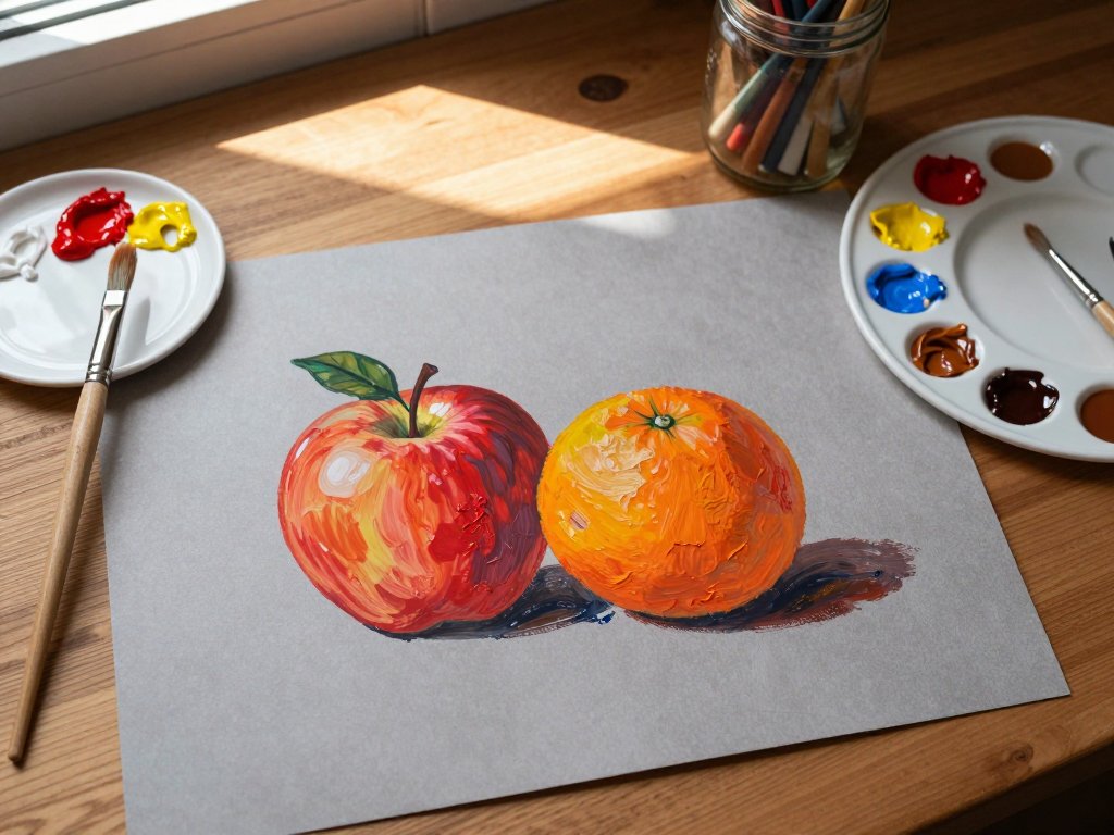
A Simple Project: A Still Life with Fruit
Let me walk you through your first painting — a simple still life with fruit. This project is designed to build confidence and practice the techniques we have discussed.
Step 1: Choose Your Reference. Set up a small bowl with an apple, an orange, and a lemon on a table near a window.
The natural light will create clear highlights and shadows, which are exactly what you need to practice the layering technique.
If natural light is not available, a desk lamp positioned at a forty-five-degree angle works just as well.
Step 2: Sketch the Composition. Using a light colored pencil or a very thin, pale gouache wash, sketch the basic shapes of the fruit and bowl on your toned paper.
Do not worry about detail — just place the forms on the page. Pay attention to where each fruit sits in relation to the others, and leave a margin around the edges for a balanced composition.
Step 3: Establish Your Mid-Tones. Mix a neutral gray from ultramarine and burnt sienna, thin it slightly, and paint the shadow areas of the fruit and the bowl.
The toned paper is already your mid-tone, so these shadows should be just a step darker than the paper itself.
Keep your brushstrokes loose and avoid overworking the area.
Step 4: Add Your Darks. Deepen the shadows with a stronger mix of ultramarine and burnt sienna, adding a touch of ivory black if needed.
Paint the darkest areas — the shadow under the bowl, the crease where the apple stem meets the fruit, the deep shadow on the lemon's far side.
Let this layer dry completely.
Step 5: Paint the Local Colors. Now comes the fun part. Mix the colors of your fruit: a warm cadmium red for the apple, a cadmium yellow with a touch of white for the lemon, and a mix of cadmium yellow and pyrrole red for the orange.
Apply these colors in thin, even layers over the dried shadows. The opaque gouache will cover the shadow layer where you want it, while the shadows remain visible where you left them exposed.
This is the magic of working on toned paper — the mid-tones are already there, so you only need to add light and dark.
Step 6: Paint the Highlights. Once the local colors are dry, mix a small amount of titanium white with a touch of the fruit's color to create a warm highlight.
Apply it to the brightest spot on each fruit — the area where the light hits most directly.
For the apple, this is a small, curved highlight near the top. For the lemon, it is a longer, narrower highlight along the ridge.
These highlights will pop dramatically against the toned paper and the surrounding color, giving your painting a luminous, three-dimensional quality.
Step 7: Refine and Finish. Step back and look at your painting. Are there areas that need more contrast?
Add another layer of shadow or a brighter highlight. Does the composition feel balanced? Adjust as needed.
The beauty of gouache is that you can paint over almost any mistake once the layer underneath is dry.
Add a simple cast shadow on the table surface to ground the still life, and sign your name in the corner.
You have just completed your first gouache illustration on toned paper.
Common Questions from Beginners
Can I use regular watercolor paper instead of toned paper? You can, but you will lose the mid-tone advantage.
If you want to try this technique on white paper, you will need to establish your mid-tones with a thin wash of neutral gray or brown before you begin painting.
This adds an extra step and makes the process more time-consuming.
Do I need to seal my finished painting? Gouache is water-soluble even when dry, so a finished piece that might be exposed to moisture should be framed under glass.
If you plan to handle the artwork frequently, a fixative spray designed for gouache or watercolor can provide light protection.
Test the fixative on a scrap piece first, as some sprays can darken or shift the colors.
What if my gouache cracks when it dries? Thick layers of gouache can sometimes crack as they dry, especially if the paint is applied too heavily or if the paper is very flexible.
To prevent this, keep your layers thin and avoid overworking an area. If the paint does crack, a thin layer of fresh gouache applied over the cracked area usually hides it.
Can I mix gouache with other media? Absolutely. Gouache pairs beautifully with colored pencil, fine-liner pen, and even watercolor.
Try adding fine pen lines over dried gouache for a mixed-media illustration that combines the softness of paint with the precision of ink.
The toned paper provides a unifying background that helps disparate media feel cohesive.
Troubleshooting Common Issues
Muddy colors. This happens when you overmix or apply a new layer before the previous one is dry.
The fix is simple: slow down. Let each layer dry completely, and when you mix colors on your palette, use a clean brush each time.
If you are still getting mud, try limiting your palette to three or four colors for a single study.
Fewer colors mean fewer opportunities for accidental gray-outs.
Lack of contrast. Beginners often paint too timidly. If your finished illustration looks flat, push your values further.
Add a darker shadow — almost black — in the deepest creases, and a brighter white highlight on the lightest points.
The contrast between near-black and near-white on the toned paper's mid-tone is what gives the painting its depth and vibrancy.
Uneasy with drawing. If you are not confident in your drawing skills, trace your reference image onto the toned paper using a lightbox or a bright window.
There is no shame in using a guide, especially when you are learning the painting medium.
The goal is to practice handling gouache, not to prove your drawing ability.
Beyond the Still Life: What to Paint Next
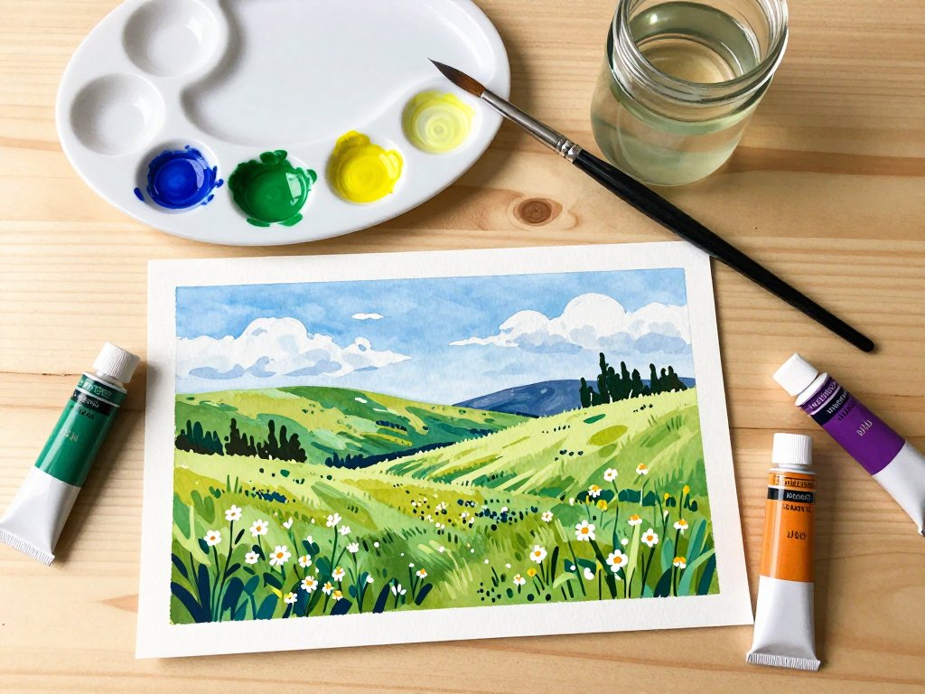
Once you have finished your first still life, the possibilities are endless. Try painting a simple landscape — a field with a tree, a cloudy sky, a stretch of shoreline.
The warm gray or cream paper will give your landscape a soft, atmospheric quality that feels both nostalgic and contemporary.
Portraits are another wonderful subject for toned paper; the mid-tone ground makes skin tones feel natural and reduces the amount of work needed to establish form.
I have found that painting small floral studies on toned paper is particularly rewarding. A single rose in a jar, painted with just four or five colors, can teach you more about light and form than a dozen detailed landscapes.
The toned paper takes the edge off perfectionism — every study is a success because the paper itself is already beautiful.
As you grow more confident, try combining techniques. Use a wash for the background, dry brush for texture in the foreground, and scumbling for atmospheric depth.
Mix your media — add a few colored pencil details over dry gouache, or outline shapes with a fine black pen.
The toned paper will tie everything together with its warm, unifying presence.
A Final Word from Someone Who Almost Gave Up
I started this article with a story about nearly quitting watercolor, and I want to circle back to that moment.
That afternoon in my grandmother's craft room, feeling defeated by a medium that would not cooperate, I had no idea I was about to discover a technique that would transform the way I paint.
The gouache on toned paper did not just save my illustration practice — it taught me something important about creativity in general.
Sometimes the problem is not you or your skills. Sometimes the problem is the surface you are working on.
If you are a busy mom who loves the idea of painting but has been intimidated by the learning curve, I hope this guide has shown you that beautiful, vibrant illustrations are within your reach.
Start with a simple still life, keep your palette small, and let the paper do some of the work.
The most important step is the first one — putting brush to paper and letting the color flow.
Everything else is just practice, and practice is its own reward.
So pick up a tube of gouache, buy a pad of toned paper, and give yourself the gift of an afternoon with no expectations. You might surprise yourself with what you create.