Introduction
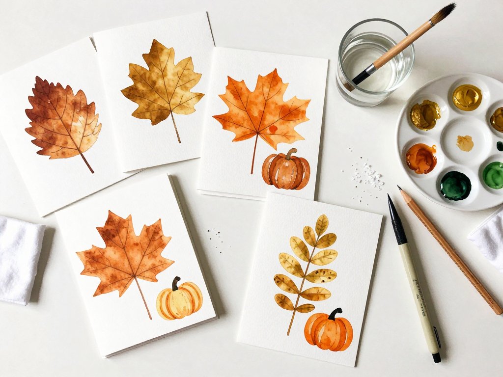
Handmade cards are where watercolor stops feeling intimidating. The paper is small, the stakes are low, and you end up with something you can actually mail.
You don't need a studio, a stretched sheet, or a free afternoon. A kitchen table, a cup of water, and twenty quiet minutes will do.
I paint cards on Sunday nights, usually with one ear on the baby monitor. Some come out lovely. Some get a leaf painted over the wobble. Both get sent.
Below are four small motifs you can learn today, the supplies that genuinely matter, and an assembly-line method for painting a dozen cards in one sitting.
Why Cards Are the Friendliest First Watercolor Project
The main reason beginners abandon watercolor is scale. A full 9 by 12 sheet is a lot of blank paper, and a wash that misbehaves can feel like a wasted evening.
A card is roughly 4 by 6 inches. One leaf fills it. If the color blooms in the wrong place, you've lost ten minutes instead of your whole weekend.
Small paper also hides imperfection better. A slightly wonky edge reads as hand-painted, not as a mistake, when it's only two inches wide.
And you finish something. A finished object does more for your motivation than any practice sheet ever will.
Cards are cheap to repeat, too. Cut one sheet of 140 lb paper into six fronts and you have six chances to get a leaf you love.
The Supplies That Actually Matter
You can spend a small fortune on watercolor. For cards, five colors and two brushes will carry you for a year.
Paper: 140 lb Cold Press, Full Stop
Buy 140 lb cold press watercolor paper, or pre-scored watercolor cards with matching envelopes if you'd rather skip the cutting.
Cold press has a gentle tooth. That texture grabs pigment, softens hard edges, and quietly hides small wobbly lines.
Skip 90 lb card stock, even when it's labeled for watercolor. Ninety-pound paper buckles the moment it receives a wet wash, and a buckled card never flattens back out.
140 lb is roughly twice as thick. It takes a proper wet-on-wet wash without turning into corrugated cardboard, and that difference is the whole reason your card looks like art instead of a rumpled note.
Brushes: A Size 6 Round and a Size 2 Liner
Two brushes are enough. A round size 6 holds plenty of water and covers a whole leaf in two strokes.
A liner or small round size 2 draws stems, veins, tree lines, and thin wheat stalks. Those fine lines are what make a beginner card look intentional.
A synthetic blend is perfectly fine. Avoid the oversized sets of tiny detail brushes; their bristles are too short to carry water to the paper.
A Limited Fall Palette
Five pigments paint everything in this article: quinacridone gold, burnt sienna, sap green, a warm red, and ultramarine blue.
Quinacridone gold is the glow inside a turning leaf. Burnt sienna is dried oak brown. Sap green handles still-green leaves and pumpkin stems.
A warm red such as pyrrol red makes berries and gourd ridges. Ultramarine is your shadow color, and mixed with burnt sienna it becomes the soft grey-brown behind everything.
A basic travel pan set works well. What matters is that the colors are transparent enough to layer, because opaque paints turn chalky by the second wash.
Everything Else on the Table
- Two water cups, one clean and one for rinsing. Cloudy rinse water tints every mix grey.
- A folded paper towel or cotton rag for blotting, lifting, and drying a brush quickly.
- Scrap watercolor paper for testing a mix before it touches the card.
- Low-tack masking tape for holding cards flat and for crisp painted borders.
- A waterproof fine liner pen and a white gel pen for veins and highlights.
- A pencil with a soft eraser for the faintest possible outline.
Lay all of it out before you paint one stroke. Reaching for a missing cup mid-wash is how cards get smeared.
Project One: A Single Autumn Leaf
Start with one leaf near the middle of the card. It teaches every core watercolor skill in about fifteen minutes, and it's the motif you'll reuse all season.
Sketch It Lightly
Draw the leaf outline in pencil as faintly as you can stand. A maple or oak silhouette is easiest, but a simple pointed oval with a stem works just as well.
Leave a thin white gap between your painted shape and the pencil line. That unpainted sliver of paper becomes a highlight, which is what makes a leaf look lit rather than cut out.
Wet-on-Wet for a Soft, Blended Leaf
Wet the whole leaf shape with clean water, then touch quinacridone gold into the base and burnt sienna near the tip. Tilt the card a few degrees and let the two find each other.
If you have never blended paint on wet paper before, start with wet-on-wet watercolor for beginners and the card projects here will feel easy.
Then don't touch it. Every extra brushstroke flattens the soft edge you were trying to keep.
Wet-on-Dry for a Crisp Leaf
For a sharper leaf, leave the paper dry. Load the size 6 round with a strong mix and paint the leaf in one confident pass.
Wet-on-dry gives you a defined edge that stops about where your brush stopped. It's the better choice for a single hero leaf on an otherwise plain card.
Which one suits you? Paint the same leaf both ways on scrap paper and compare. Two minutes tells you more than any explanation.
Veins and Stem With the Liner
Wait until the paint is completely matte before the liner touches it. A central vein and three or four side veins are plenty.
A white gel pen adds a frosty highlight along one edge and a pale stem. Keep the lines loose; a too-perfect vein looks printed.
Give each card a full ten minutes of drying time, or a minute with a hair dryer on the cool setting, before you move to the next layer.
Project Two: Negative-Space Leaves
Negative-space painting means you paint everything around the leaf and leave the paper white where the leaf sits.
It sounds backwards, and it teaches restraint better than any other exercise. You'll be surprised how often your hand wants to fill that white shape in.
Wet a soft patch of background in an area larger than your leaf. Load the size 6 with ultramarine mixed into a little burnt sienna for a warm grey-brown.
Paint around the leaf shape, working the wet edge toward it and stopping just short. The paper stays white where the leaf will be.
If paint creeps into the white shape, lift it immediately with a dry brush or the corner of a paper towel, then leave it alone.
A trio of white leaves against a soft grey-brown field looks like something from a museum shop. It's also the calmest card in this whole set.
Project Three: A Small Pumpkin or Gourd
Pumpkins are forgiving because they're basically three rounded shapes side by side, and the ridges give your brush somewhere natural to go.
Layer One: The Pale Base
Mix a weak quinacridone gold with extra water and paint the whole pumpkin silhouette in one even wash. Let it dry completely.
Layer Two: The Ridges
With a slightly stronger burnt sienna mix, paint a curved stripe down each ridge, leaving a strip of the pale base showing between them.
This is glazing: thin layers of transparent color stacked over dried washes. Thick paint in one pass flattens everything; three thin layers glow.
Layer Three: The Deep Shadows
While the second layer is still barely damp, drop a speck of warm red mixed with ultramarine into the base of each ridge.
Don't brush it in. Just touch it down and let the damp paper pull the color into a soft shadow.
The Shadow Underneath
A pumpkin with no shadow floats on the page. Mix burnt sienna with ultramarine for a cool grey-brown and paint a soft oval beneath the gourd.
Keep it wet and dilute it as it travels away from the fruit. A softer, paler edge is what makes the shadow sit on the table instead of hover.
Add the stem last, with sap green darkened by a touch of ultramarine, using the size 2 brush once the body is dry.
Project Four: A Misty Tree Line or Wheat Silhouettes
This is the fastest card in the set, and it's built entirely on a graded wash: one edge of the paint is strong and the other fades to nothing.
Wet a horizontal band across the lower two-thirds of the card. Load your round 6 with ultramarine and burnt sienna, then drag a single stroke along the top of the damp band.
The color sinks and feathers downward on its own. Add a touch more pigment at the very top and leave the bottom pale. That gradient is the mist.
Before it dries, dip the liner in a stronger dark mix and draw a row of tiny tree shapes along the horizon. Two or three strokes each is enough.
For wheat or tall grass, hold the liner nearly vertical and pull short upward flicks from a base line. Group them in threes and vary the height.
If your tree line blurs into fog entirely, that isn't a failure. That's a misty autumn morning, and it's the version people keep.
Texture Tricks: Salt, Dry Brush, and Splatter
Texture is where a simple card starts looking expensive. All three of these tricks take under a minute each.
Salt for Speckled Leaves
Sprinkle coarse salt onto a wash while it's still shiny. The grains pull pigment toward themselves and leave pale starburst speckles, which is perfect for a weathered maple leaf.
Wait until the paper is bone dry, then brush the salt off with your hand. Flicking it off while the paint is damp drags wet pigment everywhere.
Dry Brush for Edges
Wipe most of the water from your brush, then drag it lightly across dry paper. Pigment catches only the tops of the cold press tooth.
That scratchy, broken line is exactly the look of a dried leaf edge. Use it along one side of a leaf or down a tree trunk.
Splatter for Falling Leaves
Load the size 6 with a strong mix and tap the handle against your finger over the card. Fine droplets scatter across the top third like leaves coming off a tree.
Mask the area where your greeting will go with a strip of masking tape first, so the splatter lands only where you want it.
Composing a Card So It Looks Like a Card
Composition is the difference between a small painting that happens to be on a card and a card that happens to have paint on it.
Keep the image small and off-center. A single leaf sitting slightly above the middle and shifted to one side feels deliberate and calm.
Leave a deliberate band of white space for your greeting. The bottom third of the front works well, and so does the whole lower half on a simple design.
On a folded card, the front panel is roughly 4.5 by 6.25 inches. Paint within that panel and leave at least a half-inch margin on every side.
If you paint loose card fronts to mount later, work inside those same boundaries and trim to size once the paint is dry.
Resist centering everything. A horizon line placed at the bottom third grounds the whole design and leaves room above for sky.
Painting a Set of Eight to Twelve in One Evening
Cards are made in batches. The order of operations matters far more than how fast you paint.
- Cut or gather all your card fronts first, count them, and tape each one flat to a board or the table edge.
- Pencil all the outlines in one pass, very lightly, then set the pencil down and don't pick it up again.
- Paint step one on every card, such as the wet-on-wet leaf base, then stop and let them all dry flat.
- Move to the next layer on card one while the others keep drying. No waiting, no touching wet paper.
- Do all the liner work last, on fully dry cards, working in one steady run down the table.
- Leave everything overnight before writing inside or sliding cards into envelopes.
Prepare before you start. Fill both water cups, set the blotting towel within reach, and test every mix on scrap paper first.
A hair dryer on the cool setting shortens drying between layers, but keep it far enough away that it doesn't push wet pigment sideways.
Twelve cards sounds ambitious. In batch order it's about ninety minutes, and half of that is drying time you spend with your feet up.
Fixing Mistakes Without Starting Over
Every card in the set will have a moment where you're certain you've ruined it. Almost none of them are actually ruined.
Lifting Wet Paint
While the paint is still shiny, press a dry brush or the corner of a paper towel into the puddle and lift straight up. Most of the color comes with it.
Covering a Blob
Once it's dry, a stray blob becomes a leaf, a berry, or a very small gourd. Paint a shape around it and it stops being an accident.
Knowing When to Stop
The urge to fix one more thing is the most common way a wash turns muddy. If the paper is even slightly damp, put the brush down and walk away.
You can always add another layer after it dries. You can never take one off.
And if a card truly can't be saved, paint the back or trim it down for a gift tag. Nobody has ever noticed a rescued card.
Finishing, Writing, and Gifting
A painted front is only half a card. The finishing is where it becomes something a person keeps.
Rule two faint pencil lines for your greeting, write between them with the fine liner, then erase the pencil once the ink is dry.
Add one small motif to the envelope flap, such as a single leaf or three wheat flicks in the same palette. Thirty seconds makes the envelope feel considered.
For a gift set, bundle six or eight cards with twine and thread on a handmade tag cut from a trimmed card front.
Write "hand-painted, one of a kind" on the tag in pencil. A set like that is a housewarming gift, a teacher gift, or a thank-you to the neighbor who watched your kids.
Troubleshooting
My Wash Looks Overworked and Streaky
You went back into drying paint too many times. Load more pigment less often and always work toward a wet edge. One confident stroke beats five cautious ones.
My Card Is Buckling
Ninety-pound paper, or simply too much water. Switch to 140 lb cold press, tape the edges down, and use a drier brush. Small cards rarely need stretching.
My Colors Turned Muddy
Too many pigments in one mix, or a dirty rinse cup. Stick to your five colors, rinse between mixes, and let each layer dry before adding the next.
Paint Bleeds Under the Masking Tape
Water is finding a loose tape edge. Press the tape down firmly with a fingernail and keep the wash drier as you approach it.
Bleeding is worst when a puddle sits against the tape. Lift any that escapes right away with a clean damp brush, then blot.
One Small Thing to Try Tonight
If all of this feels like a lot, do only this: cut one sheet of 140 lb paper into quarters, wet a leaf shape, and drop in quinacridone gold and burnt sienna.
No liner, no composition, no set of twelve. Just watch how the two colors meet on their own.
What did the water do that you didn't expect? Keep the answer in mind for the next card, because that's how timing actually teaches itself.
Where to Go Next
Once one leaf feels easy, the same four skills carry straight into holiday cards. Evergreens, berries, and simple silhouettes all use the washes you just learned.
Then try a bundled set of blank note cards as a gift, or a stack of winter thank-yous in the same limited palette.
Your first card won't look like the ones on Pinterest. It will look handmade, which is the entire point and the reason someone keeps it.
Set out the water cup tonight. Twenty minutes, one leaf, and you'll be holding something no printer can make.